Business Application Template
"I need a template for an angular application with a sidebar containing the default menu (icon and description) minimized so that only the icon and its caption are visible, a fixed header with the name of the connected user and its context menu to log out or set personal data, a body of the page where all the pages of the application turn and a footer. All responsive because it must work both on large screens and on mobile phones or tablets"
Dependencies:
- 1. Run "npm install david-ai" in terminal
- 2. Copy the code and paste it in your project.
Blocks:
Feature
Hero
Welcome to Our SaaS Application
Experience a seamless and responsive design tailored for your needs. Our application is built to provide a user-friendly interface that adapts to any device, ensuring you stay productive on the go.
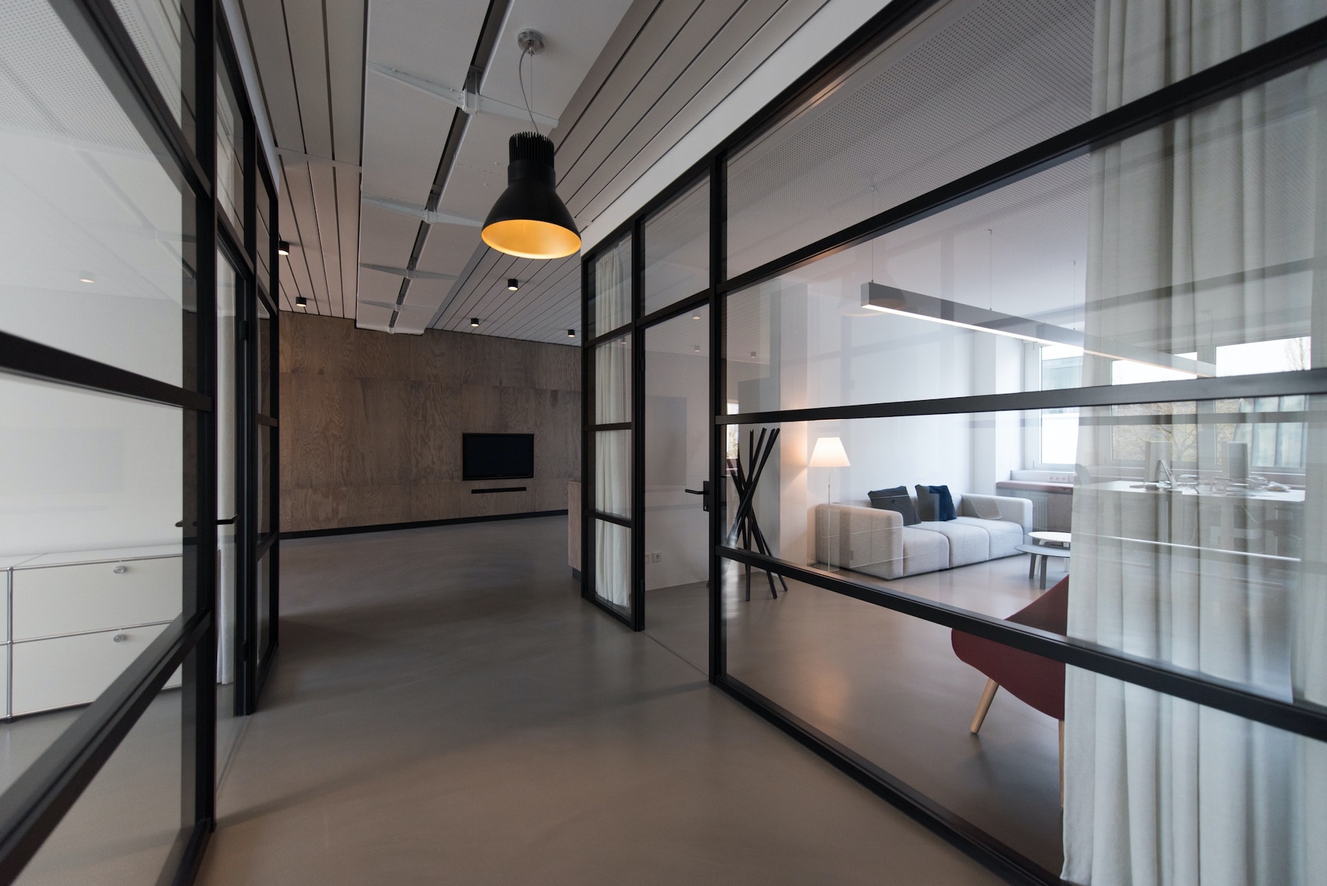
Compact Sidebar Navigation
Effortlessly navigate through your application with our compact sidebar design, featuring intuitive icons and captions for each menu item.
User-Friendly Design
Our sidebar navigation is designed to be compact and user-friendly, allowing users to quickly access different sections of the application with just a glance.
User Dashboard Header
A fixed header that displays the connected user's name along with a dropdown menu for easy access to logout and personal data settings.
Welcome, User!
The header prominently features the name of the logged-in user, providing a personalized experience.
Dynamic Content Area
A flexible main content area that adapts to display various pages of the application, ensuring a seamless user experience across devices.
Optimized for All Devices
Our application features a responsive design that provides an optimal viewing experience on desktops, tablets, and mobile phones, allowing users to access content effortlessly.
Responsive Design Principles
Implementing responsive design principles to ensure the application layout adapts seamlessly across various devices and screen sizes.
Fluid Layouts
Our application utilizes fluid layouts that adjust to the screen size, providing an optimal viewing experience on any device.
Footer Information
Stay connected with us through our relevant links and important information.
Navigate with ease
Access our support, documentation, and community forums to get the most out of our services.
Your rights matter
© 2023 Your Company Name. All rights reserved. Unauthorized use is prohibited.
Stay updated
Connect with us on social media for the latest updates and news.