Flutter Input Group
Easily extend form controls with Flutter input.
Used it in Register screens.
Example:
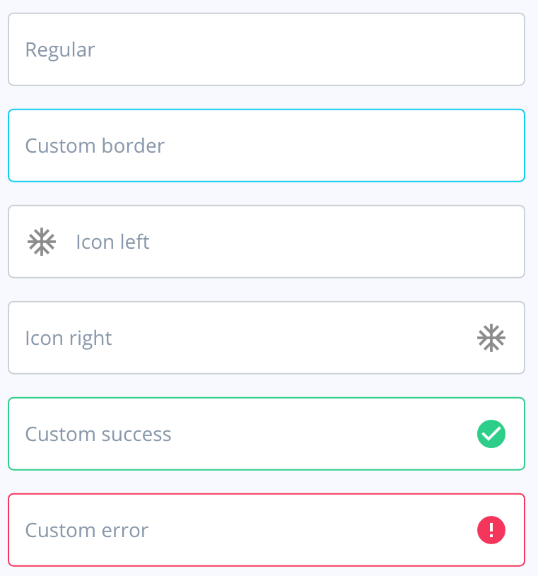
Input(
  placeholder: "Name",
  prefixIcon: Icon(Icons.school)
)
Parameters
You can always hover with your mouse on any object and see its types and parameters.
| Parameter | Type | Default | Description |
|---|---|---|---|
| placeholder | String | ||
| suffixIcon | Widget | Icon on the left side of the input. | |
| prefixIcon | Widget | Icon on the right side of the input. | |
| onTap | Function | Called when the user taps the input. | |
| onChanged | Function | Called when something inside the input’s state changes. | |
| controller | TextEditingController | ||
| autofocus | bool | false | |
| borderColor | Color | ArgonColors.border |