React-native Button
Our React-native button is an interactive element that allows users to take actions. Clicking (or tapping) them results in a specific action that is (or at least should be) described inside the button.
The
Button
component styling refers only to how it looks - the
sizing, color or a
shadow. Button action refers to what action it
performs. We included couple of button types based on their usage:
- primary buttons just help the user use the product and perform an action for him
- secondary buttons are an alternative to the primary button. These can be buttons such as “Back” or “Cancel” button
- tertiary buttons are buttons that the user might not really be looking for all the time. These buttons are very situational. We included couple of button types based on their style:
- filled is the color style based on the theme colors
- outlined is a line button does not have a fill - just an outline
-
transparent or text link is the
default style for the
Buttoncomponent - icons are used for the Social buttons
Example:
Default usage:
<Button>...</Button>Properties
| Property | Type | Default | Description |
|---|---|---|---|
| id | string | ‘Button’ | id for testID & accesibilityLabel |
| children | React.ReactNode | undefined | Renders Button content |
| round | boolean | false | Renders borderRadius value to maxSize / 2 using, maxSize value is calculated from the maximum value from width, minWidth, maxWidth, height, minHeight, maxHeight |
| rounded | boolean | false | Renders borderRadius value using theme sizes.s; default sizes.buttonRadius |
| flex | ViewStyle[‘flex’] | undefined | Renders a View flex style |
| radius | ViewStyle[‘borderRadius’] | undefined | Renders a custom borderRadius value |
| color | ViewStyle[‘backgroundColor’] | undefined | Renders a custom backgroundColor value |
| gradient | string[] | undefined | Renders LinearGradient component, colors |
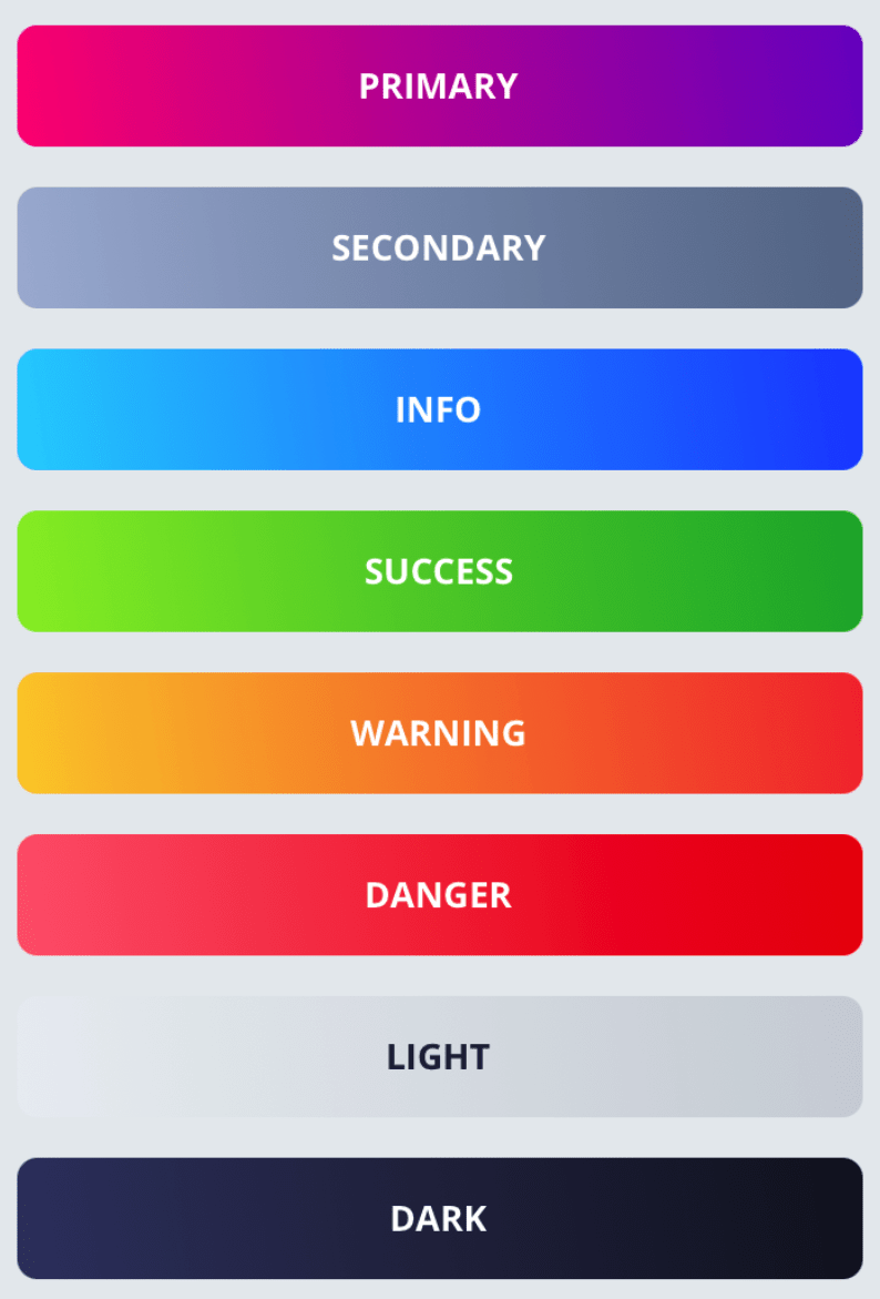
| primary | boolean | false | Renders a backgroundColor directly from the colors.primary value |
| secondary | boolean | false | Renders a backgroundColor directly from the colors.secondary value |
| tertiary | boolean | false | Renders a backgroundColor directly from the colors.tertiary value |
| gray | boolean | false | Renders a backgroundColor directly from the colors.gray value |
| black | boolean | false | Renders a backgroundColor directly from the colors.black value |
| white | boolean | false | Renders a backgroundColor directly from the colors.white value |
| light | boolean | false | Renders a backgroundColor directly from the colors.light value |
| dark | boolean | false | Renders a backgroundColor directly from the colors.dark value |
| danger | boolean | false | Renders a backgroundColor directly from the colors.danger value |
| warning | boolean | false | Renders a backgroundColor directly from the colors.warning value |
| success | boolean | false | Renders a backgroundColor directly from the colors.success value |
| info | boolean | false | Renders a backgroundColor directly from the colors.info value |
| row | boolean | false | Renders a View flexDirection: row style |
| align | ViewStyle[‘alignItems’] | undefined | Renders a flex alignItems. Available values: ‘auto’, ‘flex-start’, ‘flex-end’, ‘center’, ‘stretch’, ‘baseline’ |
| justify | ViewStyle[‘justifyContent’] | undefined | Renders a flex justifyContent. Available values: ‘flex-start’, ‘flex-end’, ‘center’, ‘space-between’, ‘space-around’, ‘space-evenly’ |
| height | ViewStyle[‘height’] | undefined | Renders a custom height value |
| width | ViewStyle[‘width’] | undefined | Renders a custom width value |
| outlined | boolean | false | Renders the container style with predefined borderWidth: 1, backgroundColor: ‘transparent’ & borderColor inherited |
| shadow | boolean | false | Generates a shadow style |
| social | facebook, twitter, dribbble | undefined | Renders social icons (‘logo-facebook’, ‘logo-twitter’, ‘logo-dribbble’) from Ionicons |
| position | ViewStyle[‘position’] | undefined | Renders the View position |
| right | ViewStyle[‘right’] | undefined | Renders the View right offset |
| left | ViewStyle[‘left’] | undefined | Renders the View left offset |
| top | ViewStyle[‘top’] | undefined | Renders the View top offset |
| bottom | ViewStyle[‘bottom’] | undefined | Renders the View bottom offset |
| haptic | boolean | false | Provides haptic feedback on touch - Haptics.selectionAsync() |
| vibrate | number, number[], null | undefined | Adds vibration feedback on touch using Vibration.vibrate pattern |
| vibrateRepeat | boolean | false | Repeat vibration pattern |