React-native Image
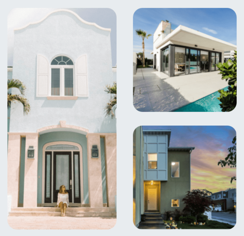
Our React-native image component is the most “real” part of your app design - in other words, they’re the closest thing to the real, non-digital world your design will have.
While everything else is made out of abstract shapes and lines,
photos of real things can add massive value to the product you’re
designing. We included couple of options and predefined style to
easily use it for different usage like in
user avatar or inside a
Card component as a background image. By default
the
Image
component has a default border radius of 14px which
can be customised or disabled from within the theme constants under
the name imageRadius
Example:
Default usage:
<Image source={...} />Properties
| Property | Type | Default | Description |
|---|---|---|---|
| id | string | ‘Image’ | id for testID & accesibilityLabel |
| avatar | boolean | false | Avatar sizing: borderRadius from Math.min(height, weight), sets the width & height to Math.min(height, weight) |
| shadow | boolean | false | Generates a shadow style |
| background | boolean | false | Renders an ImageBackground component |
| rounded | boolean | false | Renders a predefined theme sizes.borderRadius & overflow: ‘hidden’ |
| radius | ImageStyle[‘borderRadius’] | undefined | Renders a custom borderRadius value |
| color | ImageStyle[‘tintColor’] | undefined | Changes the color of all the non-transparent pixels to the tintColor. |
| transform | ImageStyle[‘transform’] | undefined | Modify the appearance and position of your components using 2D or 3D transformations |
| style |
StyleProp |
undefined | Custom Image style |
| children | React.ReactNode | undefined | Renders the ImageBackground content |