Notus React Images
We’ve designed our images so that they do not become larger then their wrapper container using Tailwind CSS. Choose the one that best suits your needs.
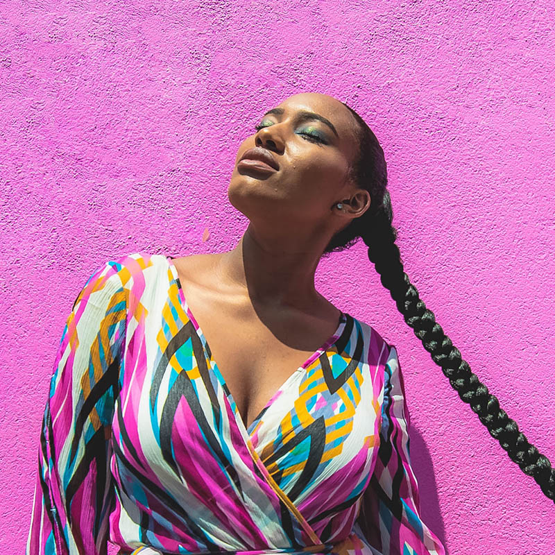
Simple Image
This is a simple image, with rounded corners, that can beautifully go alongside some text, representing a blog post.

<div className="flex flex-wrap justify-center">
  <div className="w-6/12 sm:w-4/12 px-4">
    <img src="https://images.unsplash.com/photo-1522202176988-66273c2fd55f?ixlib=rb-1.2.1&ixid=eyJhcHBfaWQiOjEyMDd9&auto=format&fit=crop&w=1051&q=80" alt="..." className="shadow rounded max-w-full h-auto align-middle border-none" />
  </div>
</div>
Circle Image
This circled image can work as a profile image.
<div className="flex flex-wrap justify-center">
  <div className="w-6/12 sm:w-4/12 px-4">
    <img src="https://demos.creative-tim.com/notus-js/assets/img/team-2-800x800.jpg" alt="..." className="shadow rounded-full max-w-full h-auto align-middle border-none" />
  </div>
</div>
Simple Raised
The difference between this image and the first one, is the shadow. While the first image had none, this has a shadow that makes the image feel like it floats.
<div className="flex flex-wrap justify-center">
  <div className="w-6/12 sm:w-4/12 px-4">
    <img src="https://images.unsplash.com/photo-1522202176988-66273c2fd55f?ixlib=rb-1.2.1&ixid=eyJhcHBfaWQiOjEyMDd9&auto=format&fit=crop&w=1051&q=80" alt="..." className="shadow-lg rounded max-w-full h-auto align-middle border-none" />
  </div>
</div>
Circle Raised
Like the above image, this one features a shadow to make it look like it floats above the other content.
<div className="flex flex-wrap justify-center">
  <div className="w-6/12 sm:w-4/12 px-4">
    <img src="https://demos.creative-tim.com/notus-js/assets/img/team-2-800x800.jpg" alt="..." className="shadow-lg rounded-full max-w-full h-auto align-middle border-none" />
  </div>
</div>