The Ultimate Component Library
Powered by AI and Tailwind CSS
David UI is your open-source solution to building high-converting UIs, offering plug-and-play components that are optimized for any Tailwind CSS workflows.
Remarkable Achievements
Discover how our UI Tools have transformed web development. These achievements showcase our dedication to innovation and our community's growth.
2.6M+
Community Members
Join our community of developers and designers
8.6M+
Cumulative Downloads
Based on Material Tailwind and Creative Tim Products
48,000+
Github Cumulative Stars
On 100+ Open Source Repositories and Projects
280,000+
Monthly NPM Downloads
Including React, HTML, Tailwind CSS and more.
Tailwind CSS Framework Integrations
Enhance your workflow with seamless integrations for your favorite tools using David UI.
React
Open-source JavaScript framework and library developed by Facebook.
Coming Soon
Next.js
React framework that gives you building blocks to create web apps.
Coming Soon
Creat React App
Set up a modern web app by running one simple terminal command.
Coming Soon
Remix
Full stack web framework that lets you focus on the user interface.
Coming Soon
Vite
Flexible programmatic APIs with full TypeScript typing.
Coming Soon
Astro
All-in-one web framework designed for speed.
Coming Soon
Gatsby
The Fastest Frontend for the Headless Web.
Coming Soon
Built for the Future of Development
Discover the difference our AI and Tailwind CSS features can bring to your web projects with solutions designed for today's coding needs.
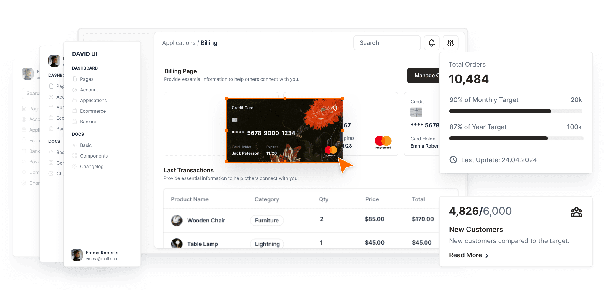
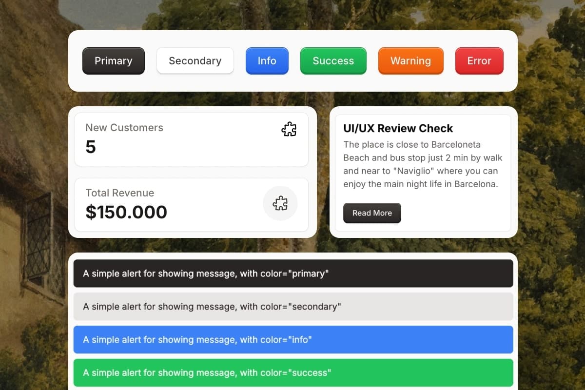
300+ Tailwind CSS Components
Every UI element you need, ready to drop in.
Save hours on repetitive UI work with our collection of 300+ beautifully crafted Tailwind CSS components. Clean, responsive, and production-ready. Just copy and paste.
Buttons, navbars, modals, forms, cards, and everything in between.
Rapid prototyping
Consistent design system
Built to work out of the box
Free Forever - No signup needed.
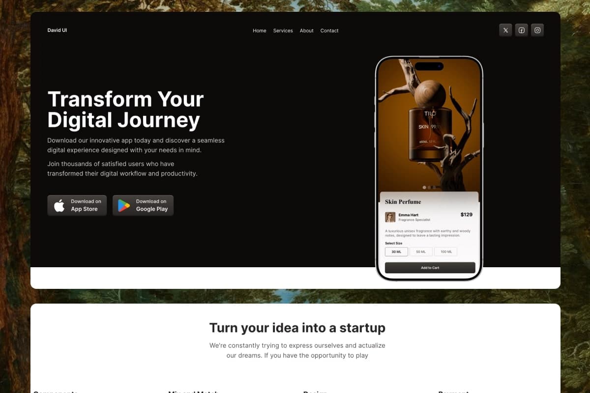
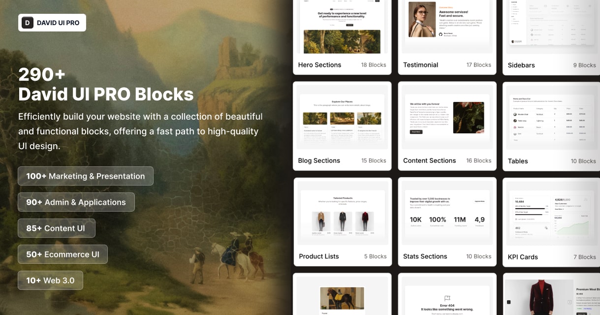
290+ Tailwind CSS Blocks
Complete UI sections to build faster than ever.
Need a full hero section, pricing block, or dashboard layout? These 300+ blocks are your shortcut. Copy-paste and go. Designed with the latest UI/UX trends in mind.
Fully-coded, fully-designed sections
Categories: Admin, Marketing, Content, E-commerce, Web3
Copy/paste into your project, instantly usable
Light & Dark Mode (coming soon)
Modern, responsive, and fully customizable
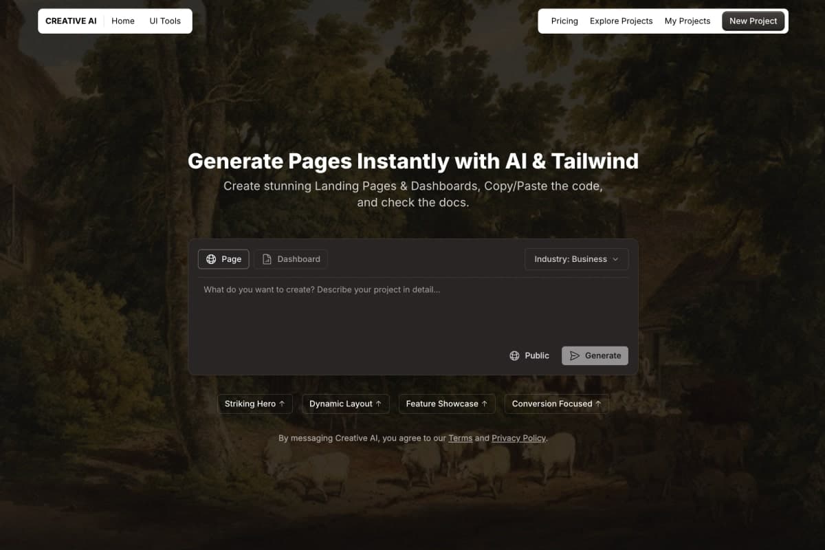
AI Pages Generator | Creative AI
Build entire pages in seconds with AI.
Generate complete landing pages and dashboards using our AI-powered builder. Tailwind CSS code included, clean, responsive, and ready to deploy.
Auto-generates Landing Pages & Dashboards
Built for SaaS, Ecom, Web3, legal, education, and more
Code is easy to customize and plug into your stack
SEO-Ready Content
300+ Components for Every Scenario
David UI's Tailwind CSS components integrate seamlessly, ensuring your projects remain visually competitive and professionally polished. Start building with precision today!


Level Up Your Designs with David UI PRO
Get access to powerful integrations and tools that take your projects to the next level!
Figma Integration Perfected
Access a comprehensive library of components, tokens, variables, and pre-configured auto-layouts for precise alignment and adaptability. The Figma integration ensures consistency and efficiency at every stage of your project.

 Preview Figma
Trusted by Developers and
Creators Worldwide
From faster development times to visually stunning results, see why David UI is the go-to choice for building scalable UIs.
Community Members
2.6M+
Cumulative Downloads
8.6M+
GitHub Cumulative Stars
48,000+
Monthly NPM Downloads
280,000+


What's Next for David UI
Explore our journey ahead! The David UI roadmap is designed to deliver powerful new features, enhance developer experiences, and redefine modern UI design.
Laying the Foundation
Enhancements & Integrations
Advanced Features & Optimizations
Laying the Foundation
Enhancements & Integrations
Advanced Features & Optimizations