-
Examples
Check out our card component examples that come in different styles for your Tailwind and JS project.
Tailwind CSS Cards - Notus JS
-Use Notus’s cards for Tailwind CSS that provide a flexible and extensible content container with multiple variants and options.
Examples
Card Info Icon
Awarded Agency
Divide details about your product or agency work into parts. A paragraph describing a feature will be enough.
<div class="w-full md:w-1/3">
  <div class="relative flex flex-col min-w-0 break-words bg-white w-full mb-8 shadow-lg rounded-lg">
    <div class="px-4 py-5 flex-auto">
      <div class="text-white p-3 text-center inline-flex items-center justify-center w-12 h-12 mb-5 shadow-lg rounded-full bg-gradient-to-b from-red-400 to-red-600 bg-red-400">
        <i class="fa fa-heart"></i>
      </div>
      <h6 class="text-xl font-semibold">Awarded Agency</h6>
      <p class="mt-2 mb-4 text-blueGray-400">Divide details about your product or agency work into parts. A paragraph describing a feature will be enough.</p>
    </div>
  </div>
</div>
Card Blog Image

Top Notch Services
The Arctic Ocean freezes every winter and much of the sea-ice then thaws every summer, and that process will continue whatever happens.
<div class="w-full md:w-2/3">
<div class="relative flex flex-col min-w-0 break-words bg-white w-full mb-6 shadow-lg rounded-lg bg-lightBlue-500">
<img alt="..." src="https://images.unsplash.com/photo-1522202176988-66273c2fd55f?ixlib=rb-1.2.1&ixid=eyJhcHBfaWQiOjEyMDd9&auto=format&fit=crop&w=1051&q=80" class="w-full align-middle rounded-t-lg"><blockquote class="relative p-8 mb-4"><svg preserveAspectRatio="none" xmlns="http://www.w3.org/2000/svg" viewBox="0 0 583 95" class="absolute left-0 w-full block h-95-px -top-94-px"><polygon points="-30,95 583,95 583,65" class="text-lightBlue-500 fill-current"></polygon></svg>
<h4 class="text-xl font-bold text-white">Top Notch Services</h4>
<p class="text-md font-light mt-2 text-white">The Arctic Ocean freezes every winter and much of the sea-ice then thaws every summer, and that process will continue whatever happens.</p></blockquote>
</div>
</div>Card Background Image and Transition
<div class="w-full md:w-2/3">
<div class="h-500-px overflow-hidden relative flex flex-col min-w-0 break-words bg-white w-full shadow-lg transition-all duration-150 ease-in-out hover:z-1 hover:transform hover:scale-110 group rounded-lg mb-4">
<div class="absolute w-full h-full bg-50-center bg-cover transition-all duration-1000 ease-in-out group-hover:transform group-hover:scale-110 rounded-lg" style="background-image: url('https://demos.creative-tim.com/notus-pro-react/static/media/new-york-city.d7a444b7.jpg'); backface-visibility: hidden;">
</div>
<div class="absolute w-full h-full bg-black opacity-50 rounded-lg">
</div><a href="javascript:;">
<div class="absolute text-left p-6 bottom-0">
<h6 class="text-xl leading-normal mb-0 text-white opacity-75">All the beautiful places</h6>
<h5 class="text-2xl font-bold leading-tight mt-0 mb-2 text-white">Research by Bang & Olufsen on city sounds and music</h5>
</div>
</a>
</div>
</div>Card Pricing
<div class="w-full md:w-1/3">
    <div class="bg-white mb-6 text-center shadow-lg rounded-lg relative flex flex-col min-w-0 break-words w-full mb-6 rounded-lg">
        <div class="bg-transparent first:rounded-t px-5 py-3 border-b border-blueGray-200">
            <h6 class="font-bold my-2">Standard</h6>
        </div>
        <div class="px-4 py-5 flex-auto">
            <div class="text-5xl mt-0 mb-0 font-bold">$25</div>
            <span> per month </span>
            <ul class="mt-6 mb-0 list-none">
                <li class="py-1 text-blueGray-500">
                    <b class="text-lightBlue-500"> 20GB </b>File Storage
                </li>
                <li class="py-1 text-blueGray-500">
                    <b class="text-lightBlue-500"> 15 </b>Users/project
                </li>
                <li class="py-1 text-blueGray-500">
                    <b class="text-lightBlue-500"> 4.000 </b>Internal messages
                </li>
            </ul>
        </div>
        <div class="mt-4 py-6 bg-transparent bg-transparent rounded-b px-4 py-3 border-t border-blueGray-200">
            <a href="javascript:;" class="text-lightBlue-500">Request a demo</a>
        </div>
    </div>
</div>
Card Blog
Miami Vice
The simplest visual description uses ordinary words to convey what the writer sees. First he or she must look at the subject – slowly, carefully, and repeatedly, if possible – to identify the parts that make the whole

<div class="w-full md:w-1/2">
    <div class="overflow-hidden mb-12 rounded-lg relative flex flex-col min-w-0 break-words bg-white w-full mb-6 shadow-lg rounded h-550-px transition-all duration-150 ease-in-out hover:transform hover:scale-110 group">
        <div class="absolute rounded-lg w-full h-full bg-50-center bg-cover transition-all duration-1000 ease-in-out group-hover:transform group-hover:scale-110" style="background-image: url('https://demos.creative-tim.com/notus-pro-react/static/media/new-york-city.d7a444b7.jpg'); backface-visibility: hidden;">
        </div>
        <div class="absolute rounded-lg w-full h-full bg-black opacity-50">
        </div>
        <div class="p-10 flex h-full items-end z-1">
            <div>
                <h1 class="text-4xl font-semibold mt-0 mb-2 text-white">Miami Vice</h1>
                <p class="text-white opacity-75 text-lg">The simplest visual description uses ordinary words to convey what the writer sees. First he or she must look at the subject – slowly, carefully, and repeatedly, if possible – to identify the parts that make the whole</p>
                <div class="py-4 mb-3 flex items-start">
                    <a href="javascript:;" class="flex items-center relative">
                        <img src="https://demos.creative-tim.com/notus-pro-react/static/media/team-3.c5d0c11c.jpg" class="rounded-full mr-4" alt="..." style="max-width: 40px;">
                        <div class="flex-1">
                            <div class="justify-between items-center">
                                <h6 class="text-sm uppercase mb-2 mt-2 text-white font-semibold">by Martin Jay</h6>
                            </div>
                        </div>
                    </a>
                </div>
                <button class="inline-block relative outline-none focus:outline-none align-middle transition-all duration-150 ease-in-out uppercase border border-solid font-bold last:mr-0 mr-2  text-white bg-red-500 border-red-500 active:bg-red-600 active:border-red-600 text-sm px-6 py-2 shadow hover:shadow-lg rounded-md">Read more...</button>
            </div>
        </div>
    </div>
</div>
Card Ecommerce
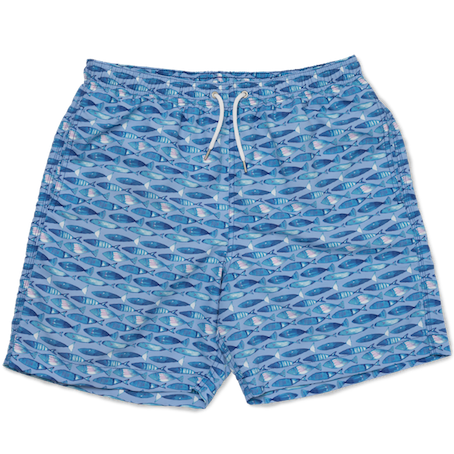
Shorts
Small

Jacket
Medium
Subtotal
$1.290
Shipping
$200
Total
$1.490
<div class="w-full md:w-2/3">
    <div class="relative flex flex-col min-w-0 break-words bg-white w-full mb-6 shadow-lg rounded-lg">
       <div class="px-4 py-5 flex-auto">
          <div class="items-center my-4 flex items-start">
             <img src="https://demos.creative-tim.com/notus-pro-react/static/media/gucci.df54712f.png" class="mr-4 w-20 p-2" alt="...">
             <div class="flex-1">
                <div class="justify-between">
                   <h6 class="text-xl font-semibold leading-tight mb-1">Shorts</h6>
                   <p class="text-blueGray-500 uppercase font-bold text-xs">Small</p>
                </div>
             </div>
             <span class="text-blueGray-700">$290</span>
          </div>
          <div class="items-center my-4 flex items-start">
             <img src="https://demos.creative-tim.com/notus-pro-react/static/media/jacket.132b3c72.png" class="mr-4 w-20 p-2" alt="...">
             <div class="flex-1">
                <div class="justify-between">
                   <h6 class="text-xl font-semibold leading-tight mb-1">Jacket</h6>
                   <p class="text-blueGray-500 uppercase font-bold text-xs">Medium</p>
                </div>
             </div>
             <span class="text-blueGray-700">$1.000</span>
          </div>
          <hr class="mt-6 mb-4 bg-blueGray-300 ml-0">
          <div class="mb-0 pt-0 relative">
             <label class="block uppercase text-blueGray-700 text-xs font-bold mb-2 ml-1">Discount</label>
             <div class="mb-2 relative flex flex-wrap w-full items-stretch">
                <div class="mr-2">
                   <div class="mb-3 pt-0"><input placeholder="Discount code" type="text" class="border-blueGray-300 px-3 py-2 text-sm  w-full placeholder-blueGray-200 text-blueGray-700 relative bg-white rounded-md outline-none focus:ring focus:ring-lightBlue-500 focus:ring-1 focus:border-lightBlue-500 border border-solid transition duration-200 "></div>
                </div>
                <div class="mb-0"><button class="inline-block outline-none focus:outline-none align-middle transition-all duration-150 ease-in-out uppercase border border-solid font-bold last:mr-0 mr-2  text-white bg-pink-500 border-pink-500 active:bg-pink-600 active:border-pink-600 text-sm px-6 py-2 shadow hover:shadow-lg rounded-md">Apply</button></div>
             </div>
          </div>
          <div>
             <hr class="mt-4 mb-2 bg-blueGray-300 ml-0">
             <div class="flex justify-between">
                <h6 class="text-blueGray-700 leading-normal mt-0 mb-2">Subtotal</h6>
                <h6 class="leading-normal mt-0 mb-2">$1.290</h6>
             </div>
             <div class="flex justify-between">
                <h6 class="text-blueGray-700 leading-normal mt-0 mb-2">Shipping</h6>
                <h6 class="leading-normal mt-0 mb-2">$200</h6>
             </div>
          </div>
          <div>
             <hr class="mt-4 mb-2 bg-blueGray-300 ml-0">
             <div class="flex justify-between">
                <h6 class="text-blueGray-700 leading-normal mt-0 mb-2">Total</h6>
                <h6 class="leading-normal mt-0 mb-2">$1.490</h6>
             </div>
          </div>
       </div>
    </div>
 </div>