React-native Input
Our React-native input is the most common form element. It has a quite simple anatomy - just a rectangle with a label and placeholder text inside (it can have the same size as your base / body text size).
This component is a bit complex due to the fact we’re using other components (Block, Text and Icon) to create the component.
Example:
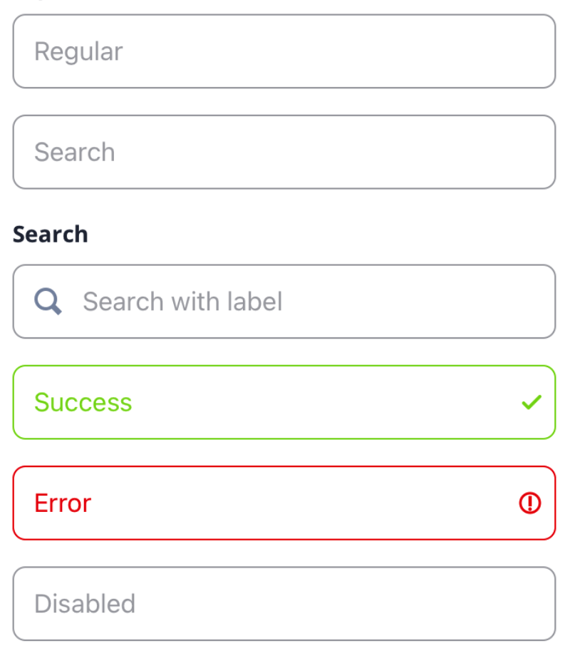
Default usage:
<Input />Properties
| Property | Type | Default | Description |
|---|---|---|---|
| id | string | ‘Input’ | id for testID & accesibilityLabel |
| children | React.ReactNode | undefined | Renders the TextInput content |
| style | TextStyle | undefined | Renders the TextInput style |
| color | ColorValue | undefined | Renders a custom borderColor & placeholderTextColor |
| primary | boolean | false | Renders a borderColor & placeholderTextColor directly from the colors.primary value |
| secondary | boolean | false | Renders a borderColor & placeholderTextColor directly from the colors.secondary value |
| tertiary | boolean | false | Renders a borderColor & placeholderTextColor directly from the colors.tertiary value |
| black | boolean | false | Renders a borderColor & placeholderTextColor directly from the colors.black value |
| white | boolean | false | Renders a borderColor & placeholderTextColor directly from the colors.white value |
| gray | boolean | false | Renders a borderColor & placeholderTextColor directly from the colors.gray value |
| danger | boolean | false | Renders a right side danger icon for invalid input value. Renders a borderColor & placeholderTextColor directly from the colors.warning value |
| warning | boolean | false | Renders a borderColor & placeholderTextColor directly from the colors.success value |
| success | boolean | false | Renders a right side success icon for valid input value. Renders a borderColor & placeholderTextColor directly from the colors.info value |
| info | boolean | false | Renders a right side success icon for valid input value.Renders a borderColor & placeholderTextColor directly from the colors.info value |
| search | boolean | false | Renders a right side search icon |
| disabled | boolean | false | Renders a disabled / non-editable TextInput |
| label | string | undefined | Renders the label top text |
| icon | keyof ITheme[‘assets’] | undefined | Renders a left side icon image from the Theme assets |