React-native Switch
Our React-native switch component has a similar purpose to checkboxes - they’re a multiple choice element that is rarely used in forms, but rather as separate objects.
The main difference between them and checkboxes is that action caused by switching a switch does not have to be confirmed by a “Submit” button.
Example:
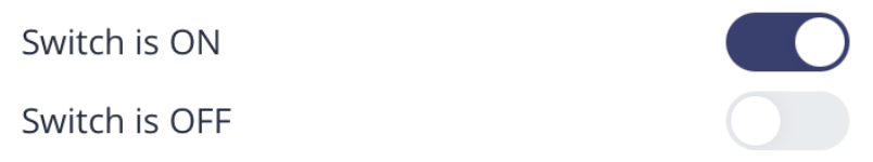
Default usage:
<Switch />Properties
| Property | Type | Default | Description |
|---|---|---|---|
| id | string | ‘Switch’ | id for testID & accesibilityLabel |
| checked | boolean | false | Switch checked value |
| style | ViewStyle | undefined | Renders the Switch style |
| thumbColor | ColorValue | ‘white’ | Renders the thumb color value |
| activeFillColor | ColorValue | undefined | Renders the switch active thumb backgroundColor value |
| inactiveFillColor | ColorValue | undefined | Renders the switch inactive thumb backgroundColor value |
| thumbStyle | ViewStyle | undefined | Renders the thumb style |
| switchStyle | ViewStyle | undefined | Renders the switch container style |
| onPress | (checked: boolean) => void | undefined | Switch onPress callback passing the checked value as params |
| haptic | boolean | true | Provides haptic feedback when toggling the switch |
| duration | Animated.TimingAnimationConfig[‘duration’] | 250 | Duration in ms for thumb animated position |