Flutter Cards
Our Flutter cards provide a flexible and extensible content container with multiple variants and options.
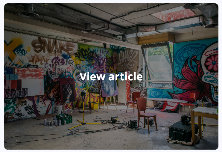
Card Category
Used it in the Beauty screens.
Example:
CardCategory(
  tap: () {},
  title: "Big title",
  img: "https://via.placeholder.com/150"
)
Parameters
You can always hover with your mouse on any object and see its types and parameters.
| Parameter | Type | Default | Description |
|---|---|---|---|
| img | String | https://via.placeholder.com/250 | The background image. |
| title | String | Placeholder Title | The displayed title. |
| tap | Function | defaultFunc() | The function called when the user taps on the card. |
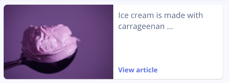
Card Horizontal
Used it in the Home and Fashion screens.
Example:
CardHorizontal(
  tap: () {},
  cta: "View article",
  title: "Big title",
  img: "https://via.placeholder.com/150"
)
Parameters
You can always hover with your mouse on any object and see its types and parameters.
| Parameter | Type | Default | Description |
|---|---|---|---|
| img | String | https://via.placeholder.com/200 | The product image. |
| title | String | Placeholder title | The displayed title. |
| tap | Function | defaultFunc() | The function called when the user taps on the card. |
| cta | String | ”” | This is the main Call-to-action. |
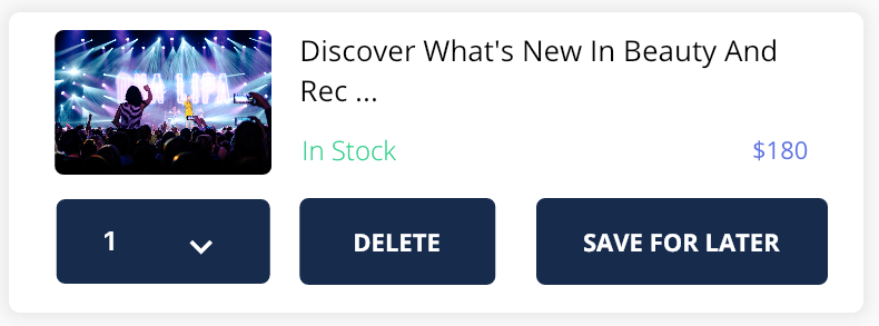
Card Shopping PRO
Used it in the Cart screen. The main purpose of this widget is displaying what the user has bought and has currently in cart.
Example:
CardShopping(
  body: "Blue moon",
  stock: true,
  price: "365",
  img: "https://via.placeholder.com/150",
  deleteOnPress: () {}
)
Parameters
You can always hover with your mouse on any object and see its types and parameters.
| Parameter | Type | Default | Description |
|---|---|---|---|
| img | String | https://via.placeholder.com/200 | The product image. |
| Body | String | Placeholder title | The displayed body of text. |
| deleteOnPress | Function | The function called when the user taps on the Delete button. | |
| cta | String | ”” | This is the main Call-to-action. |
| stock | bool | true | Displays the availability of the product. |
| price | String | 332 | Displays the price of that specific product. |
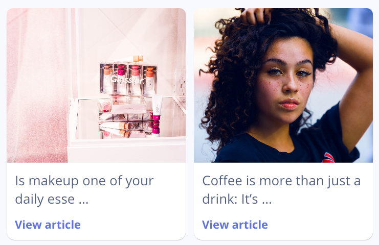
Card Small
Used it in the Home and Fashion screens.
Example:
CardSmall(
  title: "Blue moon",
  cta: "View article",
  img: "https://via.placeholder.com/150",
  tap: () {}
)
Parameters
You can always hover with your mouse on any object and see its types and parameters.
| Parameter | Type | Default | Description |
|---|---|---|---|
| img | String | https://via.placeholder.com/200 | The product image. |
| title | String | Placeholder title | The displayed body of text. |
| cta | String | ”” | This is the main Call-to-action. |
| tap | Function | defaultFunc() | The function called when the user taps on the card. |
Card Square
Used it in the Home and Fashion screens.
Example:

CardSquare(
  body: "Blue moon",
  stock: true,
  price: "365",
  img: "https://via.placeholder.com/150",
  deleteOnPress: () {}
)
Parameters
You can always hover with your mouse on any object and see its types and parameters.
| Parameter | Type | Default | Description |
|---|---|---|---|
| img | String | https://via.placeholder.com/200 | The product image. |
| title | String | Placeholder title | The displayed body of text. |
| cta | String | ”” | This is the main Call-to-action. |
| tap | Function | defaultFunc() | The function called when the user taps on the card. |