Content card with call-to-action button - shadcn/ui
PROSimple and effective card layout with header image, title, description, and prominent call-to-action button. Perfect for product showcases, service offerings, and promotional content.
Preview
Explore More Blocks
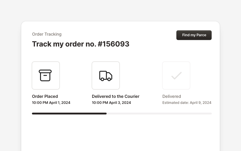
OrderProfessional order tracking and management components for React and Next.js. Build order details pages, tracking timelines, shipping status displays, order summaries, and delivery management interfaces with customizable layouts.
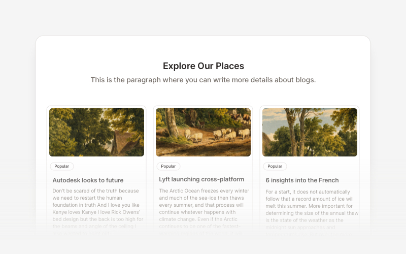
BlogElegant blog components and content layouts for React and Next.js. Create beautiful article grids, post previews, author profiles, and content-rich blog experiences.
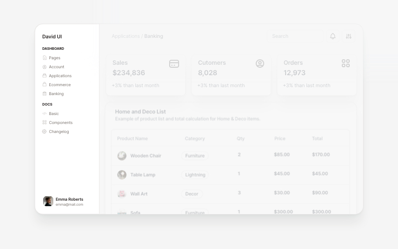
SidebarProfessional sidebar navigation and menu components for React and Next.js. Build dashboard sidebars, app navigation, crypto wallets, calendar views, task managers, and feature-rich sidebar layouts with customizable content.
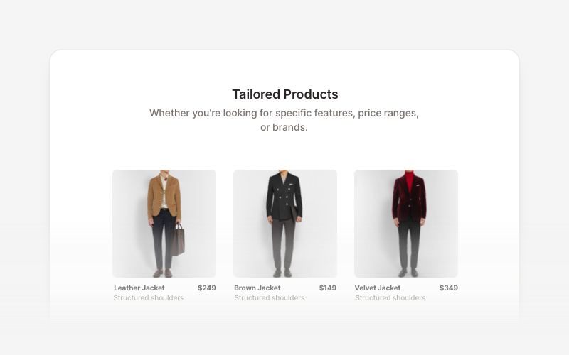
Product ListProfessional product listing and showcase components for React and Next.js. Build product grids, filtered lists, rating displays, and ecommerce product catalogs with customizable layouts.
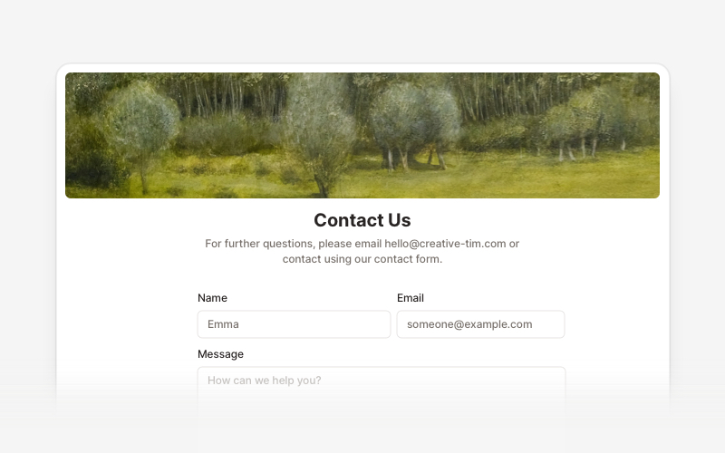
ContactProfessional contact form components and section layouts for React and Next.js. Build contact pages, feedback forms, support sections, and communication interfaces.
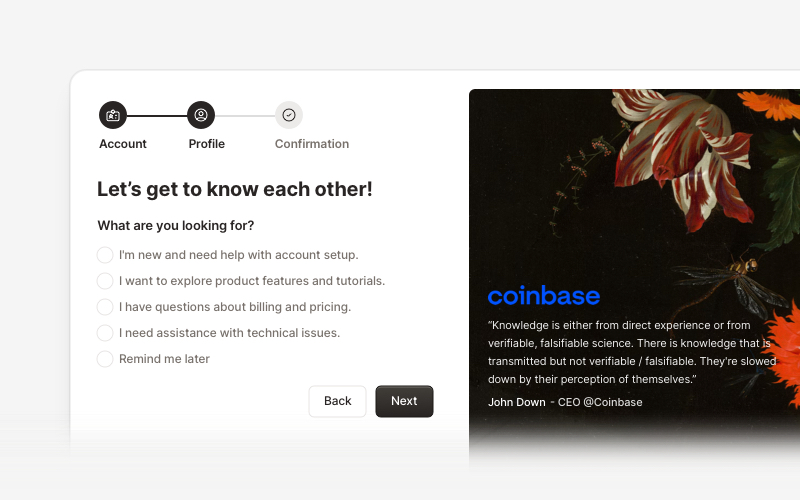
OnboardingProfessional user onboarding and welcome components for React and Next.js. Build multi-step onboarding flows, welcome cards, stepper forms, verification screens, and guided setup experiences with customizable layouts.
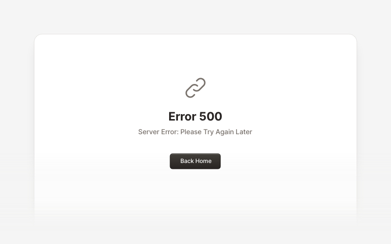
MaintenanceProfessional maintenance and downtime page components for React and Next.js. Build scheduled maintenance notifications, system upgrade messages, and under construction pages with email notifications and social links.
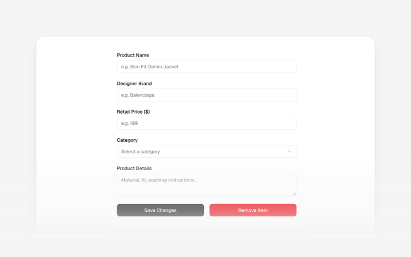
CRUDsComplete CRUD interface components and data management blocks for React and Next.js. Build admin panels, data tables, forms, and database management interfaces.