Category grid with icons and hover effects - shadcn/ui
PROClean category showcase with centered icons and hover animations. Three-column grid layout ideal for product categories, service offerings, and navigation sections with smooth transitions.
Preview
Explore More Blocks
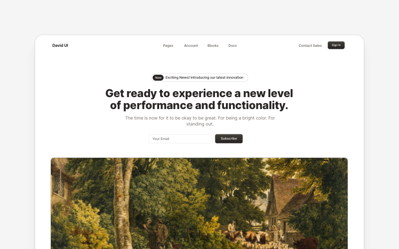
HeroEye-catching hero section components for React and Next.js. Build landing page heroes, call-to-action sections, lead generation forms, and compelling above-the-fold content.
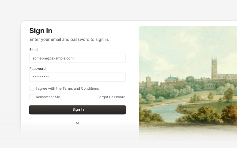
AuthenticationSecure authentication components and login flows for React and Next.js. Build sign-in forms, registration pages, password reset flows, and authentication interfaces.
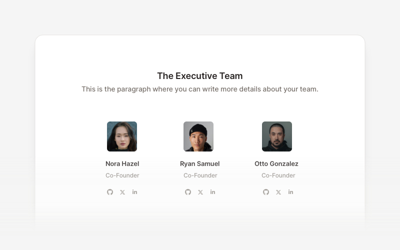
TeamProfessional team member showcase components for React and Next.js. Build team pages, member profiles, organization charts, and employee directories with customizable layouts.
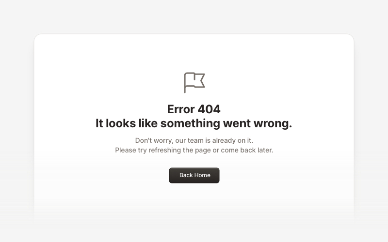
ErrorProfessional error page components for React and Next.js. Build 404 and 500 error pages with various layouts, icons, emoji, background images, and call-to-action buttons for better user experience.
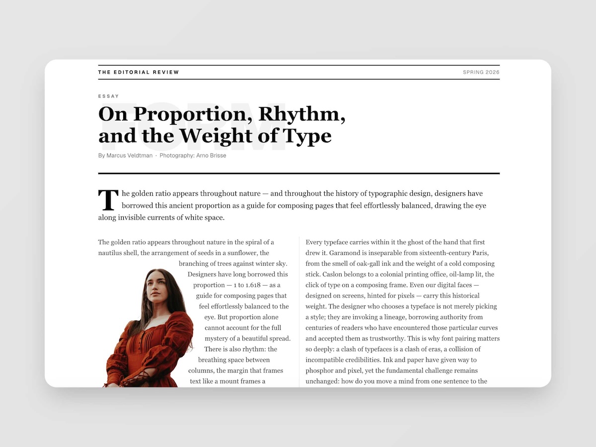
EditorialMagazine-quality editorial layouts where typography is the design. Multi-column spreads, text wrapping around images with pixel-precise line routing via Pretext, oversized words as visual anchors, pull quotes, drop caps, and the kind of spatial confidence you find in print — now in React.
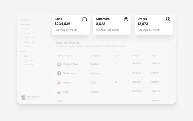
WidgetsVersatile widget components for React and Next.js. Build dashboard widgets, stats cards, join-now sections, and data visualization panels with customizable designs.
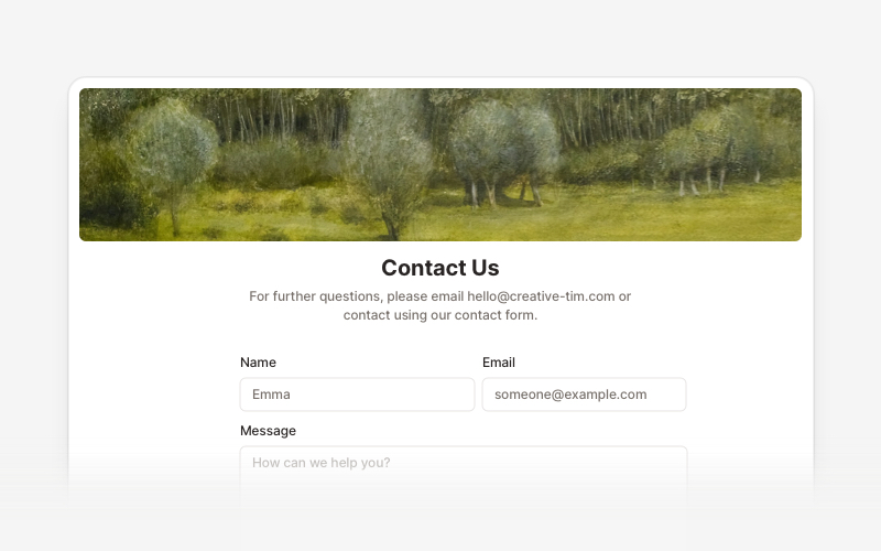
ContactProfessional contact form components and section layouts for React and Next.js. Build contact pages, feedback forms, support sections, and communication interfaces.
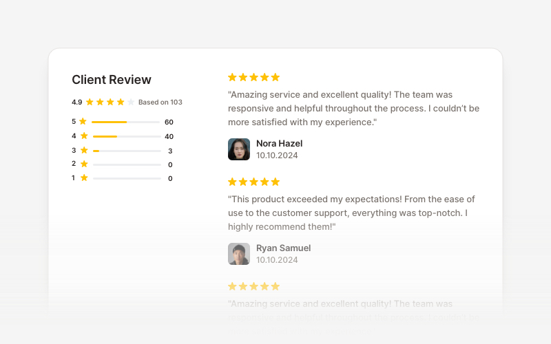
OverviewCustomer review and testimonial overview components for React and Next.js. Build review sections, rating displays with statistics, customer testimonials with profile images, and comprehensive feedback interfaces.