Product description with accordion - shadcn/ui
PROThis block example includes all the elements you are looking for on a product description page, from ratings, and choose sizes/colors, to breadcrumb navigation, built with shadcn/ui for clear structure and seamless interaction.
Preview
Explore More Blocks
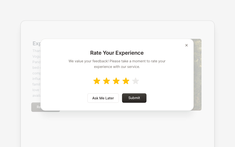
PopupEngaging popup and notification components for React and Next.js. Build welcome messages, cookie notifications, subscription forms, success confirmations, and promotional announcements with dismissible options and call-to-action elements.
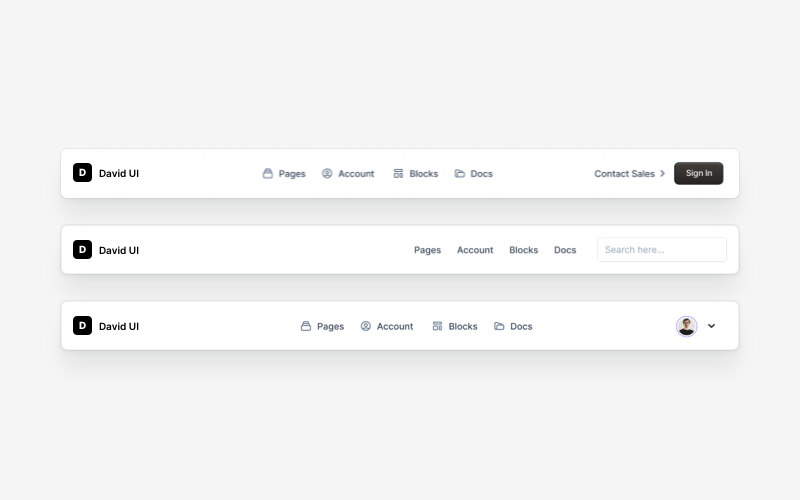
NavbarResponsive navigation bar components for React and Next.js. Build top navigation menus, mobile-friendly headers, search bars, breadcrumbs, and navigation layouts with dropdowns, icons, and user profiles.
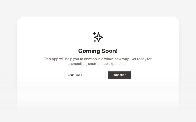
Coming SoonProfessional coming soon and launching soon page components for React and Next.js. Build launch pages with countdown timers, email subscriptions, video backgrounds, app previews, and notification signup forms.
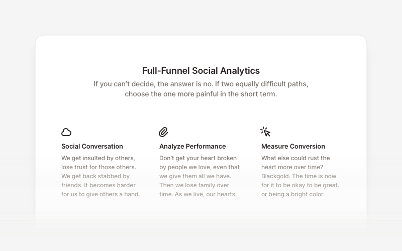
FeatureProfessional feature showcase components for React and Next.js. Build product features, service highlights, benefits sections, and feature comparison layouts with icons, images, and call-to-action elements.
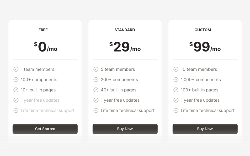
PricingProfessional pricing and plan comparison components for React and Next.js. Build pricing tables, subscription plans, feature comparisons, and pricing toggles with monthly/annual options.
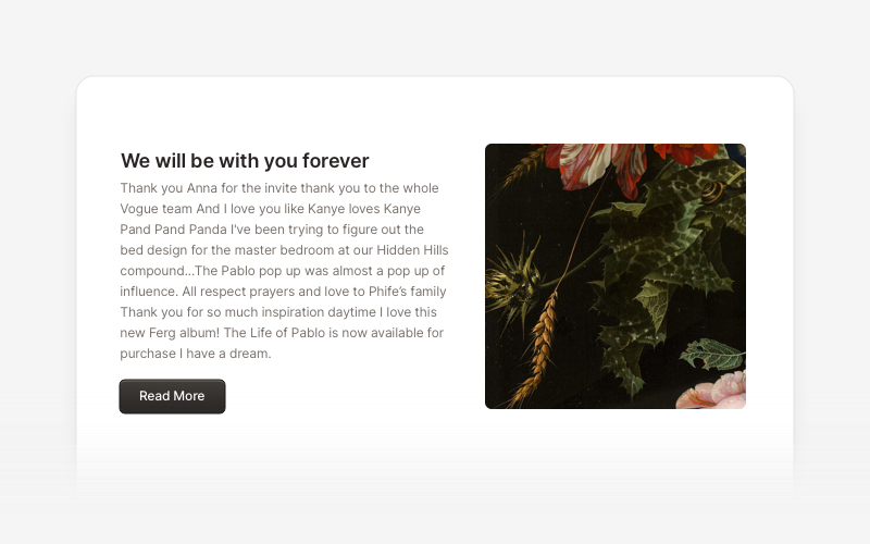
ContentVersatile content layout components for React and Next.js. Build blog posts, articles, portfolios, project showcases, comment sections, and rich content presentations with customizable designs.
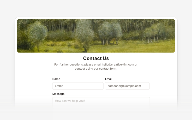
ContactProfessional contact form components and section layouts for React and Next.js. Build contact pages, feedback forms, support sections, and communication interfaces.
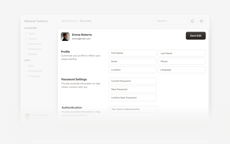
AccountBeautiful and customizable account management components for React and Next.js. Build user profiles, settings, authentication flows, and account dashboards with ready-to-use blocks.