Agency contact — editorial split layout with form - shadcn/ui
PROHigh-end web studio contact section — editorial split: left column with an oversized heading and hairline-divided contact details, right column with a refined inquiry form. Restrained, premium styling.
Preview
Explore More Blocks
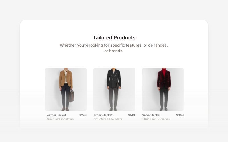
Product ListProfessional product listing and showcase components for React and Next.js. Build product grids, filtered lists, rating displays, and ecommerce product catalogs with customizable layouts.
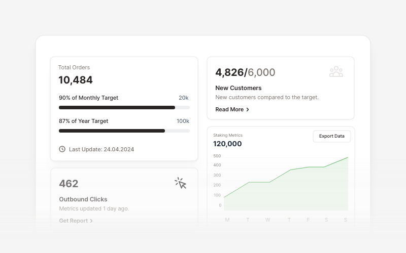
KPIProfessional KPI (Key Performance Indicator) card components for React and Next.js. Build metric displays, performance snapshots, dashboard cards with icons, badges, arrows, progress bars, charts, and action buttons to showcase business metrics and analytics.
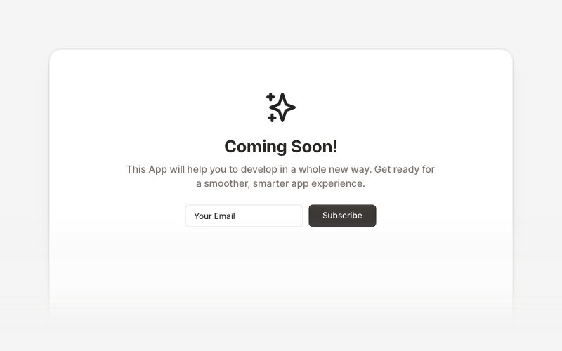
Coming SoonProfessional coming soon and launching soon page components for React and Next.js. Build launch pages with countdown timers, email subscriptions, video backgrounds, app previews, and notification signup forms.
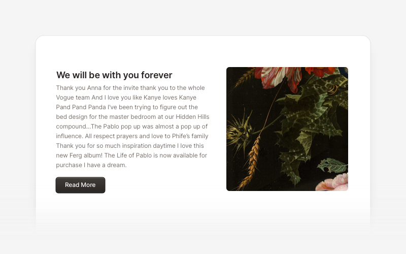
ContentVersatile content layout components for React and Next.js. Build blog posts, articles, portfolios, project showcases, comment sections, and rich content presentations with customizable designs.
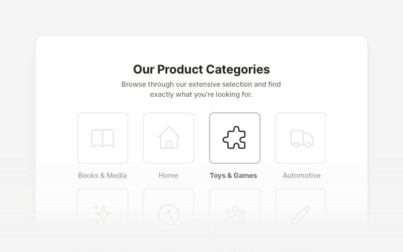
LayoutProfessional category showcase and product layout components for React and Next.js. Build category grids, product collections, navigation sections, and organized content displays.
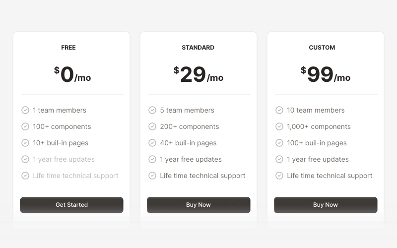
PricingProfessional pricing and plan comparison components for React and Next.js. Build pricing tables, subscription plans, feature comparisons, and pricing toggles with monthly/annual options.
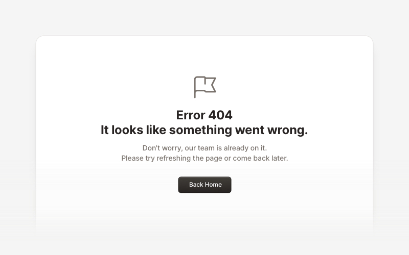
ErrorProfessional error page components for React and Next.js. Build 404 and 500 error pages with various layouts, icons, emoji, background images, and call-to-action buttons for better user experience.
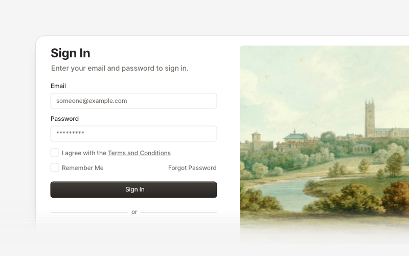
AuthenticationSecure authentication components and login flows for React and Next.js. Build sign-in forms, registration pages, password reset flows, and authentication interfaces.