Contact form with dark info panel - shadcn/ui
Implement this responsive contact form with a centered heading to get started easier, using shadcn/ui to ensure accessibility and modern layout structure.
Preview
Explore More Blocks
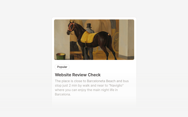
CardVersatile card layout components for React and Next.js. Build content cards with avatars, images, backgrounds, call-to-action buttons, and various layouts for displaying information in organized containers.
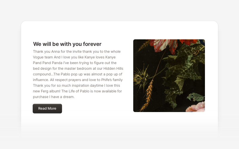
ContentVersatile content layout components for React and Next.js. Build blog posts, articles, portfolios, project showcases, comment sections, and rich content presentations with customizable designs.
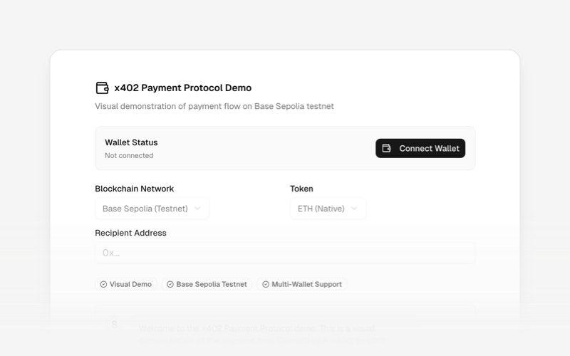
x402Internet-native payment protocol components for React and Next.js. Build AI agent payments, HTTP-based stablecoin transactions, and autonomous commerce experiences using the x402 protocol.
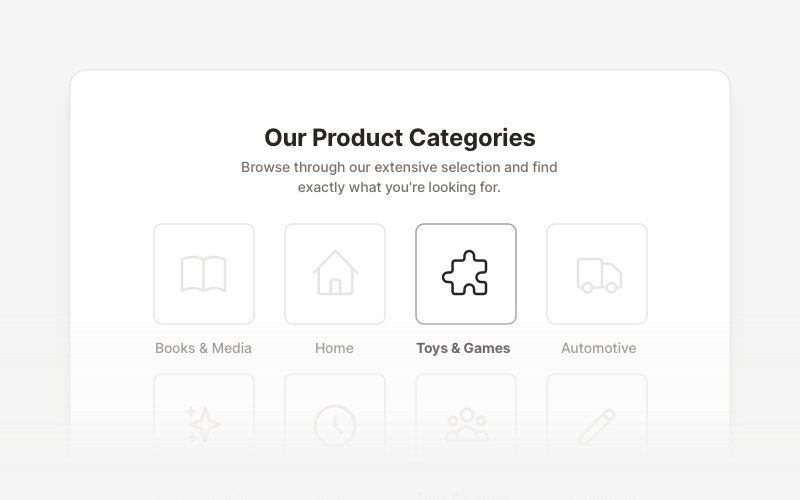
LayoutProfessional category showcase and product layout components for React and Next.js. Build category grids, product collections, navigation sections, and organized content displays.
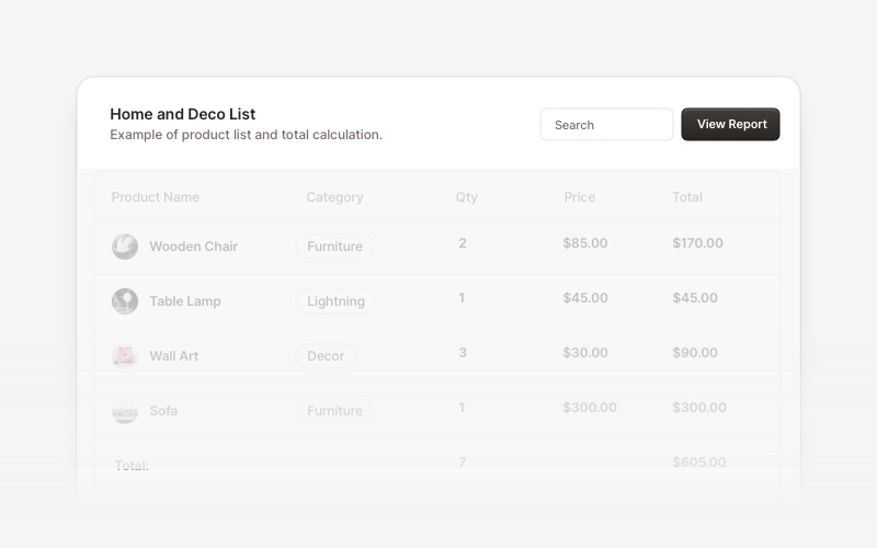
Table HeaderProfessional table header components for React and Next.js. Build search bars, filter controls, category tabs, action buttons, and sorting options for data tables with flexible layouts.
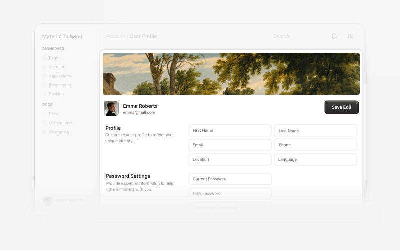
User ProfileProfessional user profile components for React and Next.js. Build user profile cards, account overviews, profile headers with statistics, social media links, and customizable layouts for displaying user information and achievements.
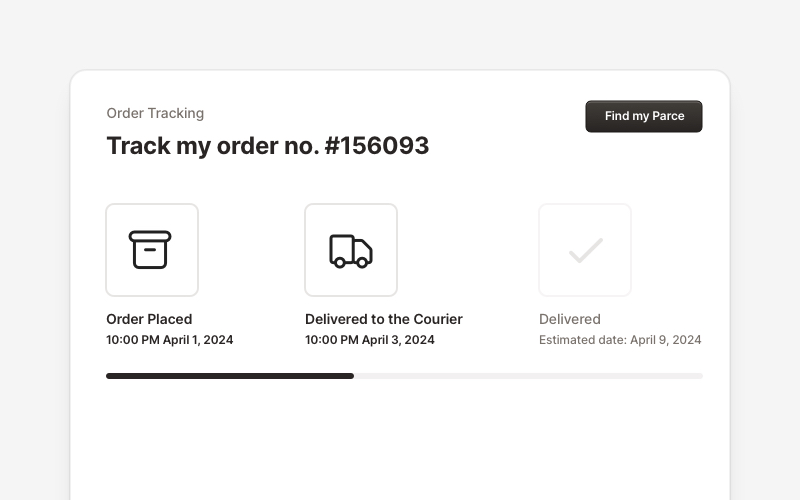
OrderProfessional order tracking and management components for React and Next.js. Build order details pages, tracking timelines, shipping status displays, order summaries, and delivery management interfaces with customizable layouts.
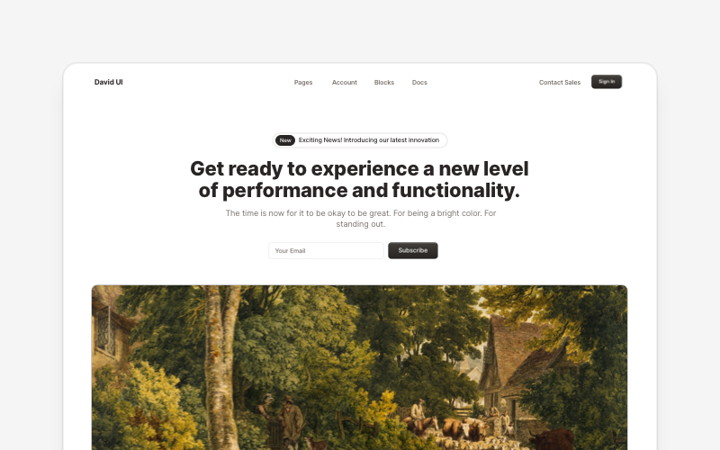
HeroEye-catching hero section components for React and Next.js. Build landing page heroes, call-to-action sections, lead generation forms, and compelling above-the-fold content.