Image cards with overlay text and dark filter - shadcn/ui
PROThree-column grid of tall image cards with dark overlay filters and white text overlay. Perfect for feature showcases, portfolio items, and visual content highlights.
Preview
Explore More Blocks

ErrorProfessional error page components for React and Next.js. Build 404 and 500 error pages with various layouts, icons, emoji, background images, and call-to-action buttons for better user experience.
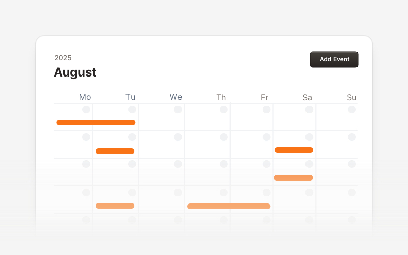
CalendarProfessional calendar and scheduling components for React and Next.js. Build event calendars, weekly schedules, daily planners, and event creation forms with date pickers and time management.
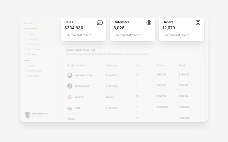
WidgetsVersatile widget components for React and Next.js. Build dashboard widgets, stats cards, join-now sections, and data visualization panels with customizable designs.
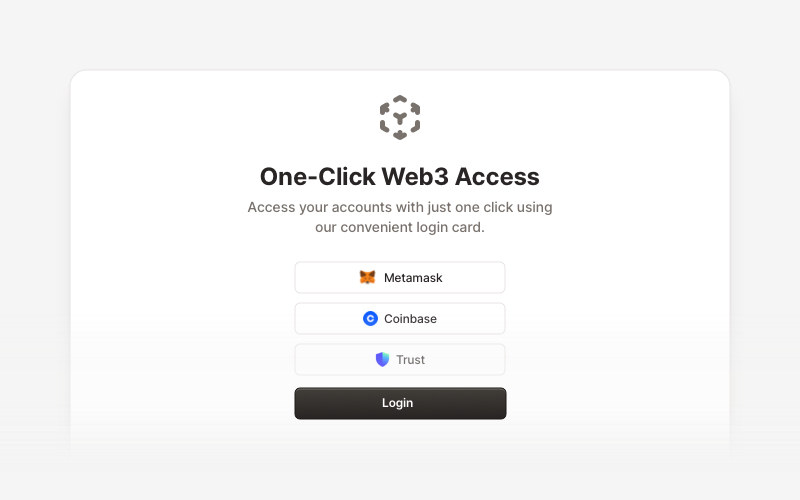
Web3 LoginModern Web3 authentication components for React and Next.js. Build crypto wallet login interfaces, blockchain selection screens, QR code authentication, and secure Web3 access flows with support for Metamask, Coinbase, Trust Wallet, and other popular crypto wallets.
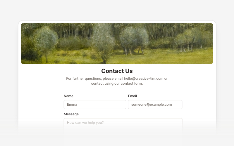
ContactProfessional contact form components and section layouts for React and Next.js. Build contact pages, feedback forms, support sections, and communication interfaces.
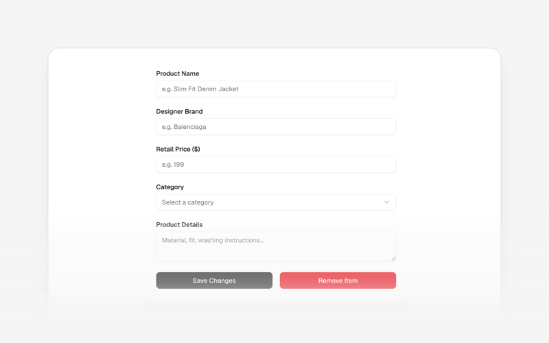
CRUDsComplete CRUD interface components and data management blocks for React and Next.js. Build admin panels, data tables, forms, and database management interfaces.
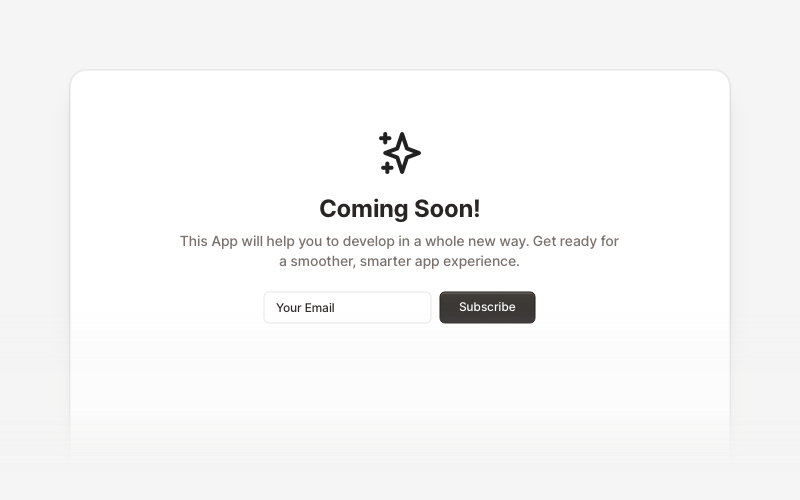
Coming SoonProfessional coming soon and launching soon page components for React and Next.js. Build launch pages with countdown timers, email subscriptions, video backgrounds, app previews, and notification signup forms.
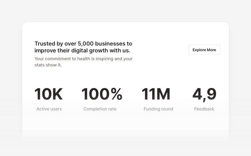
StatsProfessional statistics and metrics components for React and Next.js. Build data showcases, KPI dashboards, achievement displays, growth metrics, and performance indicators with customizable layouts and dark theme variations.