Logo showcase with feature cards - shadcn/ui
PROCompany or partner logo showcase grid followed by feature cards with icons and descriptions. Ideal for displaying client logos, integrations, or technology partners with related features.
Preview
Explore More Blocks
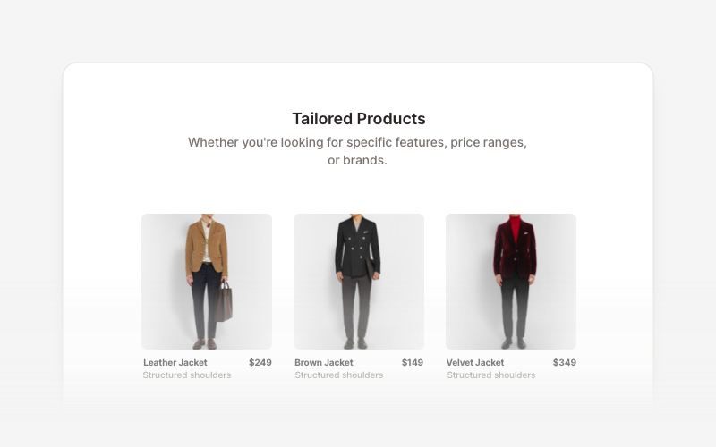
Product ListProfessional product listing and showcase components for React and Next.js. Build product grids, filtered lists, rating displays, and ecommerce product catalogs with customizable layouts.
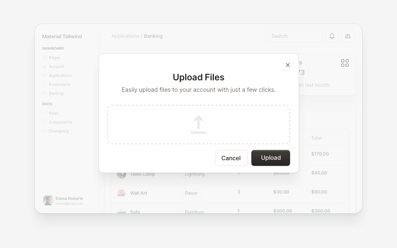
ModalsBeautiful modal and dialog components for React and Next.js. Build popups, confirmations, forms, and interactive overlay interfaces with accessible components.
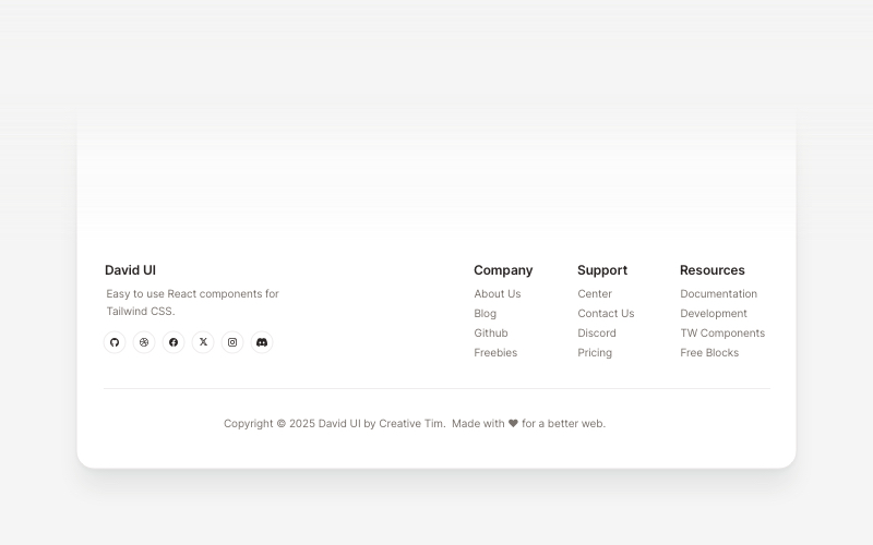
FootersModern footer components and section layouts for React and Next.js. Build professional website footers with links, social media, newsletters, and navigation.
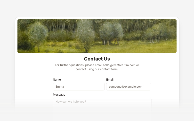
ContactProfessional contact form components and section layouts for React and Next.js. Build contact pages, feedback forms, support sections, and communication interfaces.
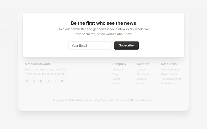
NewsletterModern newsletter subscription components for React and Next.js. Build email capture forms, subscribe popups, modals, and newsletter sections with validation and call-to-action elements.
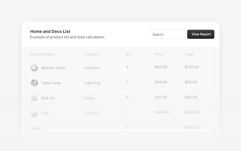
Table HeaderProfessional table header components for React and Next.js. Build search bars, filter controls, category tabs, action buttons, and sorting options for data tables with flexible layouts.
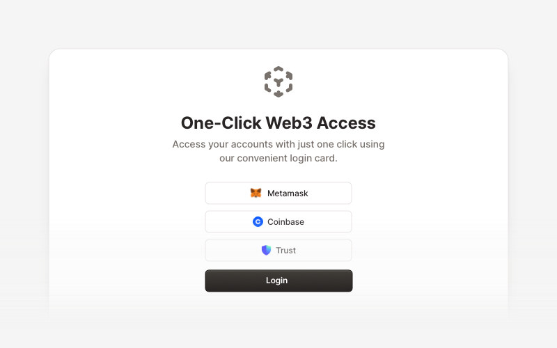
Web3 LoginModern Web3 authentication components for React and Next.js. Build crypto wallet login interfaces, blockchain selection screens, QR code authentication, and secure Web3 access flows with support for Metamask, Coinbase, Trust Wallet, and other popular crypto wallets.
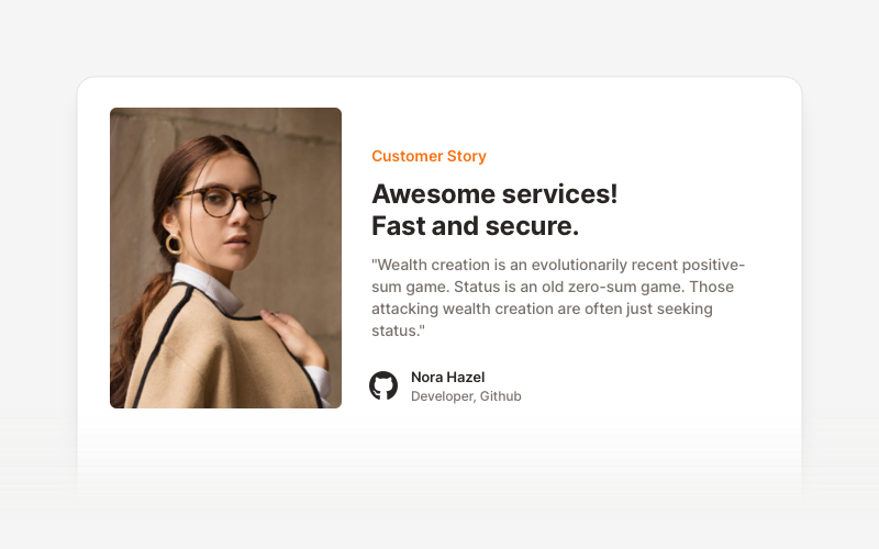
TestimonialsProfessional testimonial and social proof components for React and Next.js. Build customer reviews, ratings, case studies, and trust-building sections.