Full-screen dark stats section - shadcn/ui
PROFull-screen dark theme stats section. Features black background, centered header with tagline, headline, description, and 4-column grid of large stats with secondary color text.
Preview
Explore More Blocks
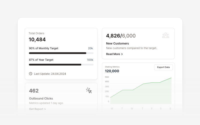
KPIProfessional KPI (Key Performance Indicator) card components for React and Next.js. Build metric displays, performance snapshots, dashboard cards with icons, badges, arrows, progress bars, charts, and action buttons to showcase business metrics and analytics.
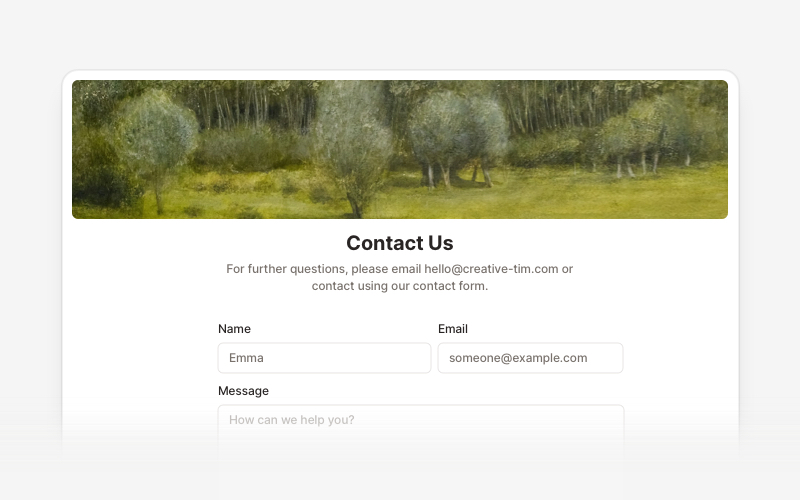
ContactProfessional contact form components and section layouts for React and Next.js. Build contact pages, feedback forms, support sections, and communication interfaces.
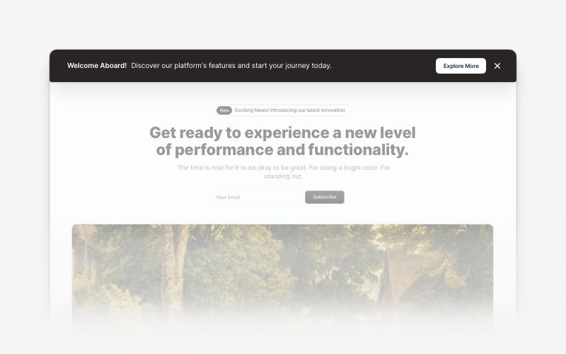
BannerAttention-grabbing banner components for React and Next.js. Build notification banners, promotional headers, announcement bars, and call-to-action banners with dismissible options.
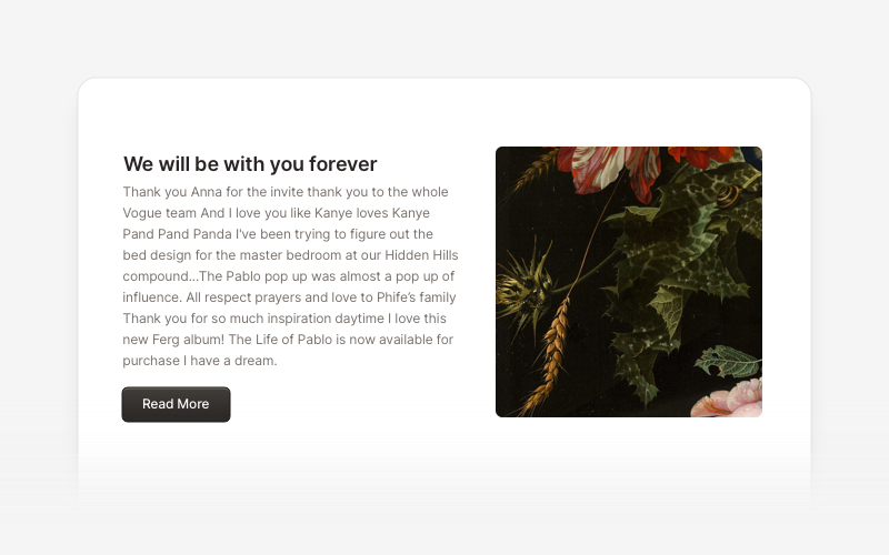
ContentVersatile content layout components for React and Next.js. Build blog posts, articles, portfolios, project showcases, comment sections, and rich content presentations with customizable designs.
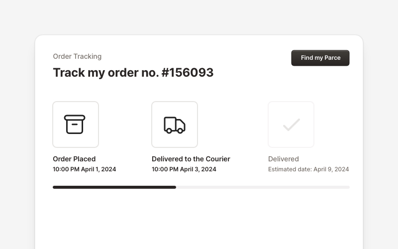
OrderProfessional order tracking and management components for React and Next.js. Build order details pages, tracking timelines, shipping status displays, order summaries, and delivery management interfaces with customizable layouts.
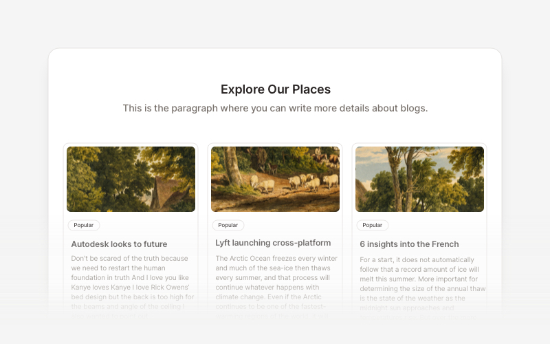
BlogElegant blog components and content layouts for React and Next.js. Create beautiful article grids, post previews, author profiles, and content-rich blog experiences.
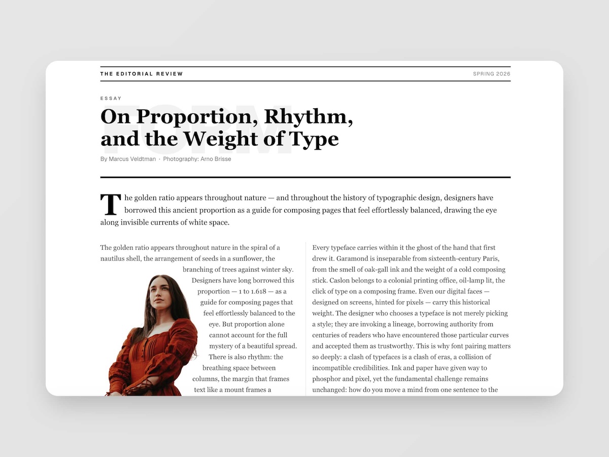
EditorialMagazine-quality editorial layouts where typography is the design. Multi-column spreads, text wrapping around images with pixel-precise line routing via Pretext, oversized words as visual anchors, pull quotes, drop caps, and the kind of spatial confidence you find in print — now in React.
LogoProfessional brand logo showcase components for React and Next.js. Build trust sections, partner displays, client logos, and company ecosystem layouts with various styles and configurations.