Complex stats with featured card - shadcn/ui
PROAdvanced stats layout with large featured card and grid. Left side showcases highlighted achievement, right side displays 2x2 grid of detailed statistics.
Preview
Explore More Blocks
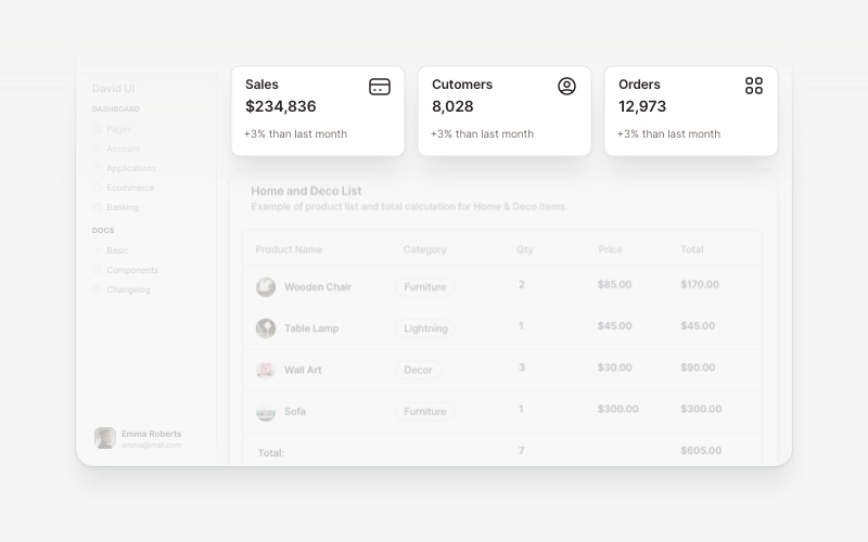
WidgetsVersatile widget components for React and Next.js. Build dashboard widgets, stats cards, join-now sections, and data visualization panels with customizable designs.
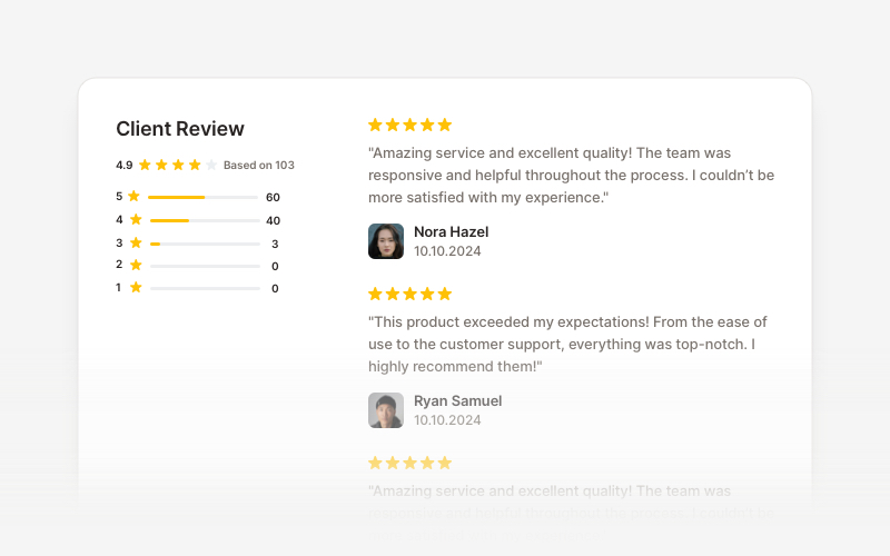
OverviewCustomer review and testimonial overview components for React and Next.js. Build review sections, rating displays with statistics, customer testimonials with profile images, and comprehensive feedback interfaces.
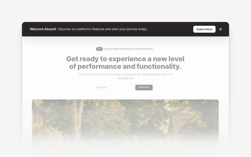
BannerAttention-grabbing banner components for React and Next.js. Build notification banners, promotional headers, announcement bars, and call-to-action banners with dismissible options.
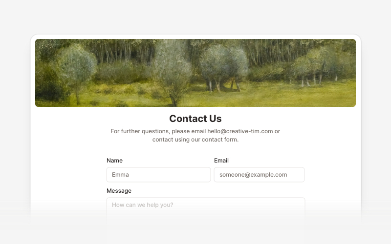
ContactProfessional contact form components and section layouts for React and Next.js. Build contact pages, feedback forms, support sections, and communication interfaces.
LogoProfessional brand logo showcase components for React and Next.js. Build trust sections, partner displays, client logos, and company ecosystem layouts with various styles and configurations.
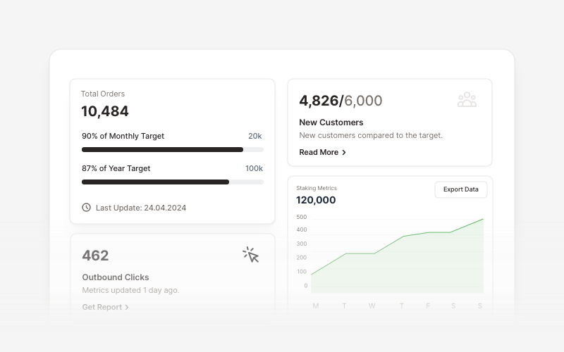
KPIProfessional KPI (Key Performance Indicator) card components for React and Next.js. Build metric displays, performance snapshots, dashboard cards with icons, badges, arrows, progress bars, charts, and action buttons to showcase business metrics and analytics.
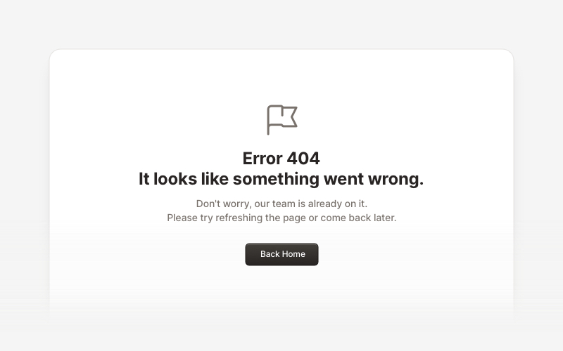
ErrorProfessional error page components for React and Next.js. Build 404 and 500 error pages with various layouts, icons, emoji, background images, and call-to-action buttons for better user experience.
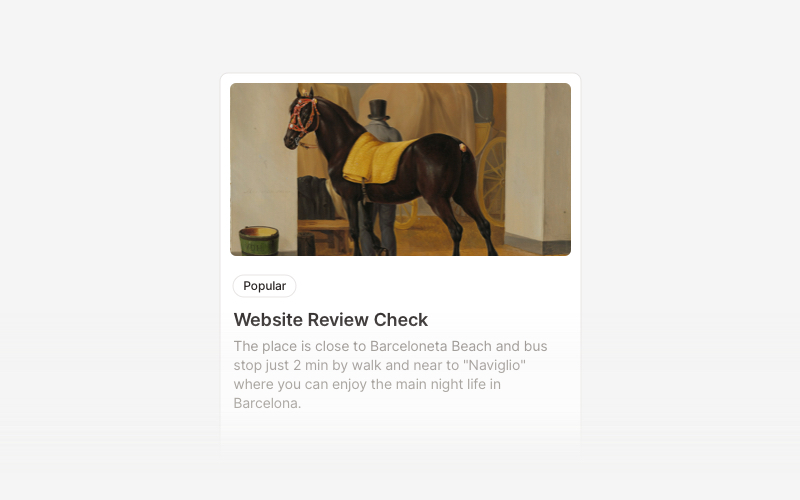
CardVersatile card layout components for React and Next.js. Build content cards with avatars, images, backgrounds, call-to-action buttons, and various layouts for displaying information in organized containers.