Priority filter dropdown with colored icons - shadcn/ui
Priority filter dropdown with archive icons in different colors (red for Urgent, amber for High, green for Normal, blue for Low). Clean and simple menu layout for task priority filtering.
Preview
Explore More Blocks
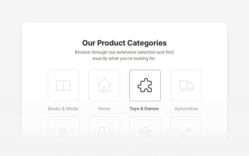
LayoutProfessional category showcase and product layout components for React and Next.js. Build category grids, product collections, navigation sections, and organized content displays.
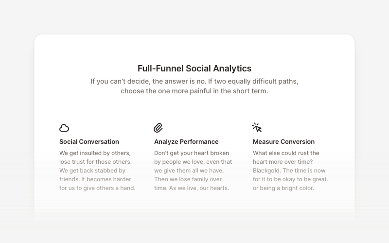
FeatureProfessional feature showcase components for React and Next.js. Build product features, service highlights, benefits sections, and feature comparison layouts with icons, images, and call-to-action elements.
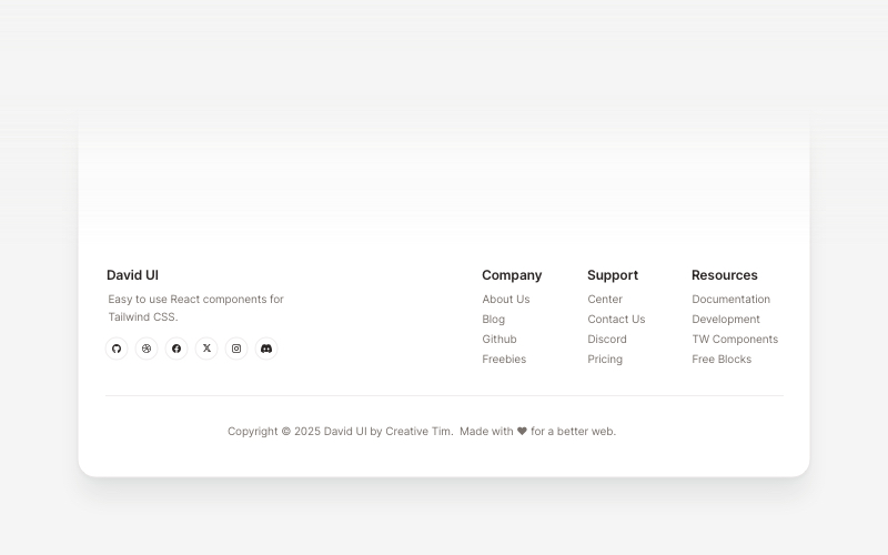
FootersModern footer components and section layouts for React and Next.js. Build professional website footers with links, social media, newsletters, and navigation.
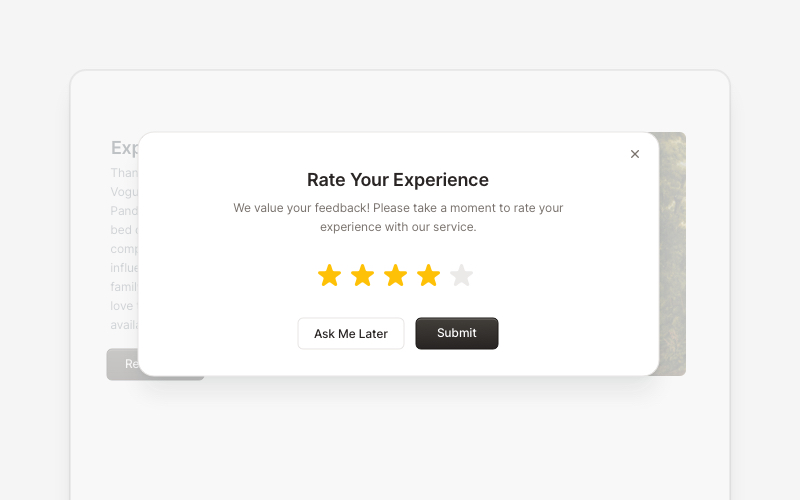
PopupEngaging popup and notification components for React and Next.js. Build welcome messages, cookie notifications, subscription forms, success confirmations, and promotional announcements with dismissible options and call-to-action elements.
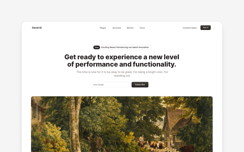
HeroEye-catching hero section components for React and Next.js. Build landing page heroes, call-to-action sections, lead generation forms, and compelling above-the-fold content.
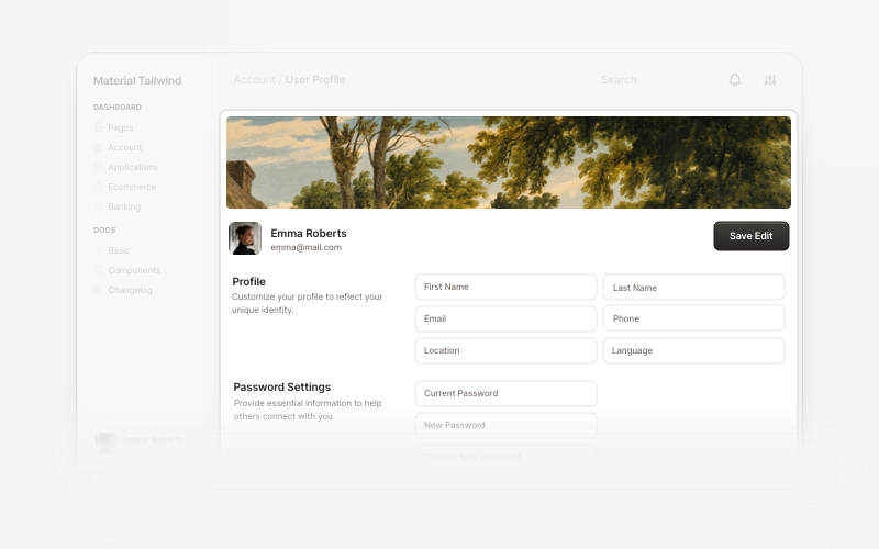
User ProfileProfessional user profile components for React and Next.js. Build user profile cards, account overviews, profile headers with statistics, social media links, and customizable layouts for displaying user information and achievements.
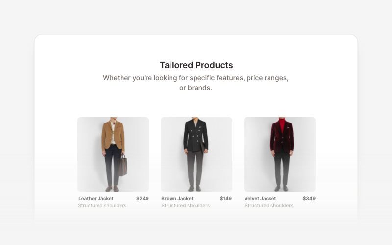
Product ListProfessional product listing and showcase components for React and Next.js. Build product grids, filtered lists, rating displays, and ecommerce product catalogs with customizable layouts.
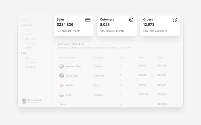
WidgetsVersatile widget components for React and Next.js. Build dashboard widgets, stats cards, join-now sections, and data visualization panels with customizable designs.