Features with simple icon presentation - shadcn/ui
PROClean three-column feature grid with plain icons, centered headings, and descriptions. Minimalist design perfect for service or product feature highlights.
Preview
Explore More Blocks
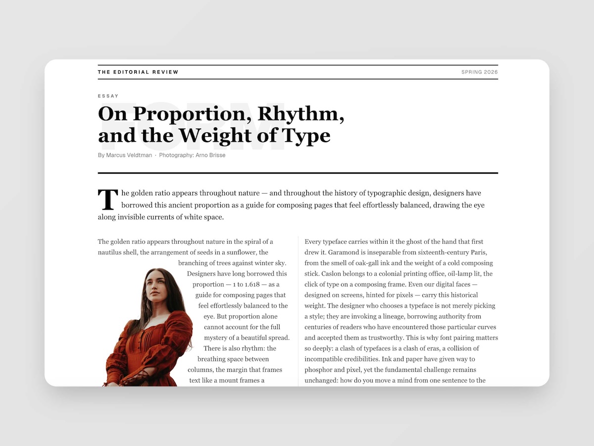
EditorialMagazine-quality editorial layouts where typography is the design. Multi-column spreads, text wrapping around images with pixel-precise line routing via Pretext, oversized words as visual anchors, pull quotes, drop caps, and the kind of spatial confidence you find in print — now in React.
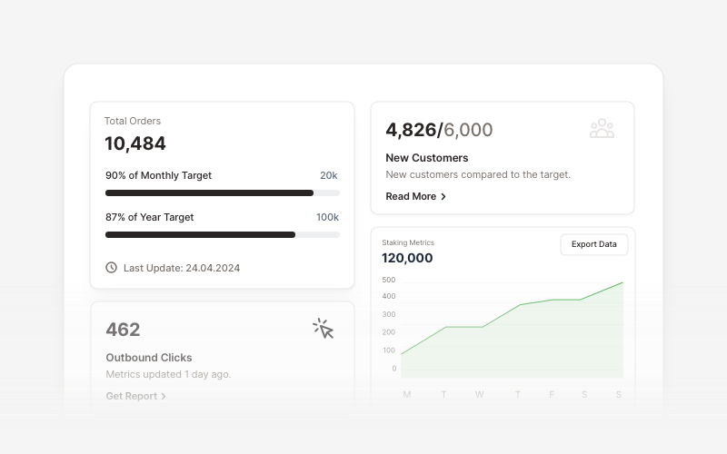
KPIProfessional KPI (Key Performance Indicator) card components for React and Next.js. Build metric displays, performance snapshots, dashboard cards with icons, badges, arrows, progress bars, charts, and action buttons to showcase business metrics and analytics.
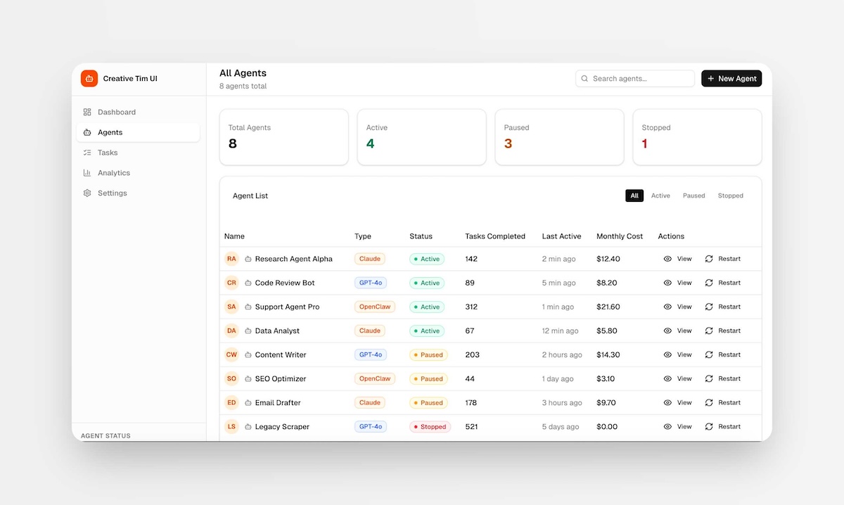
PagesComplete, ready-to-use full-page layouts for React and Next.js. Drop in a full page — dashboards, management views, and multi-section layouts composed from multiple blocks. Install with one command and customize to your needs.
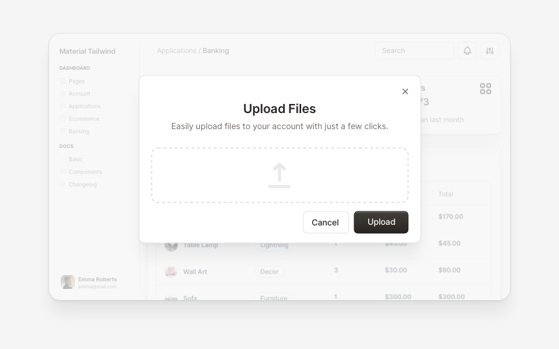
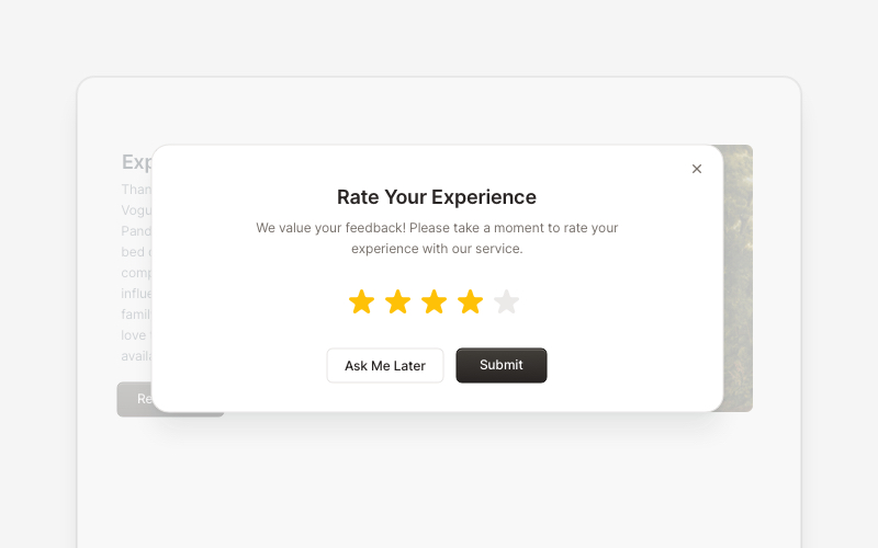
ModalsBeautiful modal and dialog components for React and Next.js. Build popups, confirmations, forms, and interactive overlay interfaces with accessible components.
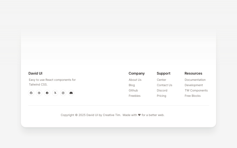
FootersModern footer components and section layouts for React and Next.js. Build professional website footers with links, social media, newsletters, and navigation.
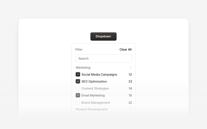
DropdownProfessional dropdown menu and filter components for React and Next.js. Build priority filters, status filters, checkbox filters, range selectors, searchable filters, and tabbed filter menus for advanced data filtering.
PopupEngaging popup and notification components for React and Next.js. Build welcome messages, cookie notifications, subscription forms, success confirmations, and promotional announcements with dismissible options and call-to-action elements.
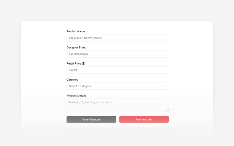
CRUDsComplete CRUD interface components and data management blocks for React and Next.js. Build admin panels, data tables, forms, and database management interfaces.