Cover image hero with single CTA button - shadcn/ui
PROA single CTA button is used and it is placed under the text. Its contrasting button color makes it stand out, prompting users to engage. Features full-width background image with dark overlay.
Preview
Explore More Blocks
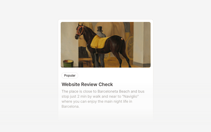
CardVersatile card layout components for React and Next.js. Build content cards with avatars, images, backgrounds, call-to-action buttons, and various layouts for displaying information in organized containers.
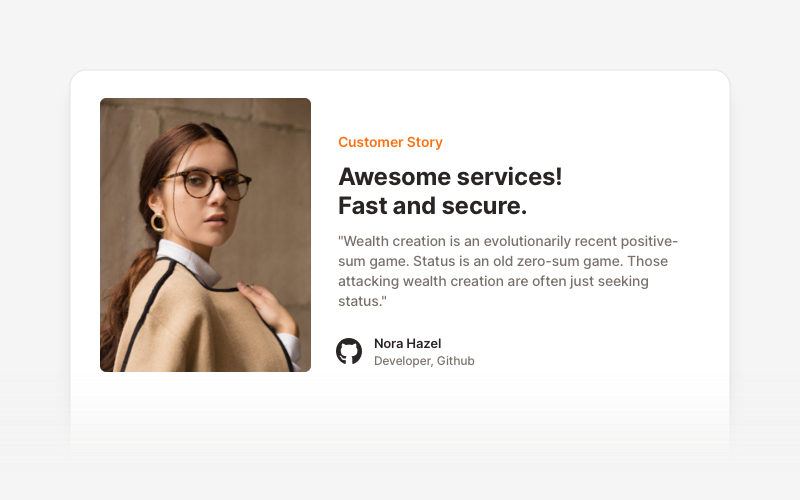
TestimonialsProfessional testimonial and social proof components for React and Next.js. Build customer reviews, ratings, case studies, and trust-building sections.

BannerAttention-grabbing banner components for React and Next.js. Build notification banners, promotional headers, announcement bars, and call-to-action banners with dismissible options.
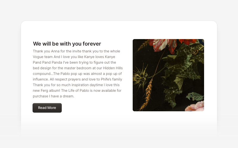
ContentVersatile content layout components for React and Next.js. Build blog posts, articles, portfolios, project showcases, comment sections, and rich content presentations with customizable designs.
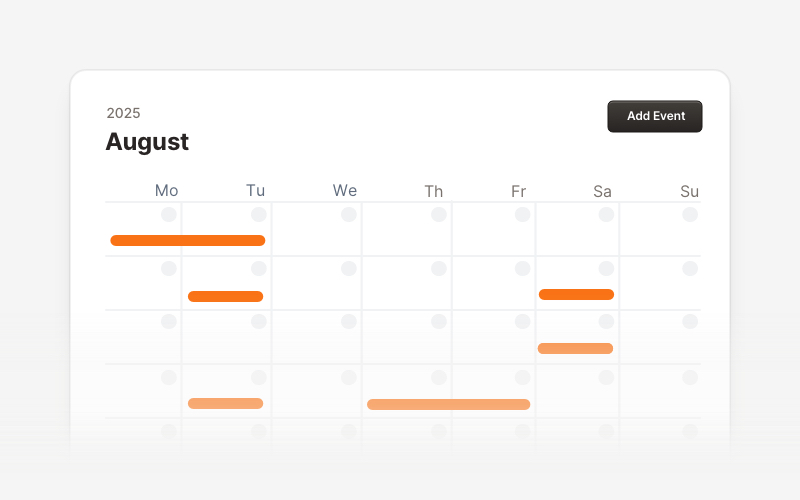
CalendarProfessional calendar and scheduling components for React and Next.js. Build event calendars, weekly schedules, daily planners, and event creation forms with date pickers and time management.
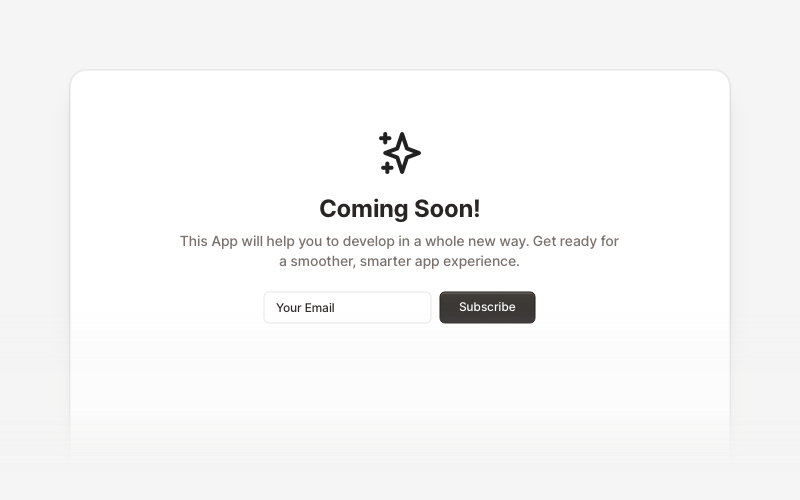
Coming SoonProfessional coming soon and launching soon page components for React and Next.js. Build launch pages with countdown timers, email subscriptions, video backgrounds, app previews, and notification signup forms.
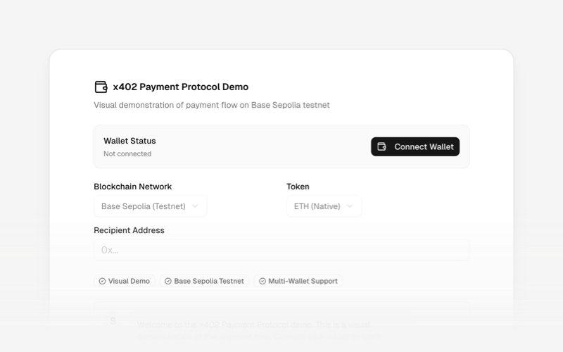
x402Internet-native payment protocol components for React and Next.js. Build AI agent payments, HTTP-based stablecoin transactions, and autonomous commerce experiences using the x402 protocol.
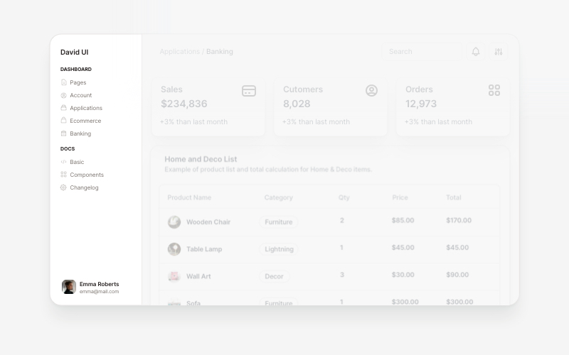
SidebarProfessional sidebar navigation and menu components for React and Next.js. Build dashboard sidebars, app navigation, crypto wallets, calendar views, task managers, and feature-rich sidebar layouts with customizable content.