Two-plan comparison with popular badge - shadcn/ui
PROSide-by-side pricing comparison with Starter and Company plans. Features highlighted premium plan with dark background and 'Popular' badge.
Preview
Explore More Blocks
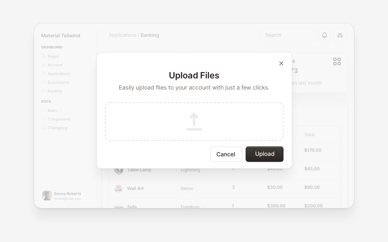
ModalsBeautiful modal and dialog components for React and Next.js. Build popups, confirmations, forms, and interactive overlay interfaces with accessible components.
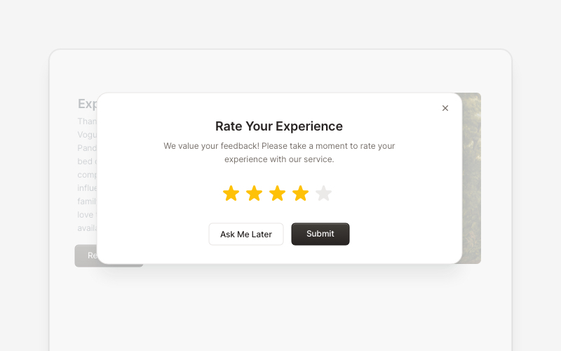
PopupEngaging popup and notification components for React and Next.js. Build welcome messages, cookie notifications, subscription forms, success confirmations, and promotional announcements with dismissible options and call-to-action elements.
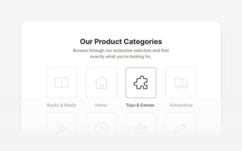
LayoutProfessional category showcase and product layout components for React and Next.js. Build category grids, product collections, navigation sections, and organized content displays.
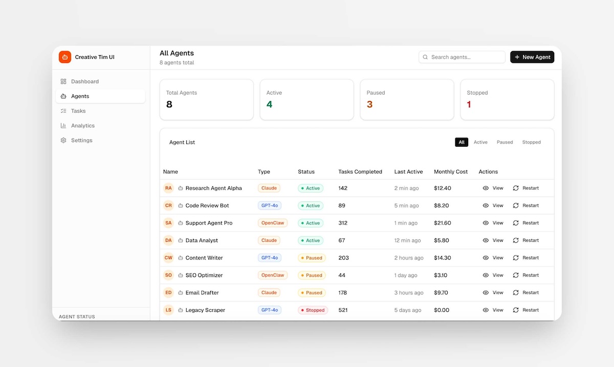
PagesComplete, ready-to-use full-page layouts for React and Next.js. Drop in a full page — dashboards, management views, and multi-section layouts composed from multiple blocks. Install with one command and customize to your needs.
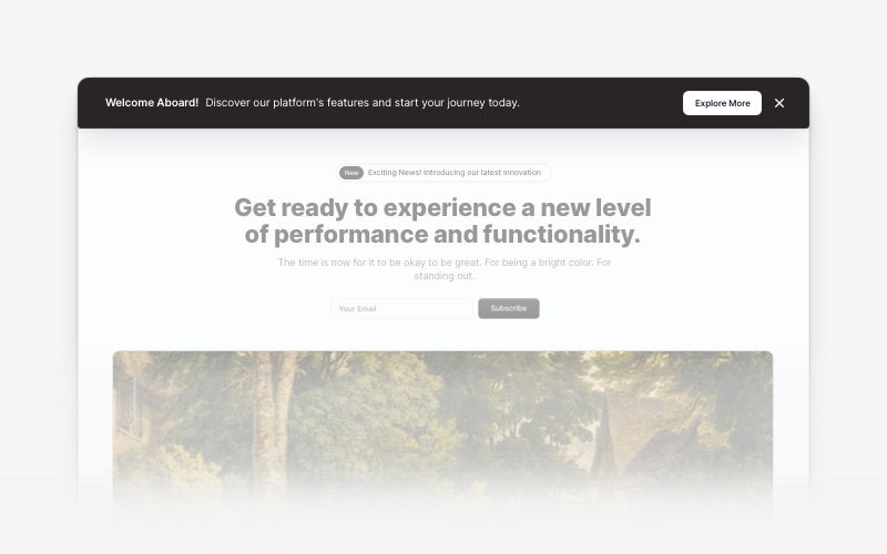
BannerAttention-grabbing banner components for React and Next.js. Build notification banners, promotional headers, announcement bars, and call-to-action banners with dismissible options.
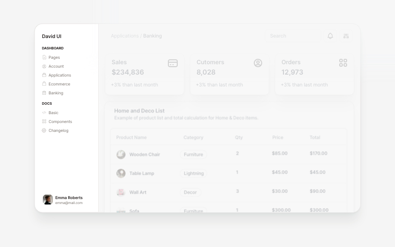
SidebarProfessional sidebar navigation and menu components for React and Next.js. Build dashboard sidebars, app navigation, crypto wallets, calendar views, task managers, and feature-rich sidebar layouts with customizable content.
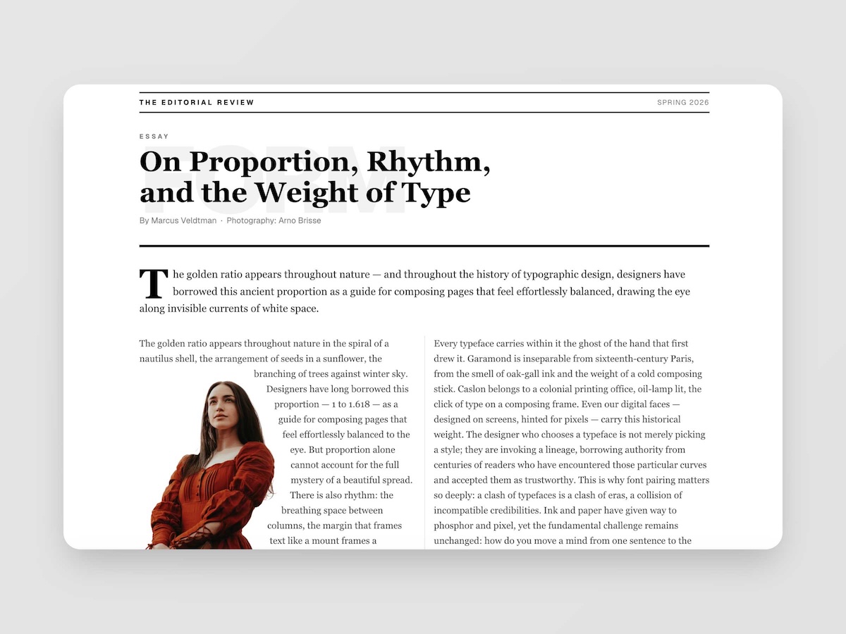
EditorialMagazine-quality editorial layouts where typography is the design. Multi-column spreads, text wrapping around images with pixel-precise line routing via Pretext, oversized words as visual anchors, pull quotes, drop caps, and the kind of spatial confidence you find in print — now in React.
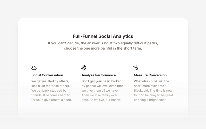
FeatureProfessional feature showcase components for React and Next.js. Build product features, service highlights, benefits sections, and feature comparison layouts with icons, images, and call-to-action elements.