KPI metric cards with embedded sparkline trend charts and change indicators - shadcn/ui
Four KPI cards in a responsive grid (lg:grid-cols-4) — Monthly Revenue, Active Users, Avg. Session, Churn Rate. Each shows the metric value, percentage change badge (top-right), subtext, and a 12-point sparkline chart. Churn rate inverts color logic (down = green).
Preview
Explore More Blocks
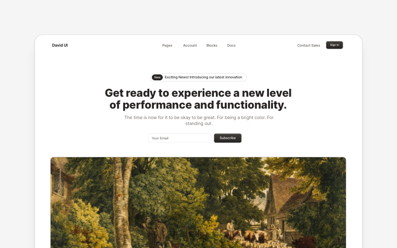
HeroEye-catching hero section components for React and Next.js. Build landing page heroes, call-to-action sections, lead generation forms, and compelling above-the-fold content.
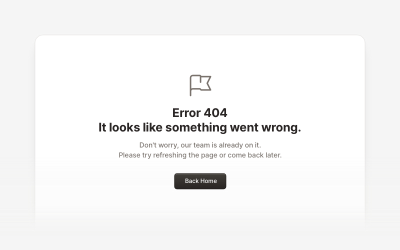
ErrorProfessional error page components for React and Next.js. Build 404 and 500 error pages with various layouts, icons, emoji, background images, and call-to-action buttons for better user experience.
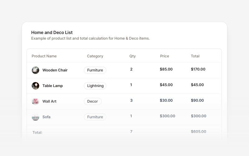
TableProfessional data table components for React and Next.js. Build product comparisons, crypto trackers, inventory tables, sales reports, member lists, invoices, and transaction records with sortable columns and interactive features.
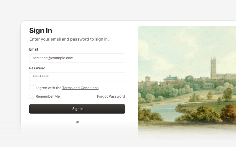
AuthenticationSecure authentication components and login flows for React and Next.js. Build sign-in forms, registration pages, password reset flows, and authentication interfaces.
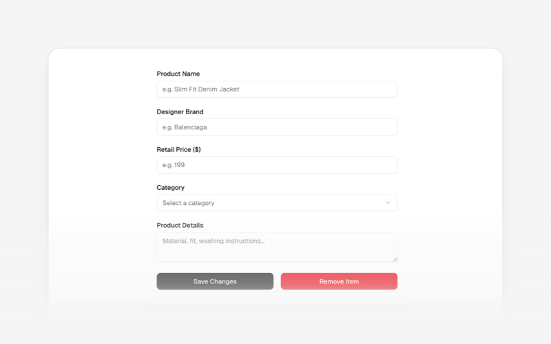
CRUDsComplete CRUD interface components and data management blocks for React and Next.js. Build admin panels, data tables, forms, and database management interfaces.
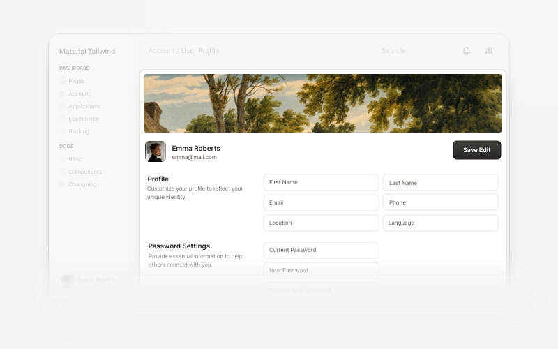
User ProfileProfessional user profile components for React and Next.js. Build user profile cards, account overviews, profile headers with statistics, social media links, and customizable layouts for displaying user information and achievements.

CardVersatile card layout components for React and Next.js. Build content cards with avatars, images, backgrounds, call-to-action buttons, and various layouts for displaying information in organized containers.
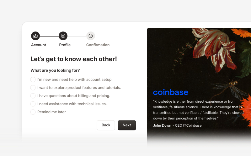
OnboardingProfessional user onboarding and welcome components for React and Next.js. Build multi-step onboarding flows, welcome cards, stepper forms, verification screens, and guided setup experiences with customizable layouts.