Alert modal with confirmation input for reset settings - shadcn/ui
Preview
Explore More Blocks
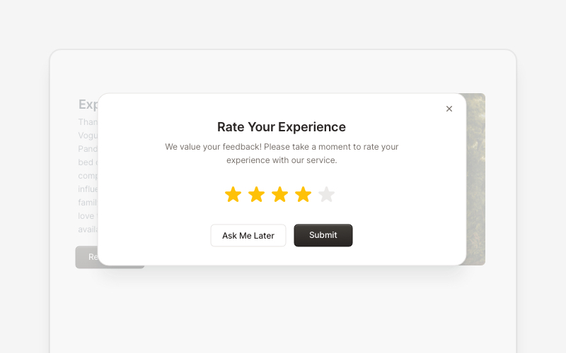
PopupEngaging popup and notification components for React and Next.js. Build welcome messages, cookie notifications, subscription forms, success confirmations, and promotional announcements with dismissible options and call-to-action elements.
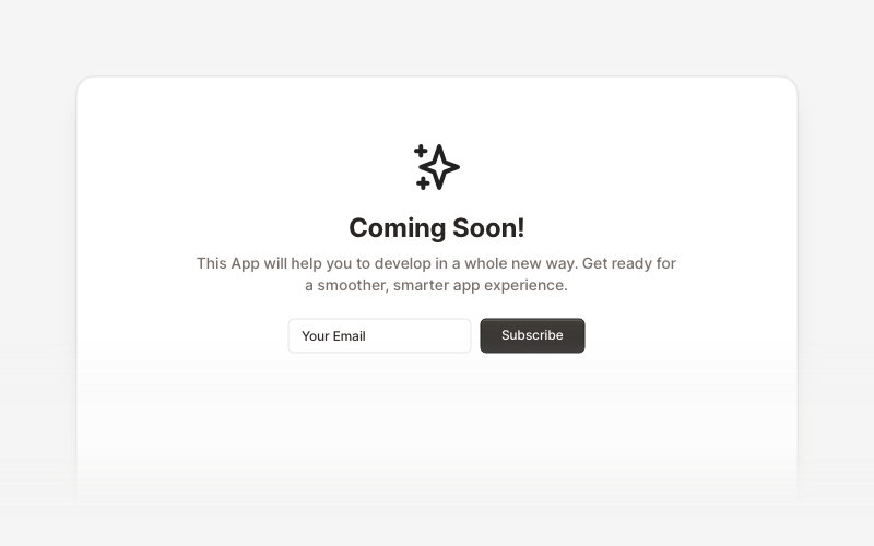
Coming SoonProfessional coming soon and launching soon page components for React and Next.js. Build launch pages with countdown timers, email subscriptions, video backgrounds, app previews, and notification signup forms.
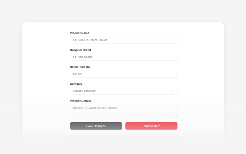
CRUDsComplete CRUD interface components and data management blocks for React and Next.js. Build admin panels, data tables, forms, and database management interfaces.
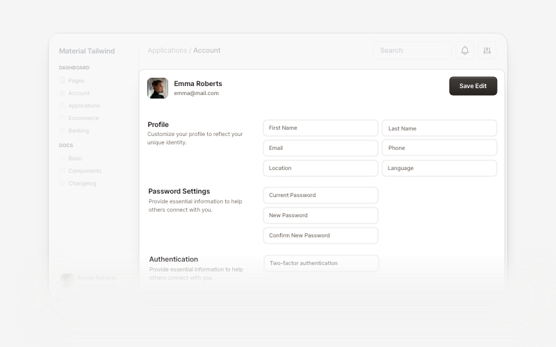
AccountBeautiful and customizable account management components for React and Next.js. Build user profiles, settings, authentication flows, and account dashboards with ready-to-use blocks.
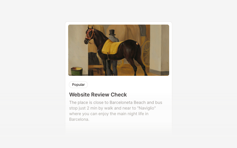
CardVersatile card layout components for React and Next.js. Build content cards with avatars, images, backgrounds, call-to-action buttons, and various layouts for displaying information in organized containers.
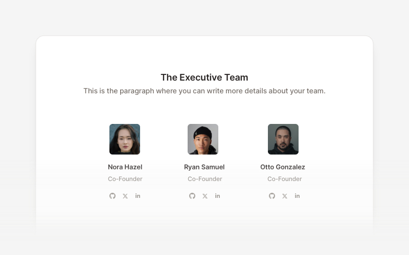
TeamProfessional team member showcase components for React and Next.js. Build team pages, member profiles, organization charts, and employee directories with customizable layouts.
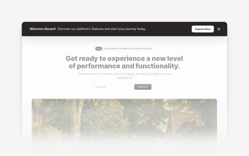
BannerAttention-grabbing banner components for React and Next.js. Build notification banners, promotional headers, announcement bars, and call-to-action banners with dismissible options.
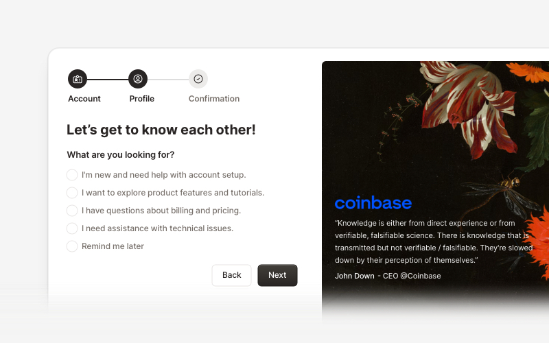
OnboardingProfessional user onboarding and welcome components for React and Next.js. Build multi-step onboarding flows, welcome cards, stepper forms, verification screens, and guided setup experiences with customizable layouts.