Invite members modal with team management - shadcn/ui
PROPreview
Explore More Blocks
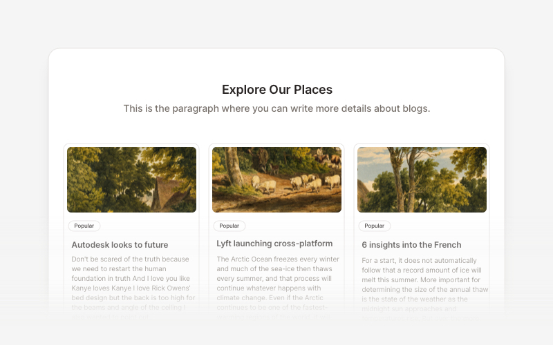
BlogElegant blog components and content layouts for React and Next.js. Create beautiful article grids, post previews, author profiles, and content-rich blog experiences.
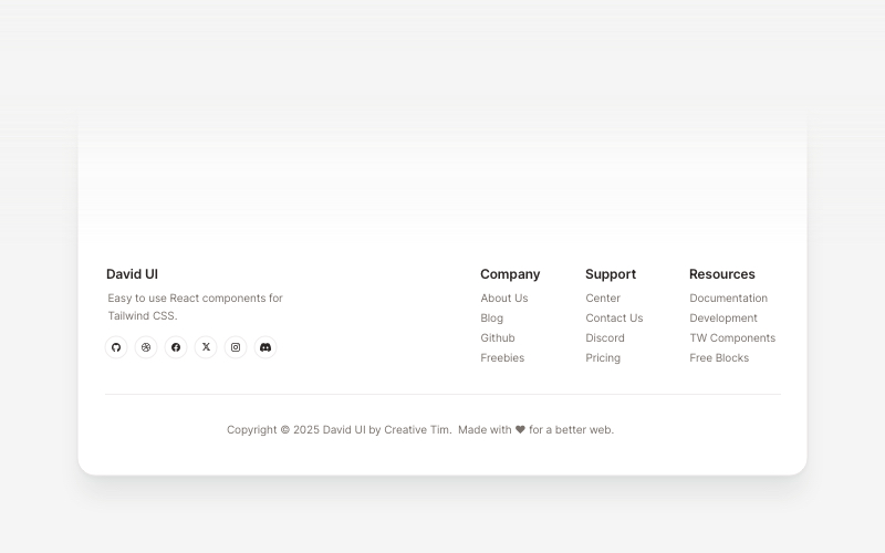
FootersModern footer components and section layouts for React and Next.js. Build professional website footers with links, social media, newsletters, and navigation.
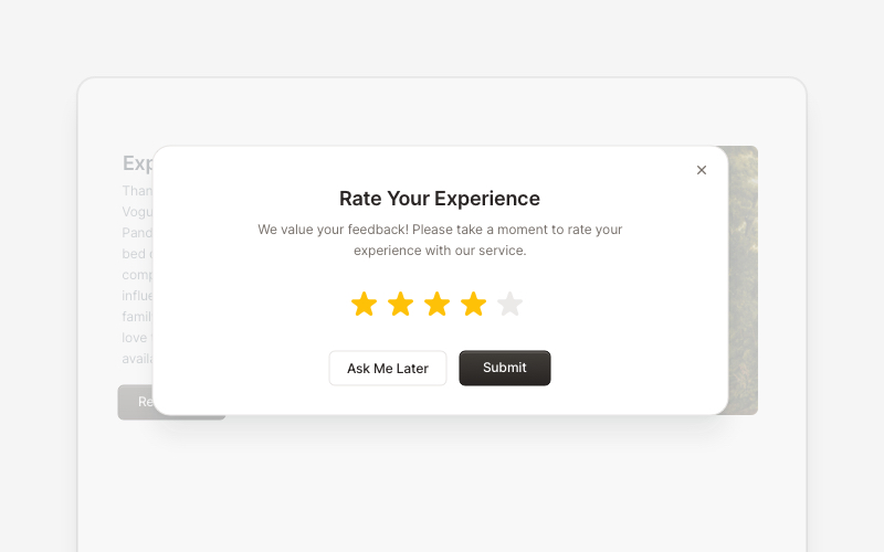
PopupEngaging popup and notification components for React and Next.js. Build welcome messages, cookie notifications, subscription forms, success confirmations, and promotional announcements with dismissible options and call-to-action elements.
ContentVersatile content layout components for React and Next.js. Build blog posts, articles, portfolios, project showcases, comment sections, and rich content presentations with customizable designs.
MaintenanceProfessional maintenance and downtime page components for React and Next.js. Build scheduled maintenance notifications, system upgrade messages, and under construction pages with email notifications and social links.
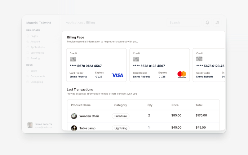
BillingProfessional billing and payment UI components for React and Next.js. Build payment forms, invoices, subscription management, and checkout flows with pre-built blocks.
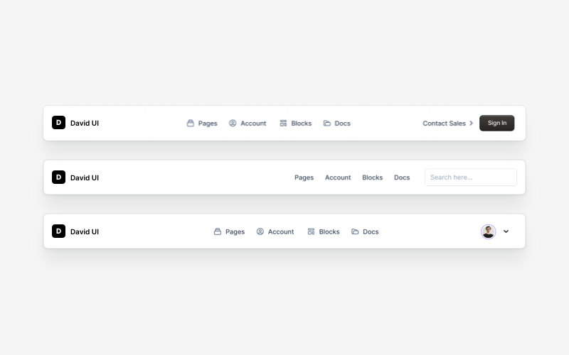
NavbarResponsive navigation bar components for React and Next.js. Build top navigation menus, mobile-friendly headers, search bars, breadcrumbs, and navigation layouts with dropdowns, icons, and user profiles.
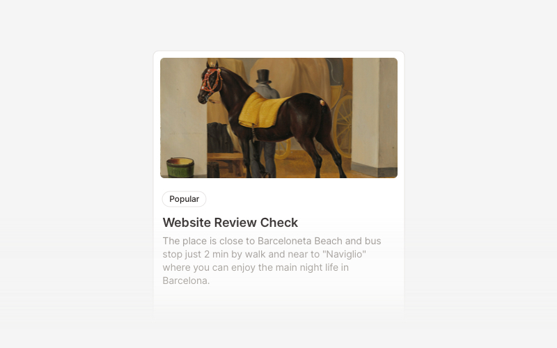
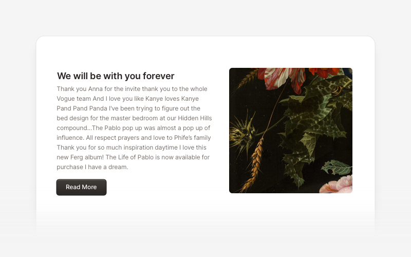
CardVersatile card layout components for React and Next.js. Build content cards with avatars, images, backgrounds, call-to-action buttons, and various layouts for displaying information in organized containers.