Publish capsule collection modal with metadata display - shadcn/ui
PROPreview
Explore More Blocks
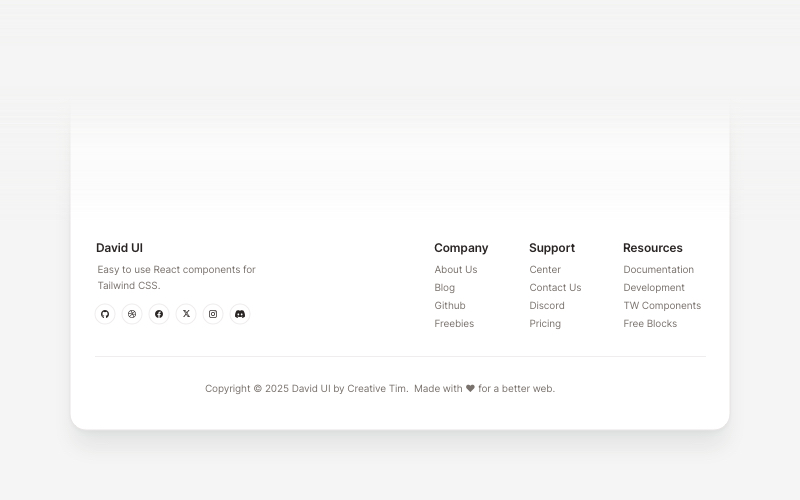
FootersModern footer components and section layouts for React and Next.js. Build professional website footers with links, social media, newsletters, and navigation.
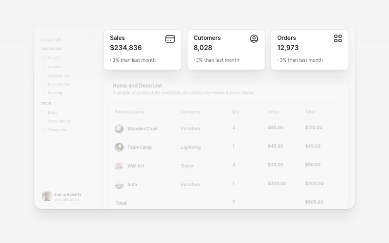
WidgetsVersatile widget components for React and Next.js. Build dashboard widgets, stats cards, join-now sections, and data visualization panels with customizable designs.
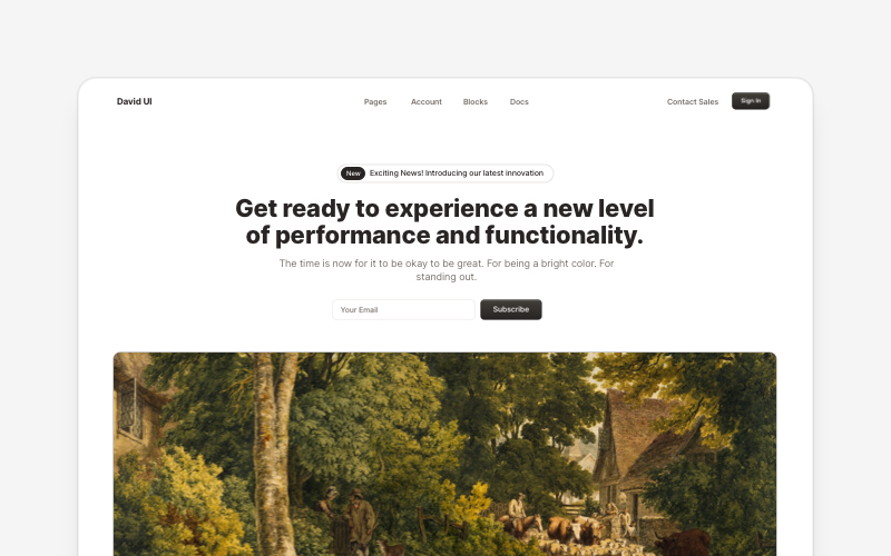
HeroEye-catching hero section components for React and Next.js. Build landing page heroes, call-to-action sections, lead generation forms, and compelling above-the-fold content.
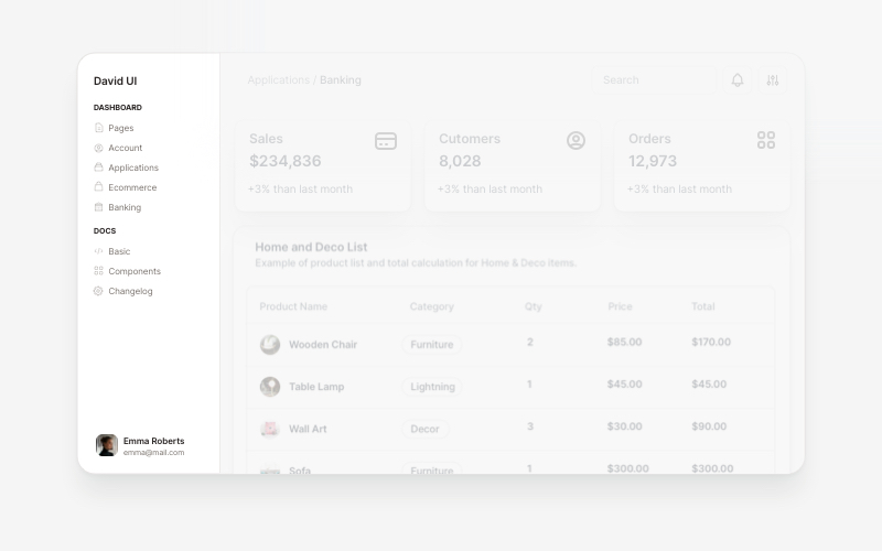
SidebarProfessional sidebar navigation and menu components for React and Next.js. Build dashboard sidebars, app navigation, crypto wallets, calendar views, task managers, and feature-rich sidebar layouts with customizable content.
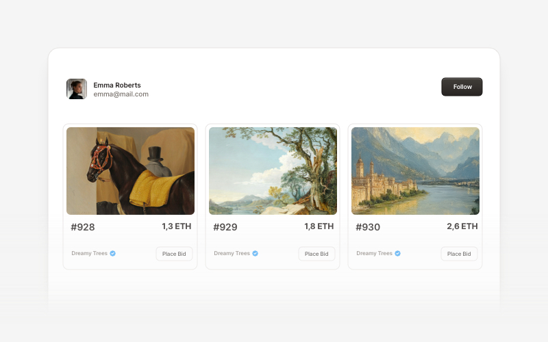
Web3 CardsModern Web3 and blockchain card components for React and Next.js. Build wallet connection cards, NFT displays, token interfaces, and decentralized application card layouts.
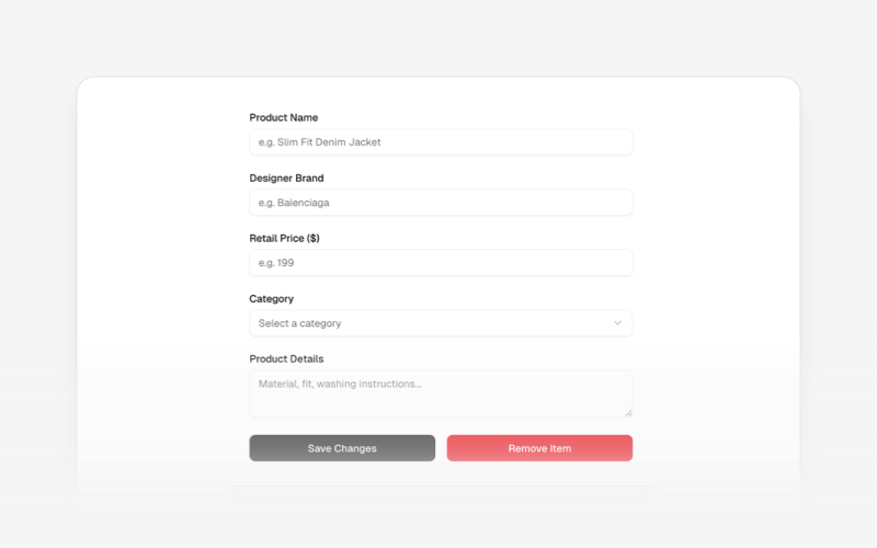
CRUDsComplete CRUD interface components and data management blocks for React and Next.js. Build admin panels, data tables, forms, and database management interfaces.
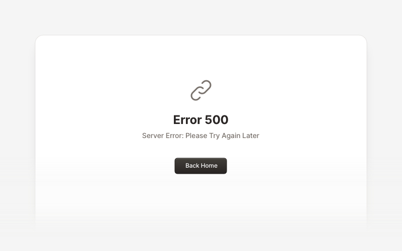
MaintenanceProfessional maintenance and downtime page components for React and Next.js. Build scheduled maintenance notifications, system upgrade messages, and under construction pages with email notifications and social links.
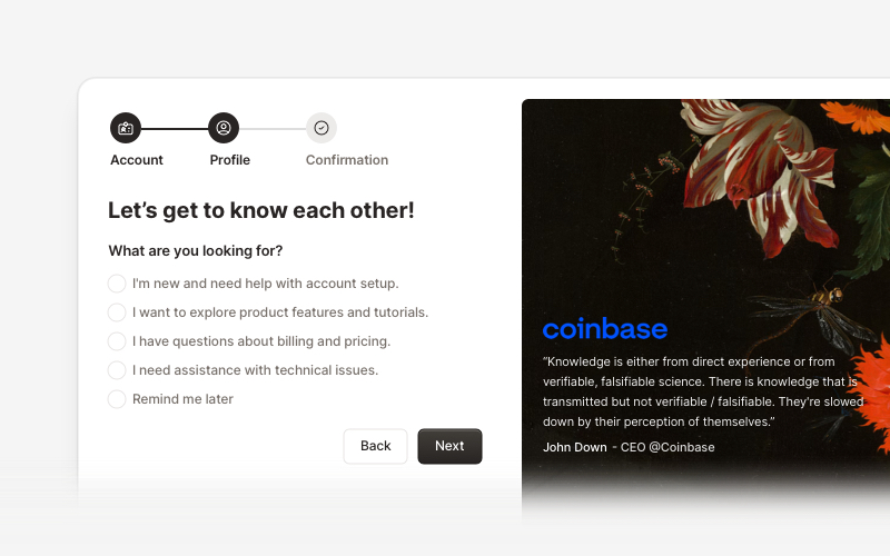
OnboardingProfessional user onboarding and welcome components for React and Next.js. Build multi-step onboarding flows, welcome cards, stepper forms, verification screens, and guided setup experiences with customizable layouts.