Welcome card with icon, title, description, and action buttons - shadcn/ui
Simple welcome card with heart icon, welcoming title, descriptive text, and Skip/Start action buttons. Perfect for onboarding flows, welcome screens, and getting started experiences.
Preview
Component Details
- ID
- onboarding-welcome-block
- Type
- Block
- Access
- Free
- Category
- Onboarding
- Published
- 3 Apr 2026
Files Included
- app/onboarding-welcome-block/page.tsx
- components/creative-tim/blocks/onboarding-welcome-block.tsx
Explore More Blocks
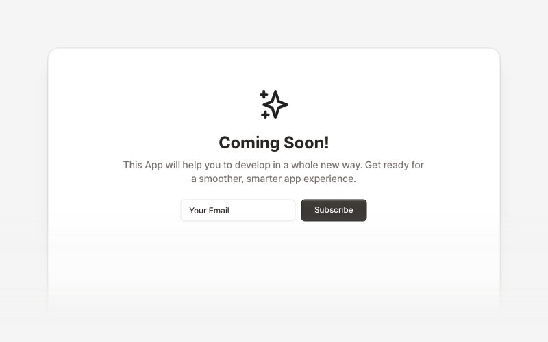
Coming SoonProfessional coming soon and launching soon page components for React and Next.js. Build launch pages with countdown timers, email subscriptions, video backgrounds, app previews, and notification signup forms.
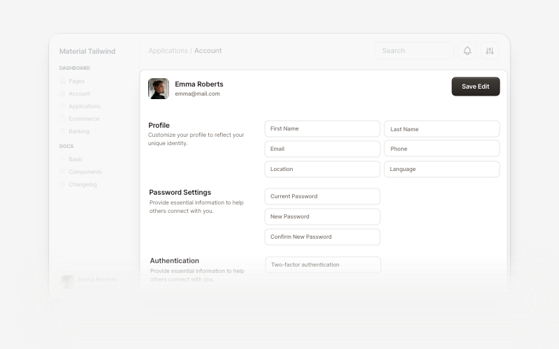
AccountBeautiful and customizable account management components for React and Next.js. Build user profiles, settings, authentication flows, and account dashboards with ready-to-use blocks.
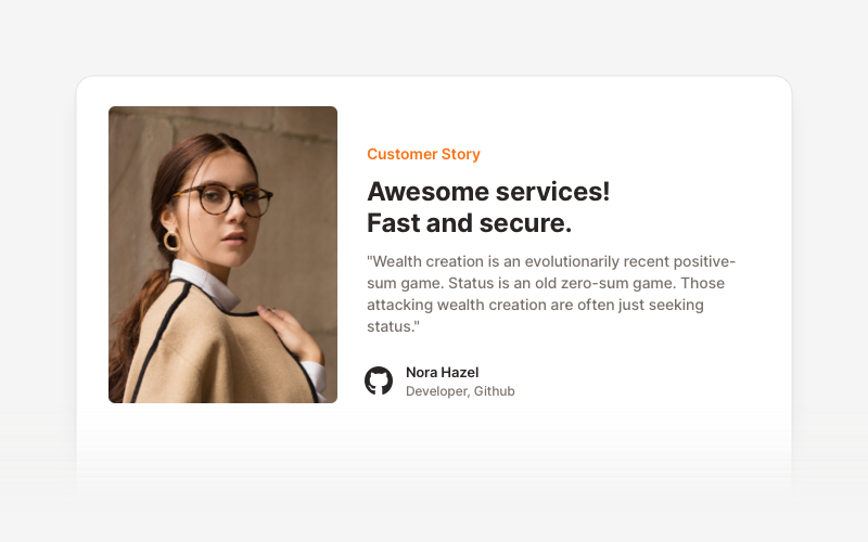
TestimonialsProfessional testimonial and social proof components for React and Next.js. Build customer reviews, ratings, case studies, and trust-building sections.
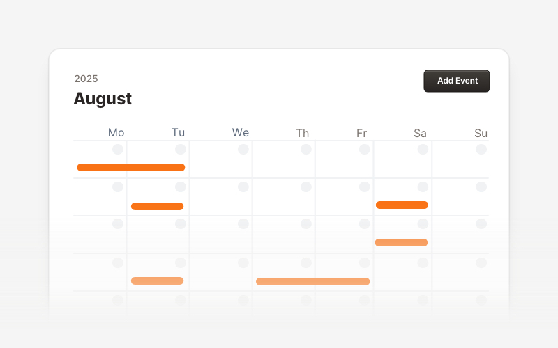
CalendarProfessional calendar and scheduling components for React and Next.js. Build event calendars, weekly schedules, daily planners, and event creation forms with date pickers and time management.
WidgetsVersatile widget components for React and Next.js. Build dashboard widgets, stats cards, join-now sections, and data visualization panels with customizable designs.
PopupEngaging popup and notification components for React and Next.js. Build welcome messages, cookie notifications, subscription forms, success confirmations, and promotional announcements with dismissible options and call-to-action elements.
MaintenanceProfessional maintenance and downtime page components for React and Next.js. Build scheduled maintenance notifications, system upgrade messages, and under construction pages with email notifications and social links.
CardVersatile card layout components for React and Next.js. Build content cards with avatars, images, backgrounds, call-to-action buttons, and various layouts for displaying information in organized containers.