Three-tier pricing with check/minus icons - shadcn/ui
PRO3-column pricing grid with Starter, Premium, and Company plans. Features detailed comparison using check and minus circle icons to show included/excluded features.
Preview
Explore More Blocks
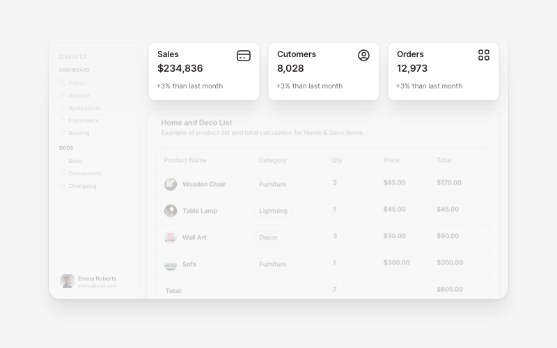
WidgetsVersatile widget components for React and Next.js. Build dashboard widgets, stats cards, join-now sections, and data visualization panels with customizable designs.
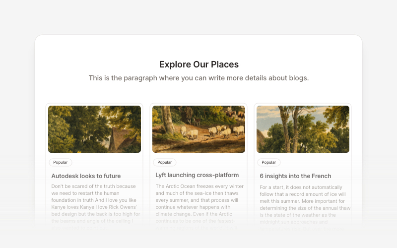
BlogElegant blog components and content layouts for React and Next.js. Create beautiful article grids, post previews, author profiles, and content-rich blog experiences.
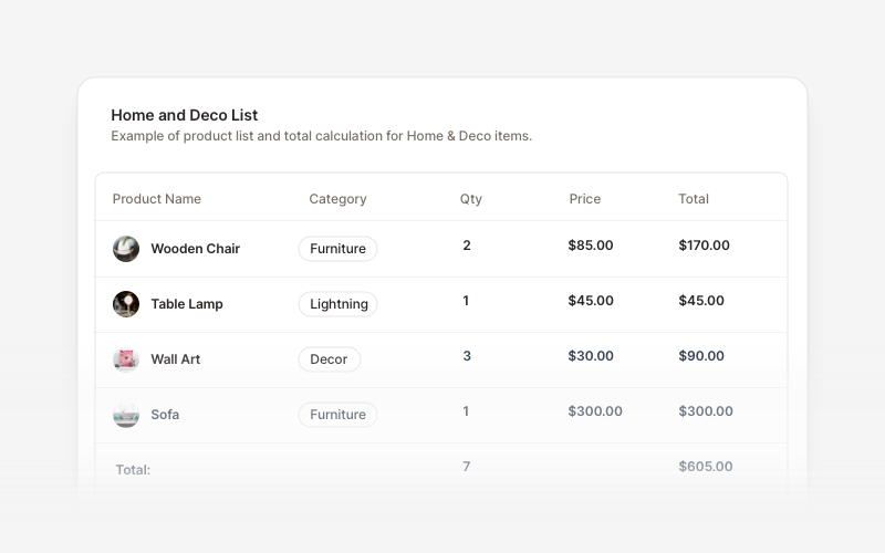
TableProfessional data table components for React and Next.js. Build product comparisons, crypto trackers, inventory tables, sales reports, member lists, invoices, and transaction records with sortable columns and interactive features.
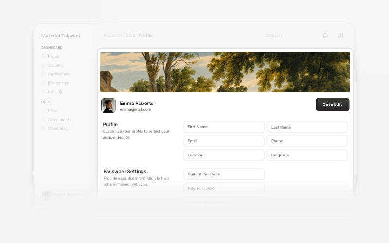
User ProfileProfessional user profile components for React and Next.js. Build user profile cards, account overviews, profile headers with statistics, social media links, and customizable layouts for displaying user information and achievements.
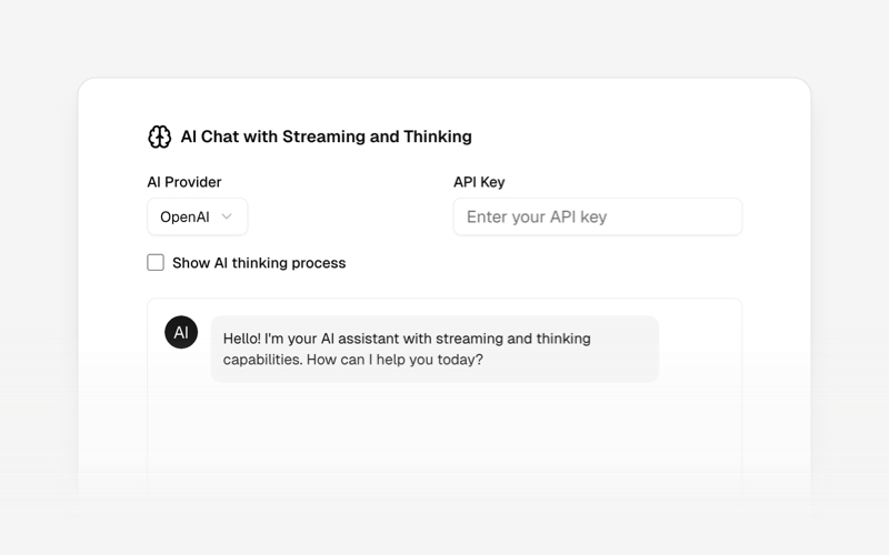
AI AgentsModern AI agent interface components and chat UI blocks for React and Next.js. Create conversational AI experiences, streaming responses, and interactive agent interfaces.
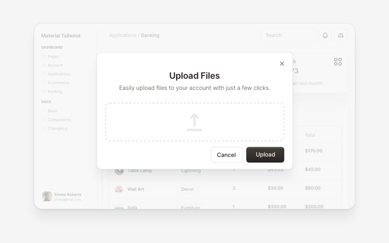
ModalsBeautiful modal and dialog components for React and Next.js. Build popups, confirmations, forms, and interactive overlay interfaces with accessible components.
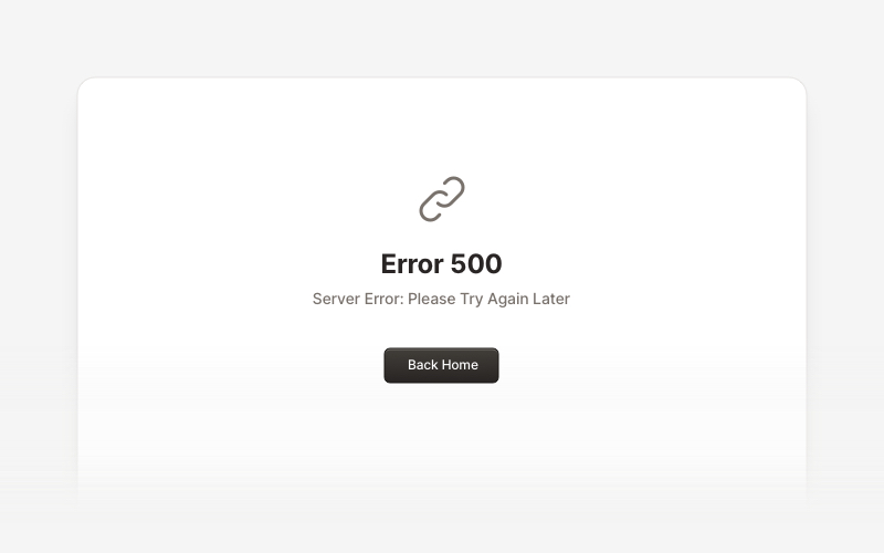
MaintenanceProfessional maintenance and downtime page components for React and Next.js. Build scheduled maintenance notifications, system upgrade messages, and under construction pages with email notifications and social links.
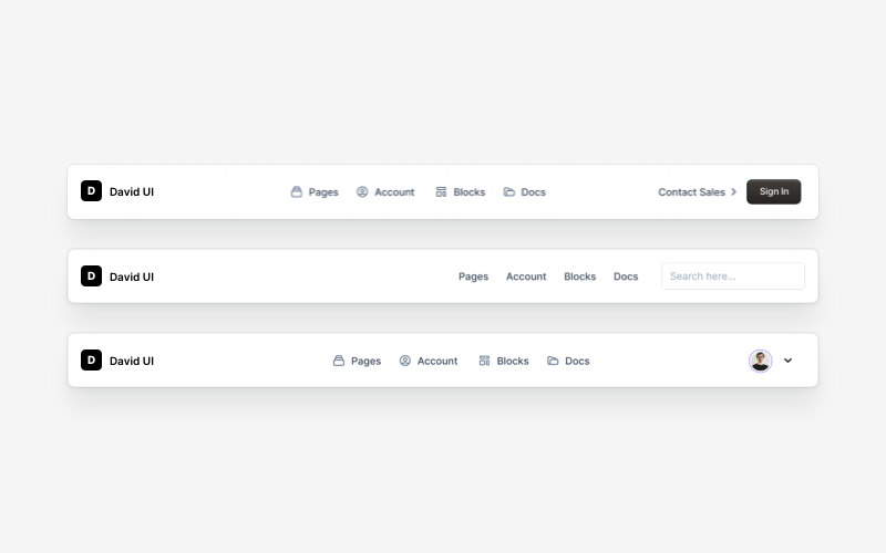
NavbarResponsive navigation bar components for React and Next.js. Build top navigation menus, mobile-friendly headers, search bars, breadcrumbs, and navigation layouts with dropdowns, icons, and user profiles.