Minimal category cards with clean layout - shadcn/ui
PROSimple and clean category cards with minimal design. Three-column grid layout featuring category titles and descriptions perfect for straightforward product organization and quick navigation.
Preview
Explore More Blocks
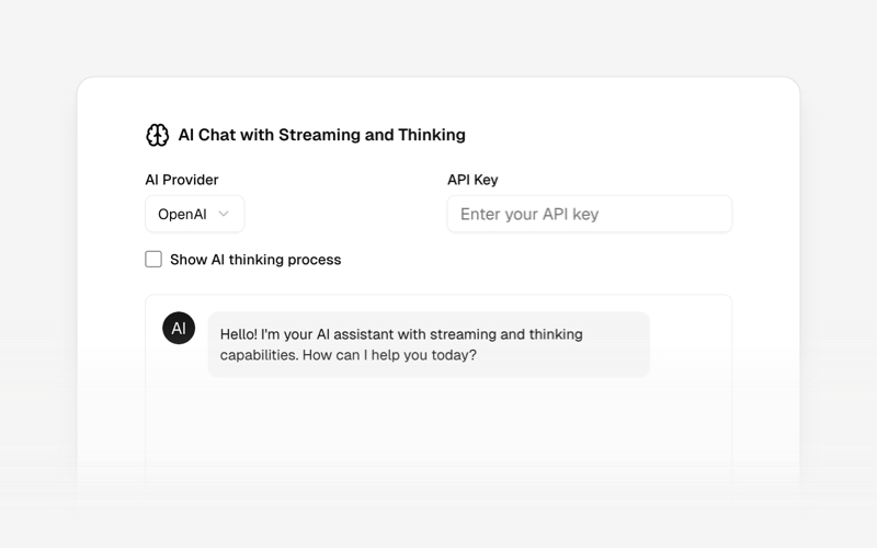
AI AgentsModern AI agent interface components and chat UI blocks for React and Next.js. Create conversational AI experiences, streaming responses, and interactive agent interfaces.
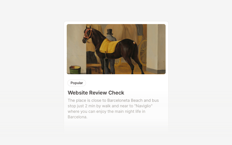
CardVersatile card layout components for React and Next.js. Build content cards with avatars, images, backgrounds, call-to-action buttons, and various layouts for displaying information in organized containers.
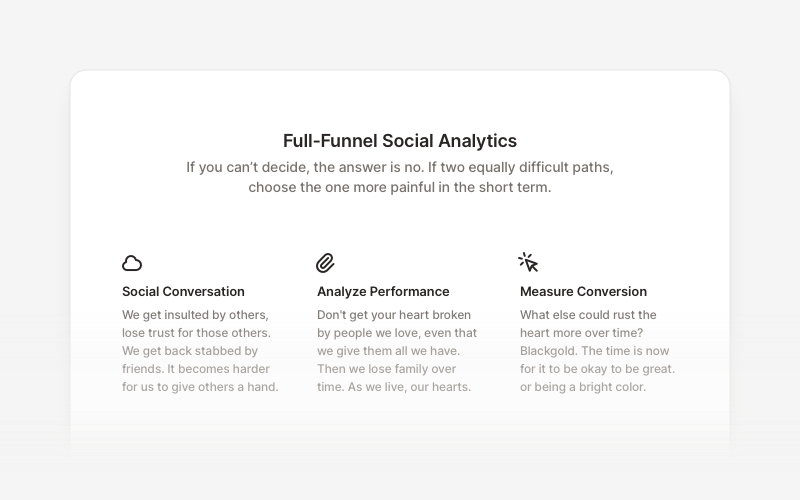
FeatureProfessional feature showcase components for React and Next.js. Build product features, service highlights, benefits sections, and feature comparison layouts with icons, images, and call-to-action elements.
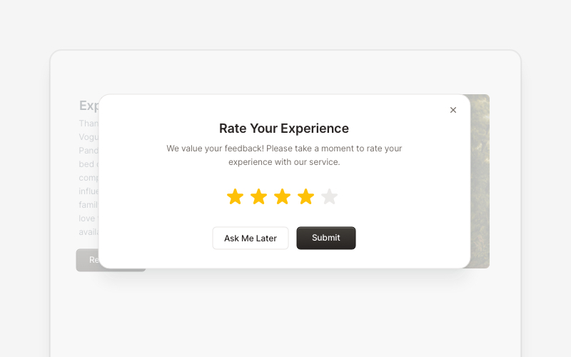
PopupEngaging popup and notification components for React and Next.js. Build welcome messages, cookie notifications, subscription forms, success confirmations, and promotional announcements with dismissible options and call-to-action elements.
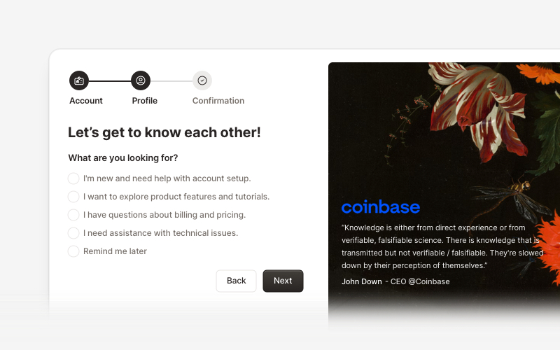
OnboardingProfessional user onboarding and welcome components for React and Next.js. Build multi-step onboarding flows, welcome cards, stepper forms, verification screens, and guided setup experiences with customizable layouts.
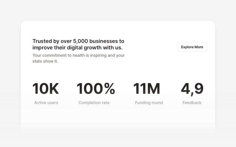
StatsProfessional statistics and metrics components for React and Next.js. Build data showcases, KPI dashboards, achievement displays, growth metrics, and performance indicators with customizable layouts and dark theme variations.
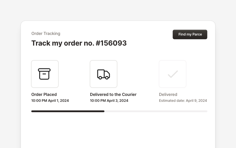
OrderProfessional order tracking and management components for React and Next.js. Build order details pages, tracking timelines, shipping status displays, order summaries, and delivery management interfaces with customizable layouts.
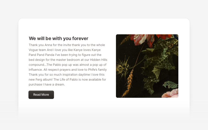
ContentVersatile content layout components for React and Next.js. Build blog posts, articles, portfolios, project showcases, comment sections, and rich content presentations with customizable designs.