Simple navigation bar with logo, links, and dropdown - shadcn/ui
Clean navigation bar with Material Tailwind logo, horizontal nav links (Dashboard, Projects, Social, Messages, Settings), notification/package icons, project selector dropdown, and Logout button. Features responsive design with burger menu toggle for mobile views.
Preview
Explore More Blocks
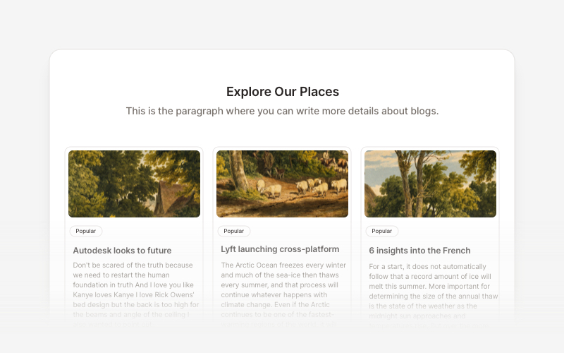
BlogElegant blog components and content layouts for React and Next.js. Create beautiful article grids, post previews, author profiles, and content-rich blog experiences.
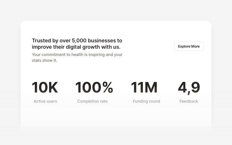
StatsProfessional statistics and metrics components for React and Next.js. Build data showcases, KPI dashboards, achievement displays, growth metrics, and performance indicators with customizable layouts and dark theme variations.
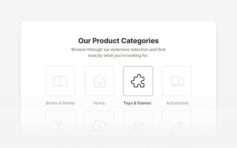
LayoutProfessional category showcase and product layout components for React and Next.js. Build category grids, product collections, navigation sections, and organized content displays.
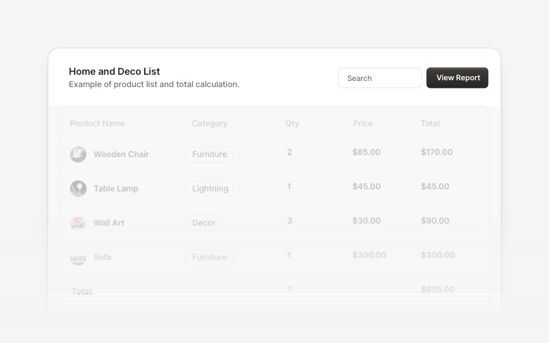
Table HeaderProfessional table header components for React and Next.js. Build search bars, filter controls, category tabs, action buttons, and sorting options for data tables with flexible layouts.
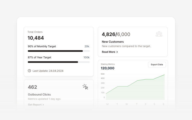
KPIProfessional KPI (Key Performance Indicator) card components for React and Next.js. Build metric displays, performance snapshots, dashboard cards with icons, badges, arrows, progress bars, charts, and action buttons to showcase business metrics and analytics.
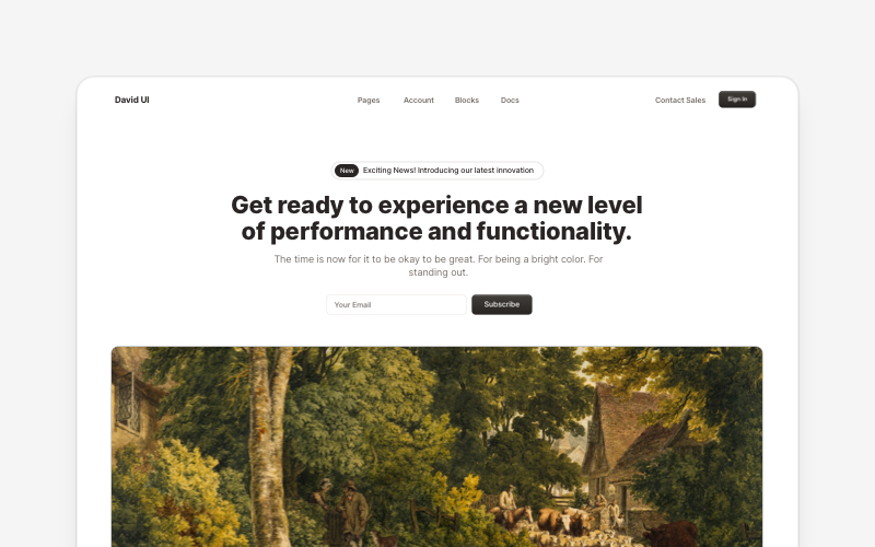
HeroEye-catching hero section components for React and Next.js. Build landing page heroes, call-to-action sections, lead generation forms, and compelling above-the-fold content.
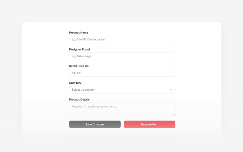
CRUDsComplete CRUD interface components and data management blocks for React and Next.js. Build admin panels, data tables, forms, and database management interfaces.
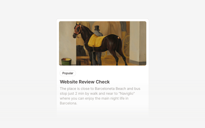
CardVersatile card layout components for React and Next.js. Build content cards with avatars, images, backgrounds, call-to-action buttons, and various layouts for displaying information in organized containers.