Simple product details grid - shadcn/ui
Try this completely free product details section for your shadcn/ui, Tailwind CSS, and React e-commerce project! It enables users to view the product's price, reviews, available colors, and add the product to the cart or favorites, all styled using shadcn/ui components.
Preview
Explore More Blocks
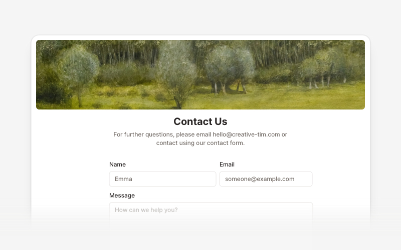
ContactProfessional contact form components and section layouts for React and Next.js. Build contact pages, feedback forms, support sections, and communication interfaces.
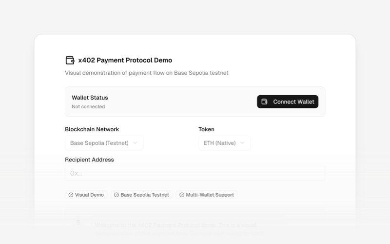
x402Internet-native payment protocol components for React and Next.js. Build AI agent payments, HTTP-based stablecoin transactions, and autonomous commerce experiences using the x402 protocol.
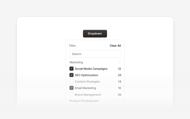
DropdownProfessional dropdown menu and filter components for React and Next.js. Build priority filters, status filters, checkbox filters, range selectors, searchable filters, and tabbed filter menus for advanced data filtering.
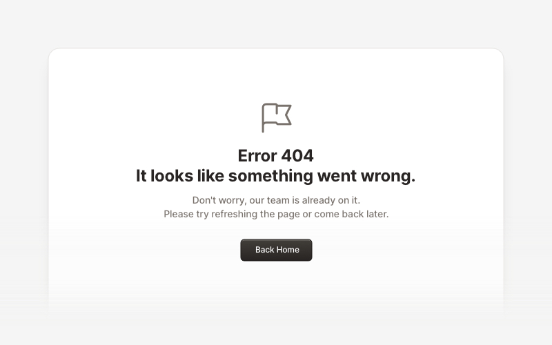
ErrorProfessional error page components for React and Next.js. Build 404 and 500 error pages with various layouts, icons, emoji, background images, and call-to-action buttons for better user experience.
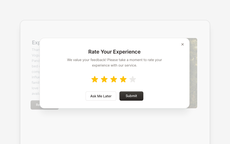
PopupEngaging popup and notification components for React and Next.js. Build welcome messages, cookie notifications, subscription forms, success confirmations, and promotional announcements with dismissible options and call-to-action elements.

TestimonialsProfessional testimonial and social proof components for React and Next.js. Build customer reviews, ratings, case studies, and trust-building sections.
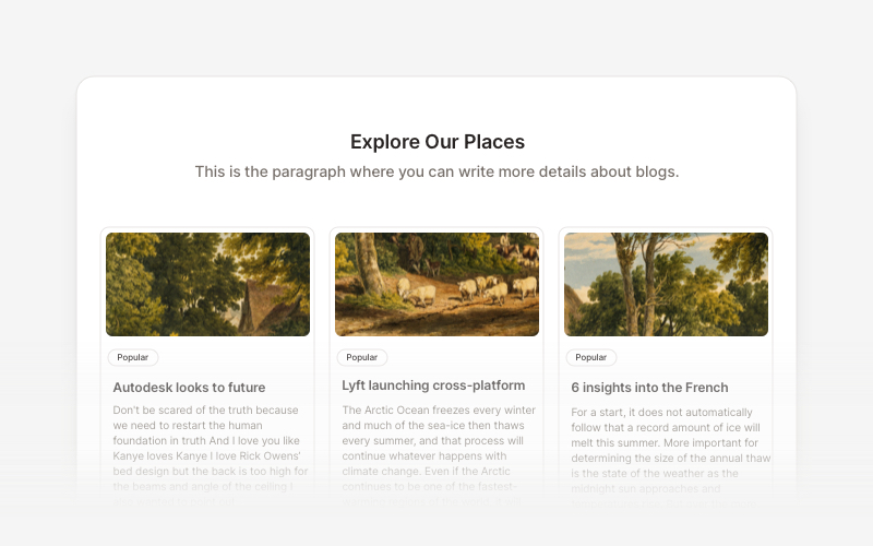
BlogElegant blog components and content layouts for React and Next.js. Create beautiful article grids, post previews, author profiles, and content-rich blog experiences.

OverviewCustomer review and testimonial overview components for React and Next.js. Build review sections, rating displays with statistics, customer testimonials with profile images, and comprehensive feedback interfaces.