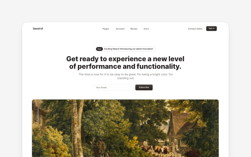
Full-viewport two-column content slide with bullet points and image - shadcn/ui
Preview
Component Details
- ID
- slide-content
- Type
- Block
- Access
- Free
- Published
- 3 Apr 2026
Files Included
- app/slide-content/page.tsx
- components/creative-tim/blocks/slide-content.tsx
Components Used
Explore More Blocks
HeroEye-catching hero section components for React and Next.js. Build landing page heroes, call-to-action sections, lead generation forms, and compelling above-the-fold content.
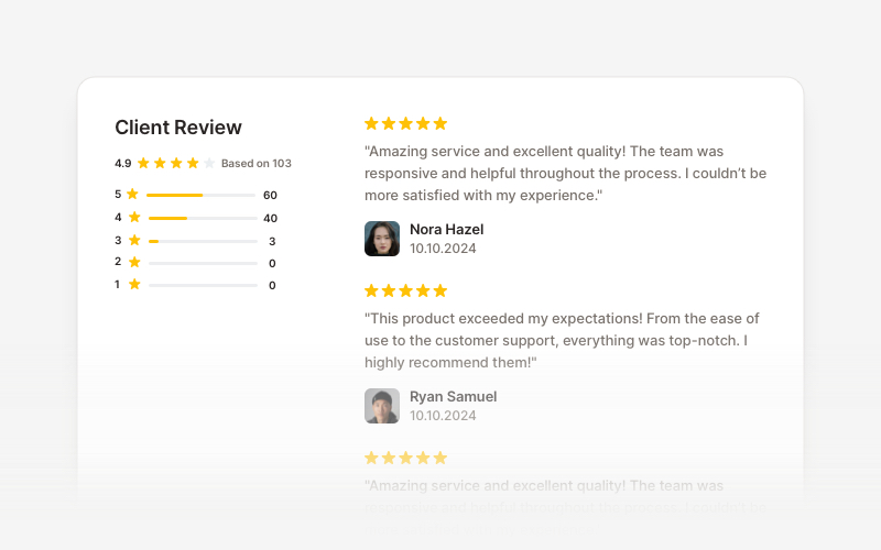
OverviewCustomer review and testimonial overview components for React and Next.js. Build review sections, rating displays with statistics, customer testimonials with profile images, and comprehensive feedback interfaces.
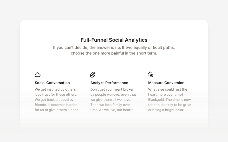
FeatureProfessional feature showcase components for React and Next.js. Build product features, service highlights, benefits sections, and feature comparison layouts with icons, images, and call-to-action elements.
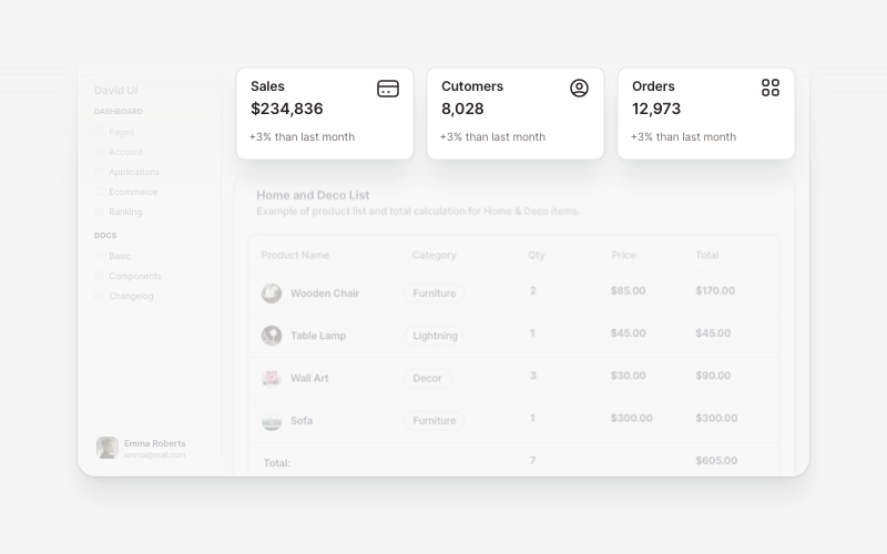
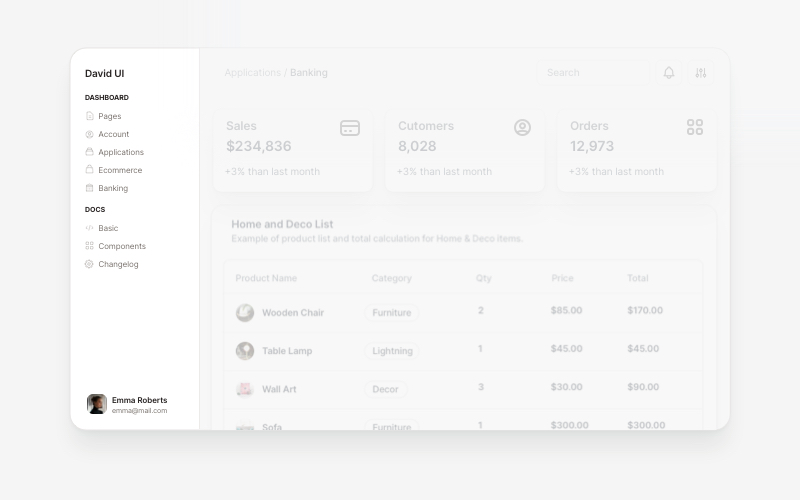
WidgetsVersatile widget components for React and Next.js. Build dashboard widgets, stats cards, join-now sections, and data visualization panels with customizable designs.

ErrorProfessional error page components for React and Next.js. Build 404 and 500 error pages with various layouts, icons, emoji, background images, and call-to-action buttons for better user experience.
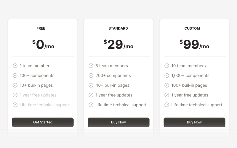
PricingProfessional pricing and plan comparison components for React and Next.js. Build pricing tables, subscription plans, feature comparisons, and pricing toggles with monthly/annual options.
SidebarProfessional sidebar navigation and menu components for React and Next.js. Build dashboard sidebars, app navigation, crypto wallets, calendar views, task managers, and feature-rich sidebar layouts with customizable content.
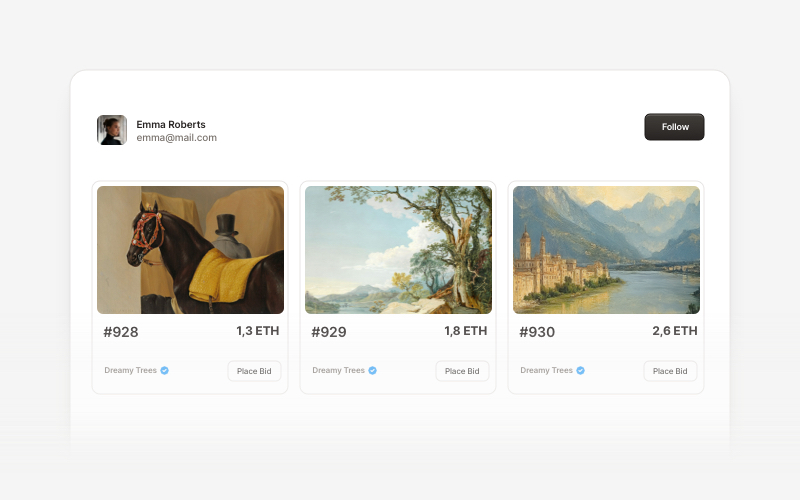
Web3 CardsModern Web3 and blockchain card components for React and Next.js. Build wallet connection cards, NFT displays, token interfaces, and decentralized application card layouts.