Stats cards with icons - shadcn/ui
PROStats section with icons and heading. Features 4-column grid with icon indicators, large metric counts, and category labels for showcasing key numbers.
Preview
Explore More Blocks
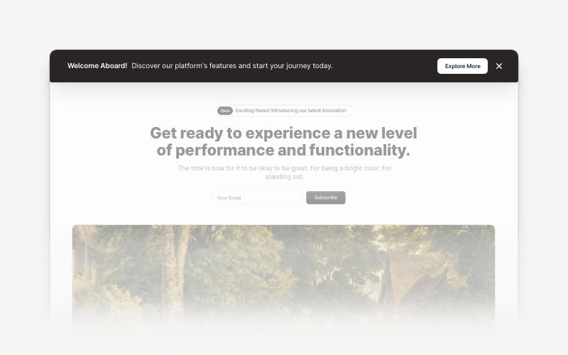
BannerAttention-grabbing banner components for React and Next.js. Build notification banners, promotional headers, announcement bars, and call-to-action banners with dismissible options.
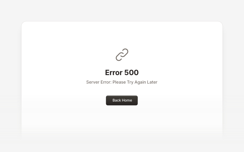
MaintenanceProfessional maintenance and downtime page components for React and Next.js. Build scheduled maintenance notifications, system upgrade messages, and under construction pages with email notifications and social links.
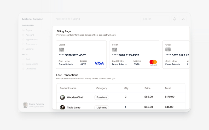
BillingProfessional billing and payment UI components for React and Next.js. Build payment forms, invoices, subscription management, and checkout flows with pre-built blocks.
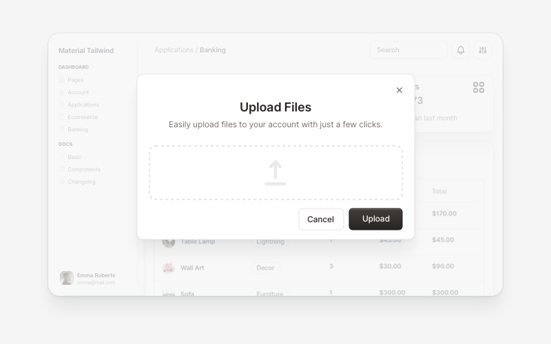
ModalsBeautiful modal and dialog components for React and Next.js. Build popups, confirmations, forms, and interactive overlay interfaces with accessible components.
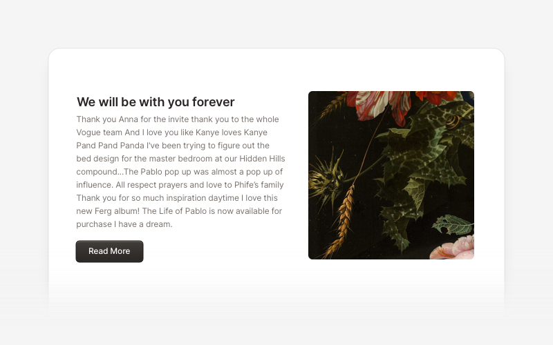
ContentVersatile content layout components for React and Next.js. Build blog posts, articles, portfolios, project showcases, comment sections, and rich content presentations with customizable designs.
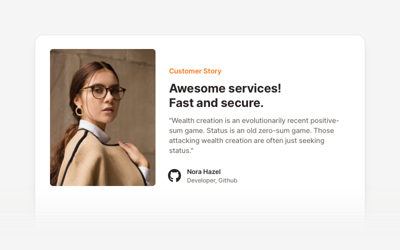
TestimonialsProfessional testimonial and social proof components for React and Next.js. Build customer reviews, ratings, case studies, and trust-building sections.
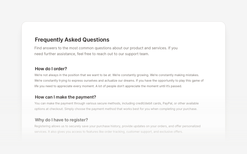
FAQsClean and accessible FAQ components and help section layouts for React and Next.js. Build knowledge bases, support pages, and frequently asked questions interfaces.
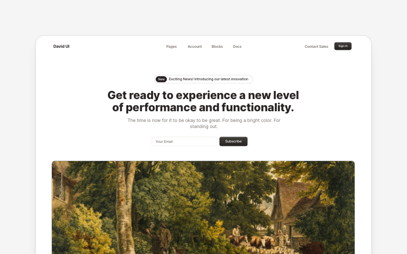
HeroEye-catching hero section components for React and Next.js. Build landing page heroes, call-to-action sections, lead generation forms, and compelling above-the-fold content.