Dark team cards block - shadcn/ui
PROElegant dark-themed team section with tall profile image cards and centered text. Three-column grid layout perfect for portfolio-style team pages.
Preview
Explore More Blocks
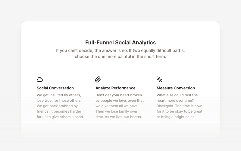
FeatureProfessional feature showcase components for React and Next.js. Build product features, service highlights, benefits sections, and feature comparison layouts with icons, images, and call-to-action elements.
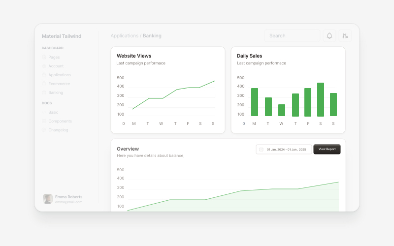
ChartsProfessional chart and data visualization components for React and Next.js. Build bar charts, line charts, area charts, comparison widgets, and interactive data dashboards with Recharts integration for displaying analytics and metrics.
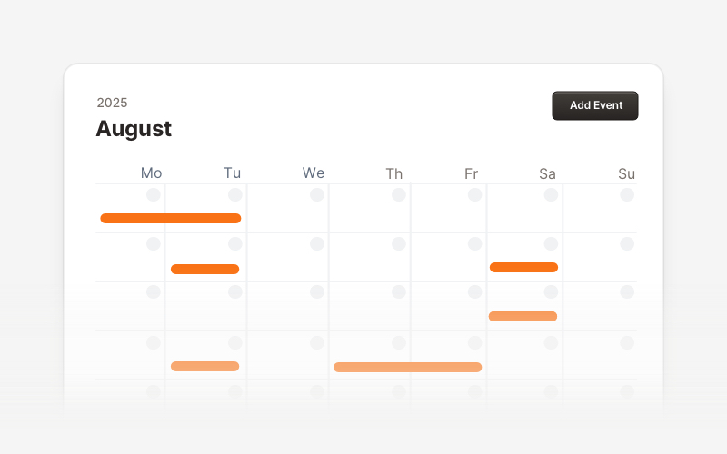
CalendarProfessional calendar and scheduling components for React and Next.js. Build event calendars, weekly schedules, daily planners, and event creation forms with date pickers and time management.
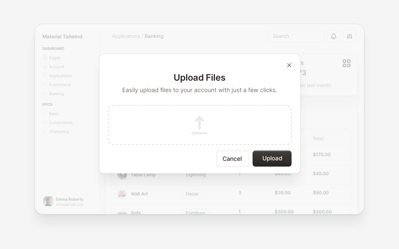
ModalsBeautiful modal and dialog components for React and Next.js. Build popups, confirmations, forms, and interactive overlay interfaces with accessible components.
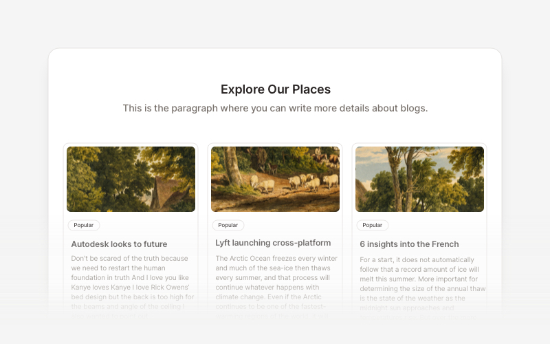
BlogElegant blog components and content layouts for React and Next.js. Create beautiful article grids, post previews, author profiles, and content-rich blog experiences.
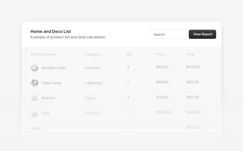
Table HeaderProfessional table header components for React and Next.js. Build search bars, filter controls, category tabs, action buttons, and sorting options for data tables with flexible layouts.
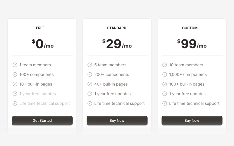
PricingProfessional pricing and plan comparison components for React and Next.js. Build pricing tables, subscription plans, feature comparisons, and pricing toggles with monthly/annual options.
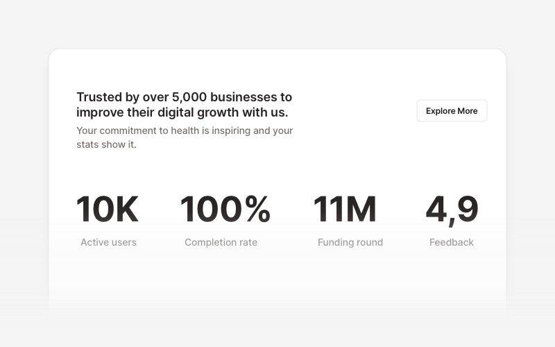
StatsProfessional statistics and metrics components for React and Next.js. Build data showcases, KPI dashboards, achievement displays, growth metrics, and performance indicators with customizable layouts and dark theme variations.