Two-member team block with horizontal layout - shadcn/ui
PROIntimate team section designed for small teams or co-founders. Horizontal card layout with profile images, detailed descriptions, and social links. Two-column layout.
Preview
Explore More Blocks
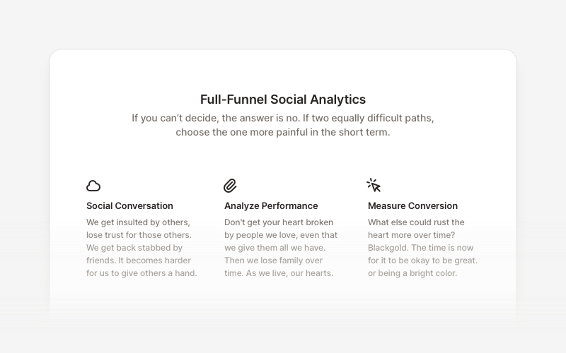
FeatureProfessional feature showcase components for React and Next.js. Build product features, service highlights, benefits sections, and feature comparison layouts with icons, images, and call-to-action elements.
LogoProfessional brand logo showcase components for React and Next.js. Build trust sections, partner displays, client logos, and company ecosystem layouts with various styles and configurations.
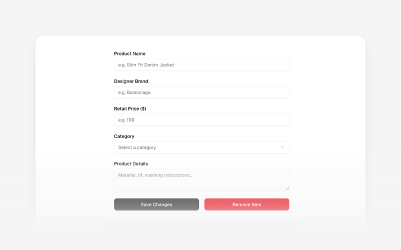
CRUDsComplete CRUD interface components and data management blocks for React and Next.js. Build admin panels, data tables, forms, and database management interfaces.
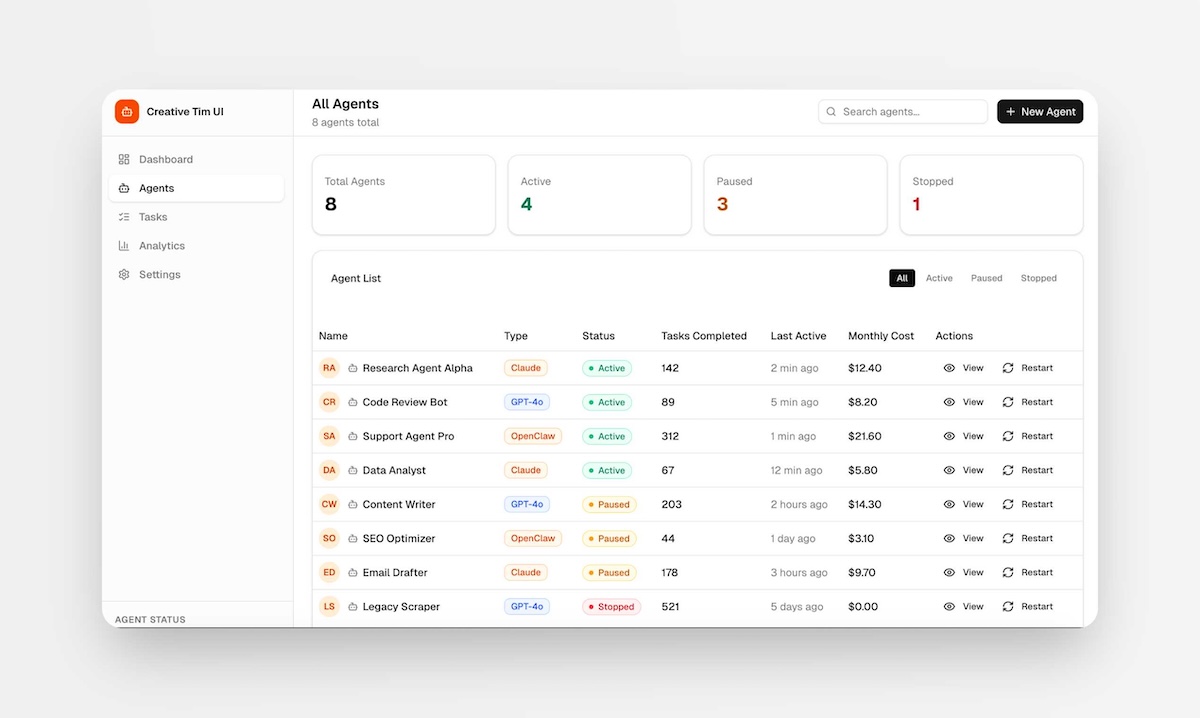
PagesComplete, ready-to-use full-page layouts for React and Next.js. Drop in a full page — dashboards, management views, and multi-section layouts composed from multiple blocks. Install with one command and customize to your needs.
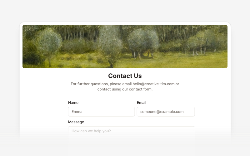
ContactProfessional contact form components and section layouts for React and Next.js. Build contact pages, feedback forms, support sections, and communication interfaces.
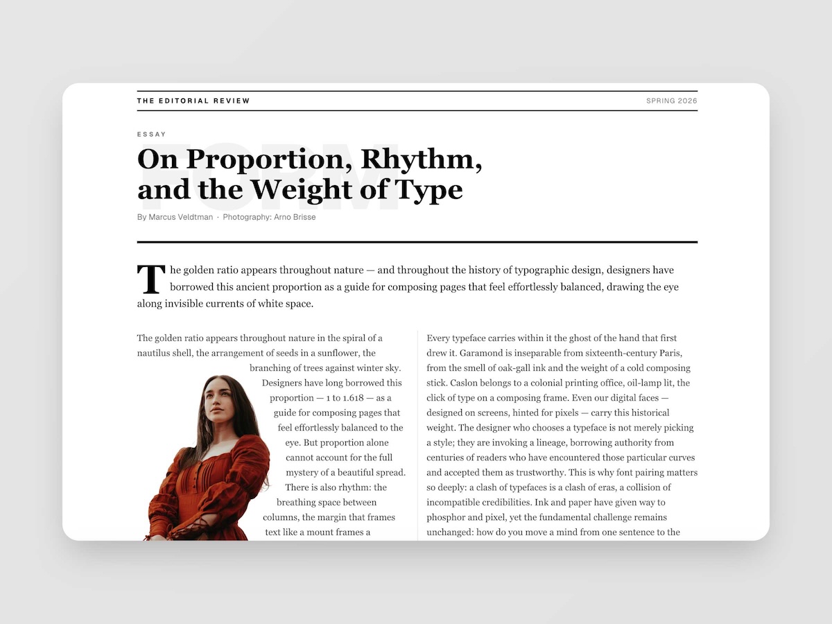
EditorialMagazine-quality editorial layouts where typography is the design. Multi-column spreads, text wrapping around images with pixel-precise line routing via Pretext, oversized words as visual anchors, pull quotes, drop caps, and the kind of spatial confidence you find in print — now in React.
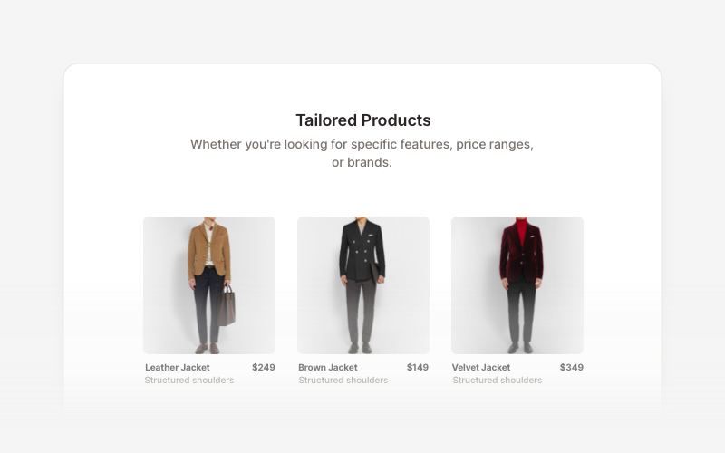
Product ListProfessional product listing and showcase components for React and Next.js. Build product grids, filtered lists, rating displays, and ecommerce product catalogs with customizable layouts.
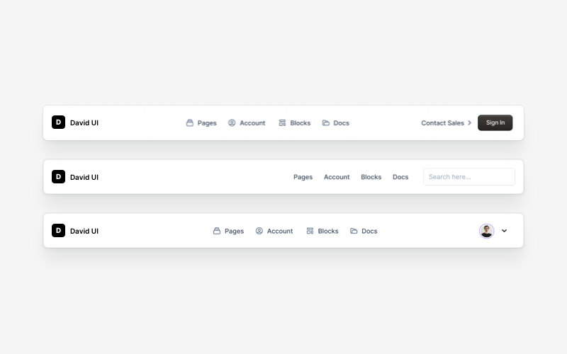
NavbarResponsive navigation bar components for React and Next.js. Build top navigation menus, mobile-friendly headers, search bars, breadcrumbs, and navigation layouts with dropdowns, icons, and user profiles.