Testimonials with submit button - shadcn/ui
PROPreview
Component Details
- ID
- testimonials-15
- Type
- Block
- Access
- PRO
- Category
- Testimonials
- Published
- 3 Apr 2026
Files Included
- app/testimonials-15/page.tsx
- components/creative-tim/blocks/testimonials-15.tsx
Components Used
Explore More Blocks
CardVersatile card layout components for React and Next.js. Build content cards with avatars, images, backgrounds, call-to-action buttons, and various layouts for displaying information in organized containers.
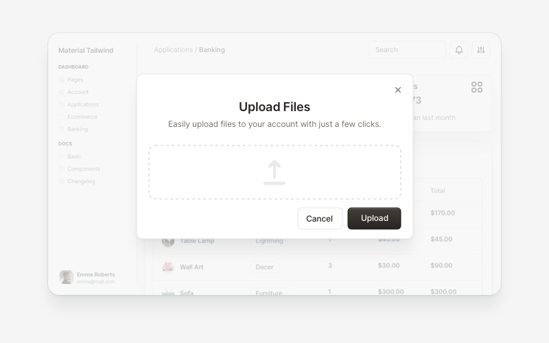
ModalsBeautiful modal and dialog components for React and Next.js. Build popups, confirmations, forms, and interactive overlay interfaces with accessible components.
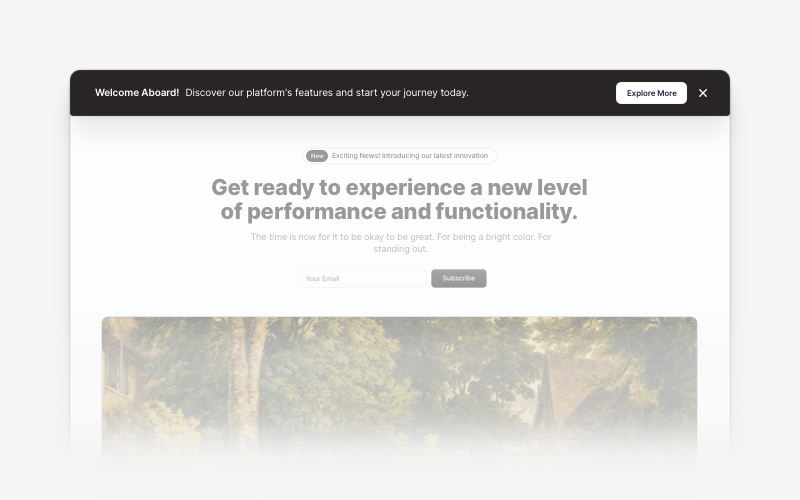
BannerAttention-grabbing banner components for React and Next.js. Build notification banners, promotional headers, announcement bars, and call-to-action banners with dismissible options.
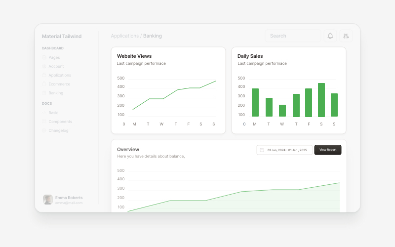
ChartsProfessional chart and data visualization components for React and Next.js. Build bar charts, line charts, area charts, comparison widgets, and interactive data dashboards with Recharts integration for displaying analytics and metrics.
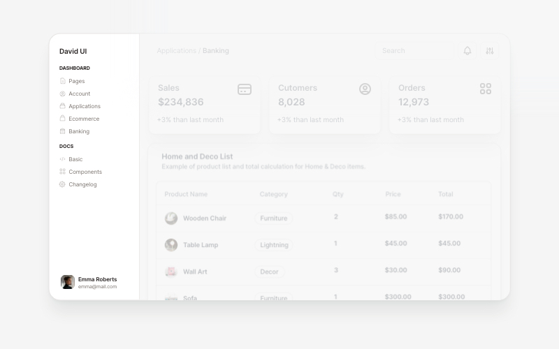
SidebarProfessional sidebar navigation and menu components for React and Next.js. Build dashboard sidebars, app navigation, crypto wallets, calendar views, task managers, and feature-rich sidebar layouts with customizable content.
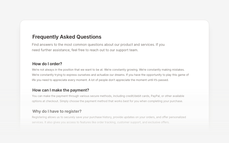
FAQsClean and accessible FAQ components and help section layouts for React and Next.js. Build knowledge bases, support pages, and frequently asked questions interfaces.
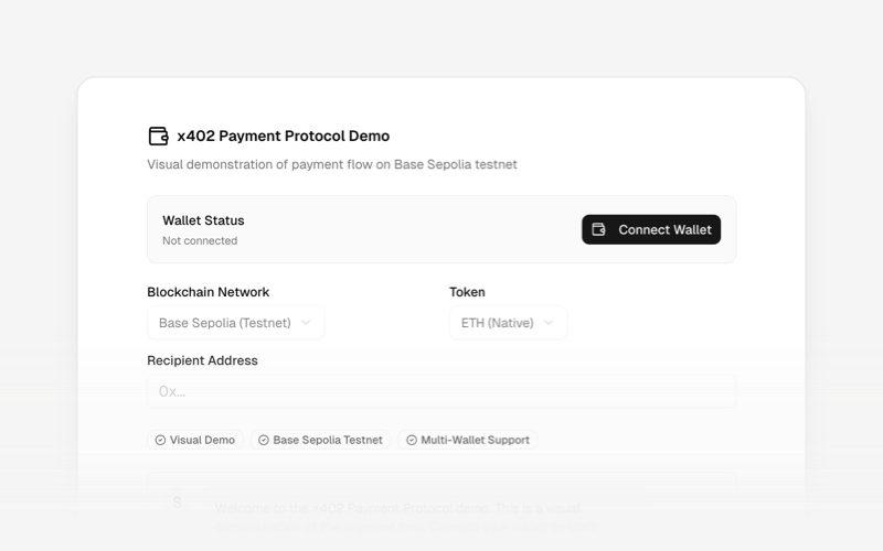
x402Internet-native payment protocol components for React and Next.js. Build AI agent payments, HTTP-based stablecoin transactions, and autonomous commerce experiences using the x402 protocol.
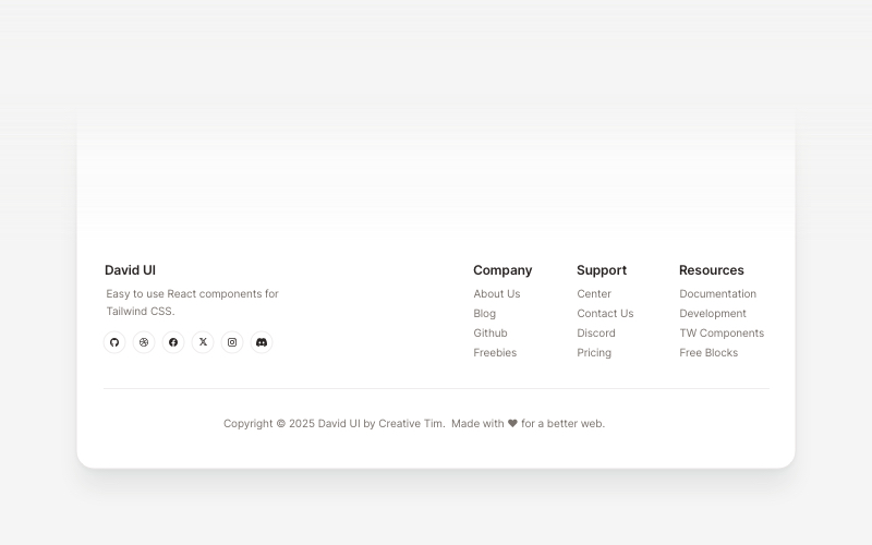
FootersModern footer components and section layouts for React and Next.js. Build professional website footers with links, social media, newsletters, and navigation.