Two-column layout with dark cards and feature lists - shadcn/ui
PROAlternating two-column layout pairing dark promotional cards with numbered feature lists. Includes icon header and descriptions, perfect for feature comparisons and service showcases.
Preview
Explore More Blocks
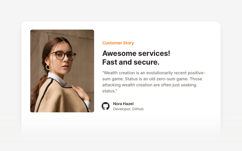
TestimonialsProfessional testimonial and social proof components for React and Next.js. Build customer reviews, ratings, case studies, and trust-building sections.
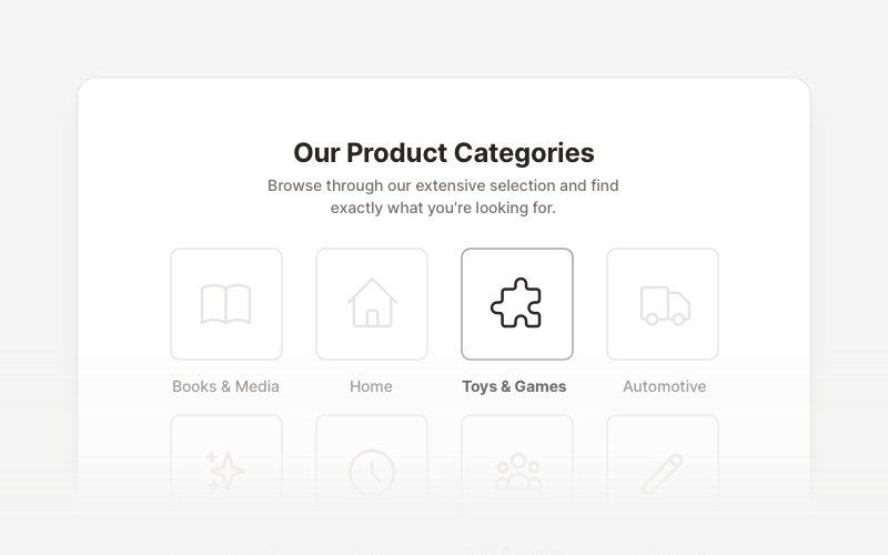
LayoutProfessional category showcase and product layout components for React and Next.js. Build category grids, product collections, navigation sections, and organized content displays.
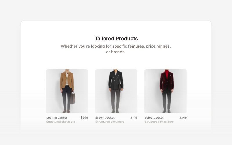
Product ListProfessional product listing and showcase components for React and Next.js. Build product grids, filtered lists, rating displays, and ecommerce product catalogs with customizable layouts.
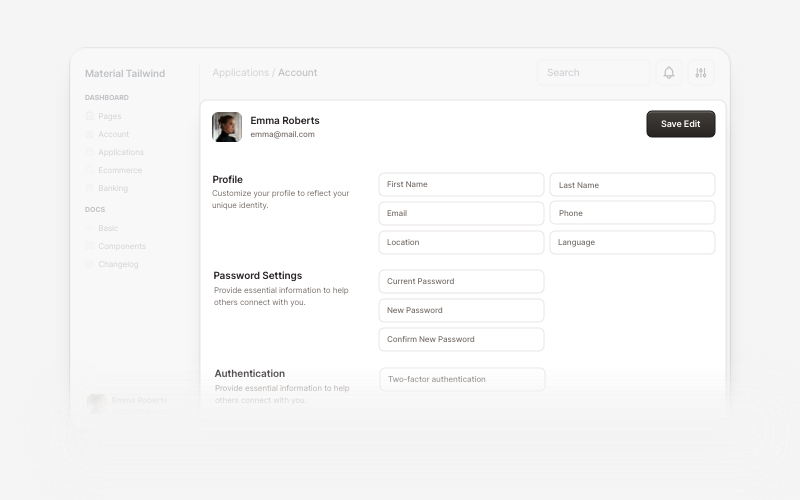
AccountBeautiful and customizable account management components for React and Next.js. Build user profiles, settings, authentication flows, and account dashboards with ready-to-use blocks.
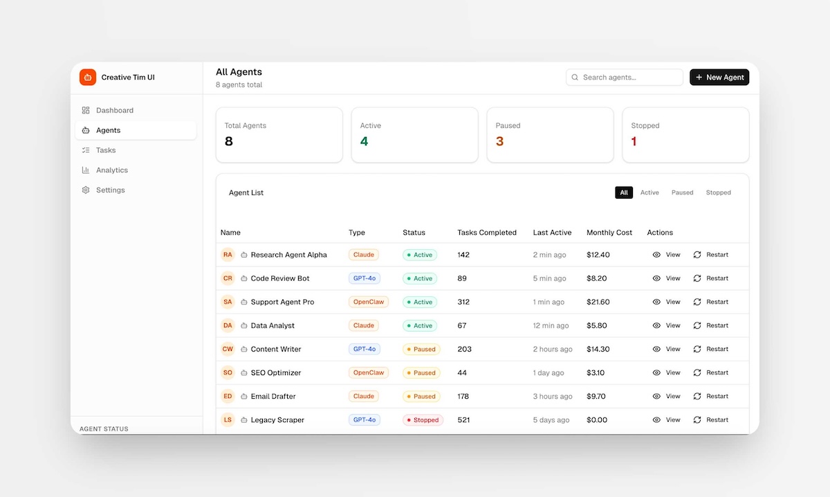
PagesComplete, ready-to-use full-page layouts for React and Next.js. Drop in a full page — dashboards, management views, and multi-section layouts composed from multiple blocks. Install with one command and customize to your needs.
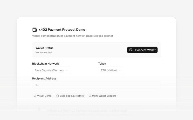
x402Internet-native payment protocol components for React and Next.js. Build AI agent payments, HTTP-based stablecoin transactions, and autonomous commerce experiences using the x402 protocol.
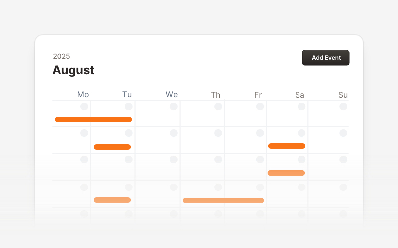
CalendarProfessional calendar and scheduling components for React and Next.js. Build event calendars, weekly schedules, daily planners, and event creation forms with date pickers and time management.
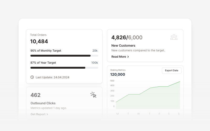
KPIProfessional KPI (Key Performance Indicator) card components for React and Next.js. Build metric displays, performance snapshots, dashboard cards with icons, badges, arrows, progress bars, charts, and action buttons to showcase business metrics and analytics.