Simple welcome popup with single call-to-action button - shadcn/ui
PROMinimal welcome message with centered text, close button, and prominent join community CTA. Perfect for first-time visitors, promotional announcements, and community engagement with simple, focused message.
Preview
Explore More Blocks
LogoProfessional brand logo showcase components for React and Next.js. Build trust sections, partner displays, client logos, and company ecosystem layouts with various styles and configurations.
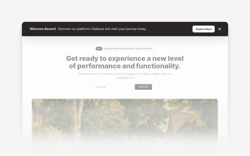
BannerAttention-grabbing banner components for React and Next.js. Build notification banners, promotional headers, announcement bars, and call-to-action banners with dismissible options.
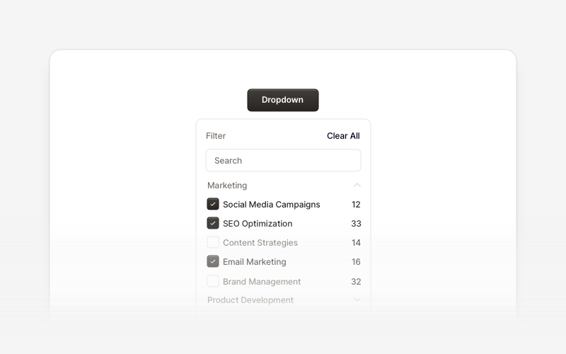
DropdownProfessional dropdown menu and filter components for React and Next.js. Build priority filters, status filters, checkbox filters, range selectors, searchable filters, and tabbed filter menus for advanced data filtering.
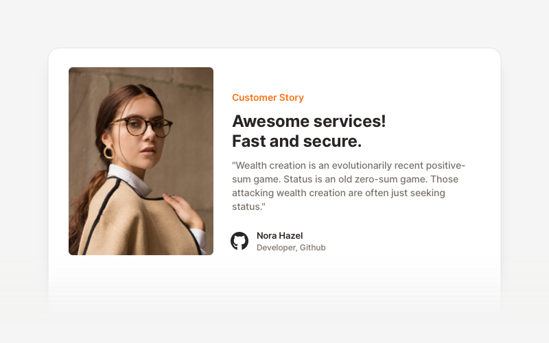
TestimonialsProfessional testimonial and social proof components for React and Next.js. Build customer reviews, ratings, case studies, and trust-building sections.
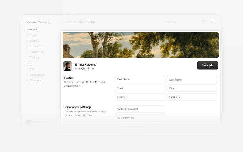
User ProfileProfessional user profile components for React and Next.js. Build user profile cards, account overviews, profile headers with statistics, social media links, and customizable layouts for displaying user information and achievements.
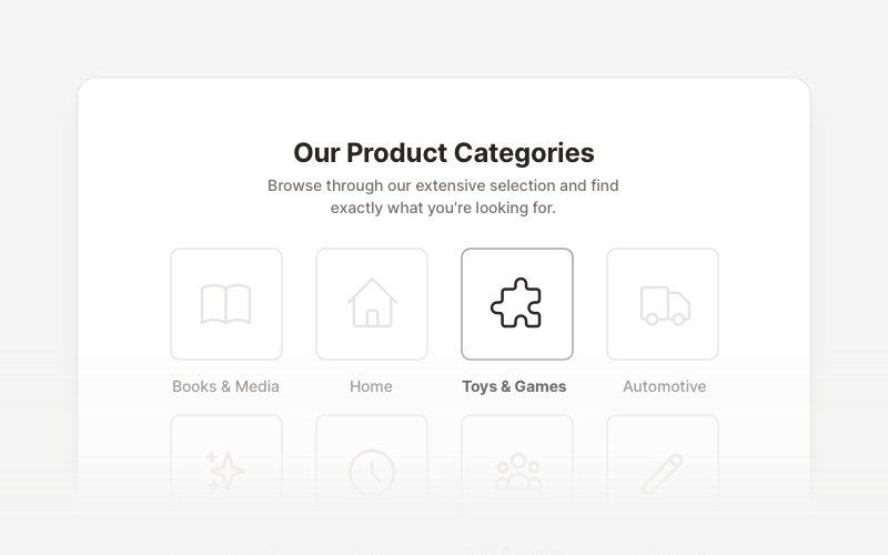
LayoutProfessional category showcase and product layout components for React and Next.js. Build category grids, product collections, navigation sections, and organized content displays.
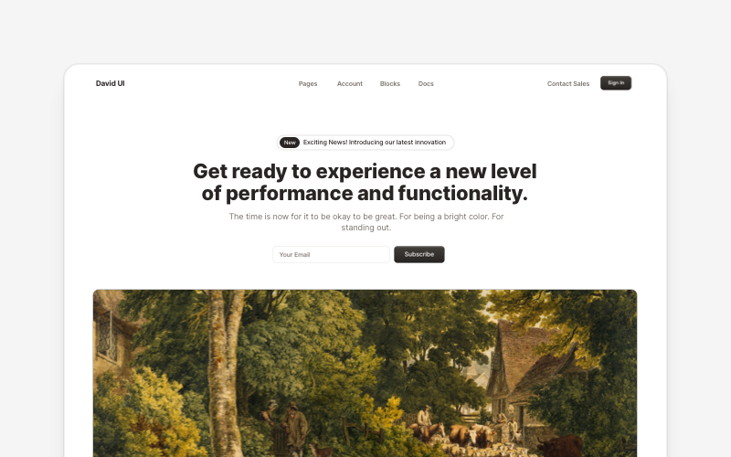
HeroEye-catching hero section components for React and Next.js. Build landing page heroes, call-to-action sections, lead generation forms, and compelling above-the-fold content.
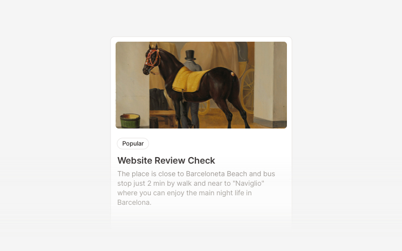
CardVersatile card layout components for React and Next.js. Build content cards with avatars, images, backgrounds, call-to-action buttons, and various layouts for displaying information in organized containers.