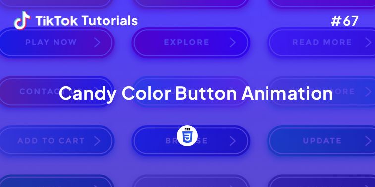
Learn with us how to create an amazing Candy Color Button Animation in HTML and CSS!
If you found us on TikTok on the following post, check out this article and copy-paste the full code!
Happy coding! 😻
@creative.tim This is art! Because coding is art 🖼 #coding #scrollanimation #css #javascript #programming ♬ original sound - Creative Tim
Contents:
1. HTML Code
2. CSS Code
Get your code ⬇️
1. HTML Code
<header>
   <link href="https://fonts.googleapis.com/css2?family=Lato&display=swap" rel="stylesheet">
</header>

<h1>Animation Buttons</h1>
<p>Hover us and enjoy the satisfying neumorphic animation designs!</p>
<div class="frame">
  <button class="custom-btn btn-1">Read More</button>
  <button class="custom-btn btn-2">Read More</button>
  <button class="custom-btn btn-3"><span>Read More</span></button>
  <button class="custom-btn btn-4"><span>Read More</span></button>
  <button class="custom-btn btn-5"><span>Read More</span></button>
  <button class="custom-btn btn-6"><span>Read More</span></button>
  <button class="custom-btn btn-7"><span>Read More</span></button>
  <button class="custom-btn btn-8"><span>Read More</span></button>
  <button class="custom-btn btn-9">Read More</button>
  <button class="custom-btn btn-10">Read More</button>
  <button class="custom-btn btn-11">Read More<div class="dot"></div></button>
  <button class="custom-btn btn-12"><span>Click!</span><span>Read More</span></button>
  <button class="custom-btn btn-13">Read More</button>
  <button class="custom-btn btn-14">Read More</button>
  <button class="custom-btn btn-15">Read More</button>
  <button class="custom-btn btn-16">Read More</button>
  <p style="font-family: Andale Mono, monospace;">
    DEERBUCKS.DESIGNING</p>
</div>
2. CSS Code
body {
  background: #e0e5ec;
}
h1 {
  position: relative;
  text-align: center;
  color: #353535;
  font-size: 50px;
  font-family: "Cormorant Garamond", serif;
}

p {
  font-family: 'Lato', sans-serif;
  font-weight: 300;
  text-align: center;
  font-size: 18px;
  color: #676767;
}
.frame {
  width: 90%;
  margin: 40px auto;
  text-align: center;
}
button {
  margin: 20px;
}
.custom-btn {
  width: 130px;
  height: 40px;
  color: #fff;
  border-radius: 5px;
  padding: 10px 25px;
  font-family: 'Lato', sans-serif;
  font-weight: 500;
  background: transparent;
  cursor: pointer;
  transition: all 0.3s ease;
  position: relative;
  display: inline-block;
   box-shadow:inset 2px 2px 2px 0px rgba(255,255,255,.5),
   7px 7px 20px 0px rgba(0,0,0,.1),
   4px 4px 5px 0px rgba(0,0,0,.1);
  outline: none;
}

/* 1 */
.btn-1 {
  background: rgb(6,14,131);
  background: linear-gradient(0deg, rgba(6,14,131,1) 0%, rgba(12,25,180,1) 100%);
  border: none;
}
.btn-1:hover {
   background: rgb(0,3,255);
background: linear-gradient(0deg, rgba(0,3,255,1) 0%, rgba(2,126,251,1) 100%);
}

/* 2 */
.btn-2 {
  background: rgb(96,9,240);
  background: linear-gradient(0deg, rgba(96,9,240,1) 0%, rgba(129,5,240,1) 100%);
  border: none;

}
.btn-2:before {
  height: 0%;
  width: 2px;
}
.btn-2:hover {
  box-shadow:  4px 4px 6px 0 rgba(255,255,255,.5),
              -4px -4px 6px 0 rgba(116, 125, 136, .5),
    inset -4px -4px 6px 0 rgba(255,255,255,.2),
    inset 4px 4px 6px 0 rgba(0, 0, 0, .4);
}


/* 3 */
.btn-3 {
  background: rgb(0,172,238);
background: linear-gradient(0deg, rgba(0,172,238,1) 0%, rgba(2,126,251,1) 100%);
  width: 130px;
  height: 40px;
  line-height: 42px;
  padding: 0;
  border: none;

}
.btn-3 span {
  position: relative;
  display: block;
  width: 100%;
  height: 100%;
}
.btn-3:before,
.btn-3:after {
  position: absolute;
  content: "";
  right: 0;
  top: 0;
   background: rgba(2,126,251,1);
  transition: all 0.3s ease;
}
.btn-3:before {
  height: 0%;
  width: 2px;
}
.btn-3:after {
  width: 0%;
  height: 2px;
}
.btn-3:hover{
   background: transparent;
  box-shadow: none;
}
.btn-3:hover:before {
  height: 100%;
}
.btn-3:hover:after {
  width: 100%;
}
.btn-3 span:hover{
   color: rgba(2,126,251,1);
}
.btn-3 span:before,
.btn-3 span:after {
  position: absolute;
  content: "";
  left: 0;
  bottom: 0;
   background: rgba(2,126,251,1);
  transition: all 0.3s ease;
}
.btn-3 span:before {
  width: 2px;
  height: 0%;
}
.btn-3 span:after {
  width: 0%;
  height: 2px;
}
.btn-3 span:hover:before {
  height: 100%;
}
.btn-3 span:hover:after {
  width: 100%;
}

/* 4 */
.btn-4 {
  background-color: #4dccc6;
background-image: linear-gradient(315deg, #4dccc6 0%, #96e4df 74%);
  line-height: 42px;
  padding: 0;
  border: none;
}
.btn-4:hover{
  background-color: #89d8d3;
background-image: linear-gradient(315deg, #89d8d3 0%, #03c8a8 74%);
}
.btn-4 span {
  position: relative;
  display: block;
  width: 100%;
  height: 100%;
}
.btn-4:before,
.btn-4:after {
  position: absolute;
  content: "";
  right: 0;
  top: 0;
   box-shadow:  4px 4px 6px 0 rgba(255,255,255,.9),
              -4px -4px 6px 0 rgba(116, 125, 136, .2),
    inset -4px -4px 6px 0 rgba(255,255,255,.9),
    inset 4px 4px 6px 0 rgba(116, 125, 136, .3);
  transition: all 0.3s ease;
}
.btn-4:before {
  height: 0%;
  width: .1px;
}
.btn-4:after {
  width: 0%;
  height: .1px;
}
.btn-4:hover:before {
  height: 100%;
}
.btn-4:hover:after {
  width: 100%;
}
.btn-4 span:before,
.btn-4 span:after {
  position: absolute;
  content: "";
  left: 0;
  bottom: 0;
  box-shadow:  4px 4px 6px 0 rgba(255,255,255,.9),
              -4px -4px 6px 0 rgba(116, 125, 136, .2),
    inset -4px -4px 6px 0 rgba(255,255,255,.9),
    inset 4px 4px 6px 0 rgba(116, 125, 136, .3);
  transition: all 0.3s ease;
}
.btn-4 span:before {
  width: .1px;
  height: 0%;
}
.btn-4 span:after {
  width: 0%;
  height: .1px;
}
.btn-4 span:hover:before {
  height: 100%;
}
.btn-4 span:hover:after {
  width: 100%;
}

/* 5 */
.btn-5 {
  width: 130px;
  height: 40px;
  line-height: 42px;
  padding: 0;
  border: none;
  background: rgb(255,27,0);
background: linear-gradient(0deg, rgba(255,27,0,1) 0%, rgba(251,75,2,1) 100%);
}
.btn-5:hover {
  color: #f0094a;
  background: transparent;
   box-shadow:none;
}
.btn-5:before,
.btn-5:after{
  content:'';
  position:absolute;
  top:0;
  right:0;
  height:2px;
  width:0;
  background: #f0094a;
  box-shadow:
   -1px -1px 5px 0px #fff,
   7px 7px 20px 0px #0003,
   4px 4px 5px 0px #0002;
  transition:400ms ease all;
}
.btn-5:after{
  right:inherit;
  top:inherit;
  left:0;
  bottom:0;
}
.btn-5:hover:before,
.btn-5:hover:after{
  width:100%;
  transition:800ms ease all;
}


/* 6 */
.btn-6 {
  background: rgb(247,150,192);
background: radial-gradient(circle, rgba(247,150,192,1) 0%, rgba(118,174,241,1) 100%);
  line-height: 42px;
  padding: 0;
  border: none;
}
.btn-6 span {
  position: relative;
  display: block;
  width: 100%;
  height: 100%;
}
.btn-6:before,
.btn-6:after {
  position: absolute;
  content: "";
  height: 0%;
  width: 1px;
 box-shadow:
   -1px -1px 20px 0px rgba(255,255,255,1),
   -4px -4px 5px 0px rgba(255,255,255,1),
   7px 7px 20px 0px rgba(0,0,0,.4),
   4px 4px 5px 0px rgba(0,0,0,.3);
}
.btn-6:before {
  right: 0;
  top: 0;
  transition: all 500ms ease;
}
.btn-6:after {
  left: 0;
  bottom: 0;
  transition: all 500ms ease;
}
.btn-6:hover{
  background: transparent;
  color: #76aef1;
  box-shadow: none;
}
.btn-6:hover:before {
  transition: all 500ms ease;
  height: 100%;
}
.btn-6:hover:after {
  transition: all 500ms ease;
  height: 100%;
}
.btn-6 span:before,
.btn-6 span:after {
  position: absolute;
  content: "";
  box-shadow:
   -1px -1px 20px 0px rgba(255,255,255,1),
   -4px -4px 5px 0px rgba(255,255,255,1),
   7px 7px 20px 0px rgba(0,0,0,.4),
   4px 4px 5px 0px rgba(0,0,0,.3);
}
.btn-6 span:before {
  left: 0;
  top: 0;
  width: 0%;
  height: .5px;
  transition: all 500ms ease;
}
.btn-6 span:after {
  right: 0;
  bottom: 0;
  width: 0%;
  height: .5px;
  transition: all 500ms ease;
}
.btn-6 span:hover:before {
  width: 100%;
}
.btn-6 span:hover:after {
  width: 100%;
}

/* 7 */
.btn-7 {
background: linear-gradient(0deg, rgba(255,151,0,1) 0%, rgba(251,75,2,1) 100%);
  line-height: 42px;
  padding: 0;
  border: none;
}
.btn-7 span {
  position: relative;
  display: block;
  width: 100%;
  height: 100%;
}
.btn-7:before,
.btn-7:after {
  position: absolute;
  content: "";
  right: 0;
  bottom: 0;
  background: rgba(251,75,2,1);
  box-shadow:
   -7px -7px 20px 0px rgba(255,255,255,.9),
   -4px -4px 5px 0px rgba(255,255,255,.9),
   7px 7px 20px 0px rgba(0,0,0,.2),
   4px 4px 5px 0px rgba(0,0,0,.3);
  transition: all 0.3s ease;
}
.btn-7:before{
   height: 0%;
   width: 2px;
}
.btn-7:after {
  width: 0%;
  height: 2px;
}
.btn-7:hover{
  color: rgba(251,75,2,1);
  background: transparent;
}
.btn-7:hover:before {
  height: 100%;
}
.btn-7:hover:after {
  width: 100%;
}
.btn-7 span:before,
.btn-7 span:after {
  position: absolute;
  content: "";
  left: 0;
  top: 0;
  background: rgba(251,75,2,1);
  box-shadow:
   -7px -7px 20px 0px rgba(255,255,255,.9),
   -4px -4px 5px 0px rgba(255,255,255,.9),
   7px 7px 20px 0px rgba(0,0,0,.2),
   4px 4px 5px 0px rgba(0,0,0,.3);
  transition: all 0.3s ease;
}
.btn-7 span:before {
  width: 2px;
  height: 0%;
}
.btn-7 span:after {
  height: 2px;
  width: 0%;
}
.btn-7 span:hover:before {
  height: 100%;
}
.btn-7 span:hover:after {
  width: 100%;
}

/* 8 */
.btn-8 {
  background-color: #f0ecfc;
background-image: linear-gradient(315deg, #f0ecfc 0%, #c797eb 74%);
  line-height: 42px;
  padding: 0;
  border: none;
}
.btn-8 span {
  position: relative;
  display: block;
  width: 100%;
  height: 100%;
}
.btn-8:before,
.btn-8:after {
  position: absolute;
  content: "";
  right: 0;
  bottom: 0;
  background: #c797eb;
  /*box-shadow:  4px 4px 6px 0 rgba(255,255,255,.5),
              -4px -4px 6px 0 rgba(116, 125, 136, .2),
    inset -4px -4px 6px 0 rgba(255,255,255,.5),
    inset 4px 4px 6px 0 rgba(116, 125, 136, .3);*/
  transition: all 0.3s ease;
}
.btn-8:before{
   height: 0%;
   width: 2px;
}
.btn-8:after {
  width: 0%;
  height: 2px;
}
.btn-8:hover:before {
  height: 100%;
}
.btn-8:hover:after {
  width: 100%;
}
.btn-8:hover{
  background: transparent;
}
.btn-8 span:hover{
  color: #c797eb;
}
.btn-8 span:before,
.btn-8 span:after {
  position: absolute;
  content: "";
  left: 0;
  top: 0;
  background: #c797eb;
  /*box-shadow:  4px 4px 6px 0 rgba(255,255,255,.5),
              -4px -4px 6px 0 rgba(116, 125, 136, .2),
    inset -4px -4px 6px 0 rgba(255,255,255,.5),
    inset 4px 4px 6px 0 rgba(116, 125, 136, .3);*/
  transition: all 0.3s ease;
}
.btn-8 span:before {
  width: 2px;
  height: 0%;
}
.btn-8 span:after {
  height: 2px;
  width: 0%;
}
.btn-8 span:hover:before {
  height: 100%;
}
.btn-8 span:hover:after {
  width: 100%;
}


/* 9 */
.btn-9 {
  border: none;
  transition: all 0.3s ease;
  overflow: hidden;
}
.btn-9:after {
  position: absolute;
  content: " ";
  z-index: -1;
  top: 0;
  left: 0;
  width: 100%;
  height: 100%;
   background-color: #1fd1f9;
background-image: linear-gradient(315deg, #1fd1f9 0%, #b621fe 74%);
  transition: all 0.3s ease;
}
.btn-9:hover {
  background: transparent;
  box-shadow:  4px 4px 6px 0 rgba(255,255,255,.5),
              -4px -4px 6px 0 rgba(116, 125, 136, .2),
    inset -4px -4px 6px 0 rgba(255,255,255,.5),
    inset 4px 4px 6px 0 rgba(116, 125, 136, .3);
  color: #fff;
}
.btn-9:hover:after {
  -webkit-transform: scale(2) rotate(180deg);
  transform: scale(2) rotate(180deg);
  box-shadow:  4px 4px 6px 0 rgba(255,255,255,.5),
              -4px -4px 6px 0 rgba(116, 125, 136, .2),
    inset -4px -4px 6px 0 rgba(255,255,255,.5),
    inset 4px 4px 6px 0 rgba(116, 125, 136, .3);
}

/* 10 */
.btn-10 {
  background: rgb(22,9,240);
background: linear-gradient(0deg, rgba(22,9,240,1) 0%, rgba(49,110,244,1) 100%);
  color: #fff;
  border: none;
  transition: all 0.3s ease;
  overflow: hidden;
}
.btn-10:after {
  position: absolute;
  content: " ";
  top: 0;
  left: 0;
  z-index: -1;
  width: 100%;
  height: 100%;
  transition: all 0.3s ease;
  -webkit-transform: scale(.1);
  transform: scale(.1);
}
.btn-10:hover {
  color: #fff;
  border: none;
  background: transparent;
}
.btn-10:hover:after {
  background: rgb(0,3,255);
background: linear-gradient(0deg, rgba(2,126,251,1) 0%,  rgba(0,3,255,1)100%);
  -webkit-transform: scale(1);
  transform: scale(1);
}

/* 11 */
.btn-11 {
  border: none;
  background: rgb(251,33,117);
    background: linear-gradient(0deg, rgba(251,33,117,1) 0%, rgba(234,76,137,1) 100%);
    color: #fff;
    overflow: hidden;
}
.btn-11:hover {
    text-decoration: none;
    color: #fff;
}
.btn-11:before {
    position: absolute;
    content: '';
    display: inline-block;
    top: -180px;
    left: 0;
    width: 30px;
    height: 100%;
    background-color: #fff;
    animation: shiny-btn1 3s ease-in-out infinite;
}
.btn-11:hover{
  opacity: .7;
}
.btn-11:active{
  box-shadow:  4px 4px 6px 0 rgba(255,255,255,.3),
              -4px -4px 6px 0 rgba(116, 125, 136, .2),
    inset -4px -4px 6px 0 rgba(255,255,255,.2),
    inset 4px 4px 6px 0 rgba(0, 0, 0, .2);
}


@-webkit-keyframes shiny-btn1 {
    0% { -webkit-transform: scale(0) rotate(45deg); opacity: 0; }
    80% { -webkit-transform: scale(0) rotate(45deg); opacity: 0.5; }
    81% { -webkit-transform: scale(4) rotate(45deg); opacity: 1; }
    100% { -webkit-transform: scale(50) rotate(45deg); opacity: 0; }
}


/* 12 */
.btn-12{
  position: relative;
  right: 20px;
  bottom: 20px;
  border:none;
  box-shadow: none;
  width: 130px;
  height: 40px;
  line-height: 42px;
  -webkit-perspective: 230px;
  perspective: 230px;
}
.btn-12 span {
  background: rgb(0,172,238);
background: linear-gradient(0deg, rgba(0,172,238,1) 0%, rgba(2,126,251,1) 100%);
  display: block;
  position: absolute;
  width: 130px;
  height: 40px;
  box-shadow:inset 2px 2px 2px 0px rgba(255,255,255,.5),
   7px 7px 20px 0px rgba(0,0,0,.1),
   4px 4px 5px 0px rgba(0,0,0,.1);
  border-radius: 5px;
  margin:0;
  text-align: center;
  -webkit-box-sizing: border-box;
  -moz-box-sizing: border-box;
  box-sizing: border-box;
  -webkit-transition: all .3s;
  transition: all .3s;
}
.btn-12 span:nth-child(1) {
  box-shadow:
   -7px -7px 20px 0px #fff9,
   -4px -4px 5px 0px #fff9,
   7px 7px 20px 0px #0002,
   4px 4px 5px 0px #0001;
  -webkit-transform: rotateX(90deg);
  -moz-transform: rotateX(90deg);
  transform: rotateX(90deg);
  -webkit-transform-origin: 50% 50% -20px;
  -moz-transform-origin: 50% 50% -20px;
  transform-origin: 50% 50% -20px;
}
.btn-12 span:nth-child(2) {
  -webkit-transform: rotateX(0deg);
  -moz-transform: rotateX(0deg);
  transform: rotateX(0deg);
  -webkit-transform-origin: 50% 50% -20px;
  -moz-transform-origin: 50% 50% -20px;
  transform-origin: 50% 50% -20px;
}
.btn-12:hover span:nth-child(1) {
  box-shadow:inset 2px 2px 2px 0px rgba(255,255,255,.5),
   7px 7px 20px 0px rgba(0,0,0,.1),
   4px 4px 5px 0px rgba(0,0,0,.1);
  -webkit-transform: rotateX(0deg);
  -moz-transform: rotateX(0deg);
  transform: rotateX(0deg);
}
.btn-12:hover span:nth-child(2) {
  box-shadow:inset 2px 2px 2px 0px rgba(255,255,255,.5),
   7px 7px 20px 0px rgba(0,0,0,.1),
   4px 4px 5px 0px rgba(0,0,0,.1);
 color: transparent;
  -webkit-transform: rotateX(-90deg);
  -moz-transform: rotateX(-90deg);
  transform: rotateX(-90deg);
}


/* 13 */
.btn-13 {
  background-color: #89d8d3;
background-image: linear-gradient(315deg, #89d8d3 0%, #03c8a8 74%);
  border: none;
  z-index: 1;
}
.btn-13:after {
  position: absolute;
  content: "";
  width: 100%;
  height: 0;
  bottom: 0;
  left: 0;
  z-index: -1;
  border-radius: 5px;
   background-color: #4dccc6;
background-image: linear-gradient(315deg, #4dccc6 0%, #96e4df 74%);
  box-shadow:
   -7px -7px 20px 0px #fff9,
   -4px -4px 5px 0px #fff9,
   7px 7px 20px 0px #0002,
   4px 4px 5px 0px #0001;
  transition: all 0.3s ease;
}
.btn-13:hover {
  color: #fff;
}
.btn-13:hover:after {
  top: 0;
  height: 100%;
}
.btn-13:active {
  top: 2px;
}


/* 14 */
.btn-14 {
  background: rgb(255,151,0);
  border: none;
  z-index: 1;
}
.btn-14:after {
  position: absolute;
  content: "";
  width: 100%;
  height: 0;
  top: 0;
  left: 0;
  z-index: -1;
  border-radius: 5px;
  background-color: #eaf818;
  background-image: linear-gradient(315deg, #eaf818 0%, #f6fc9c 74%);
   box-shadow:inset 2px 2px 2px 0px rgba(255,255,255,.5);
   7px 7px 20px 0px rgba(0,0,0,.1),
   4px 4px 5px 0px rgba(0,0,0,.1);
  transition: all 0.3s ease;
}
.btn-14:hover {
  color: #000;
}
.btn-14:hover:after {
  top: auto;
  bottom: 0;
  height: 100%;
}
.btn-14:active {
  top: 2px;
}

/* 15 */
.btn-15 {
  background: #b621fe;
  border: none;
  z-index: 1;
}
.btn-15:after {
  position: absolute;
  content: "";
  width: 0;
  height: 100%;
  top: 0;
  right: 0;
  z-index: -1;
  background-color: #663dff;
  border-radius: 5px;
   box-shadow:inset 2px 2px 2px 0px rgba(255,255,255,.5),
   7px 7px 20px 0px rgba(0,0,0,.1),
   4px 4px 5px 0px rgba(0,0,0,.1);
  transition: all 0.3s ease;
}
.btn-15:hover {
  color: #fff;
}
.btn-15:hover:after {
  left: 0;
  width: 100%;
}
.btn-15:active {
  top: 2px;
}


/* 16 */
.btn-16 {
  border: none;
  color: #000;
}
.btn-16:after {
  position: absolute;
  content: "";
  width: 0;
  height: 100%;
  top: 0;
  left: 0;
  direction: rtl;
  z-index: -1;
  box-shadow:
   -7px -7px 20px 0px #fff9,
   -4px -4px 5px 0px #fff9,
   7px 7px 20px 0px #0002,
   4px 4px 5px 0px #0001;
  transition: all 0.3s ease;
}
.btn-16:hover {
  color: #000;
}
.btn-16:hover:after {
  left: auto;
  right: 0;
  width: 100%;
}
.btn-16:active {
  top: 2px;
}
I hope you did find this tutorial useful!
For more web development or UI/UX design tutorials, follow us on:
Other useful resources:


