Change password form with validation - shadcn/ui
PROThis Tailwind CSS block example comes with clear instructions and required steps to ensure the user creates a secure password. The visibility toggles next to the password fields are a helpful feature that allows users to verify their input without compromising security, styled with shadcn/ui.
Preview
Explore More Blocks
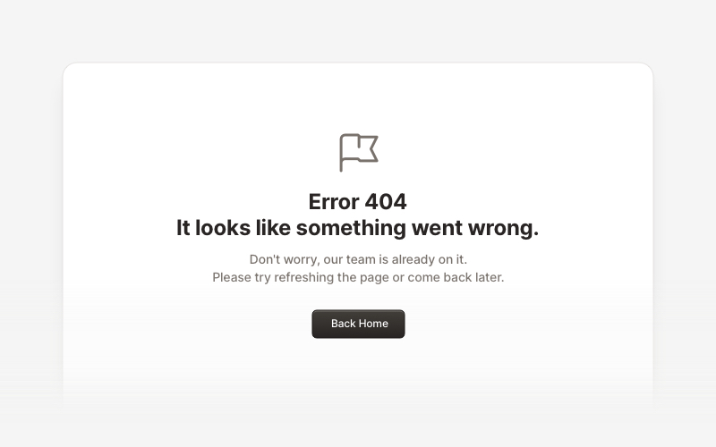
ErrorProfessional error page components for React and Next.js. Build 404 and 500 error pages with various layouts, icons, emoji, background images, and call-to-action buttons for better user experience.
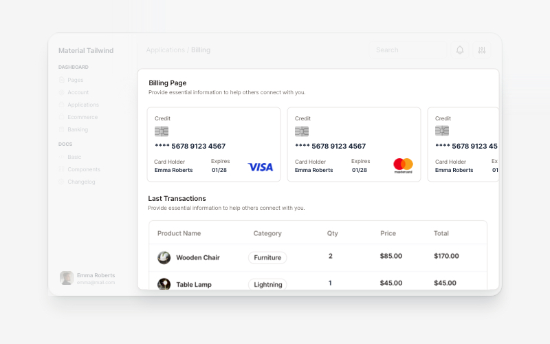
BillingProfessional billing and payment UI components for React and Next.js. Build payment forms, invoices, subscription management, and checkout flows with pre-built blocks.
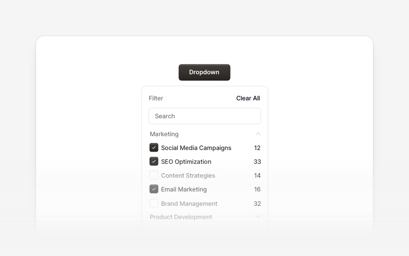
DropdownProfessional dropdown menu and filter components for React and Next.js. Build priority filters, status filters, checkbox filters, range selectors, searchable filters, and tabbed filter menus for advanced data filtering.
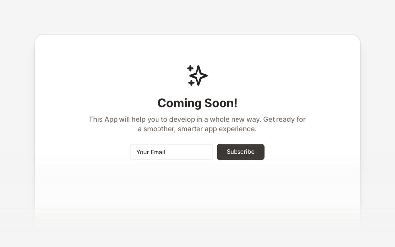
Coming SoonProfessional coming soon and launching soon page components for React and Next.js. Build launch pages with countdown timers, email subscriptions, video backgrounds, app previews, and notification signup forms.
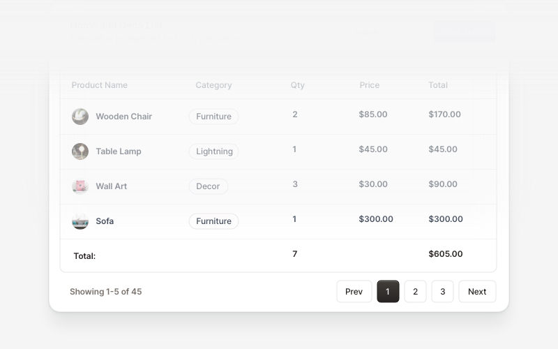
Table FooterProfessional table footer components for React and Next.js. Build pagination controls, row selection displays, date range filters, progress indicators, and action buttons for data tables with customizable layouts.
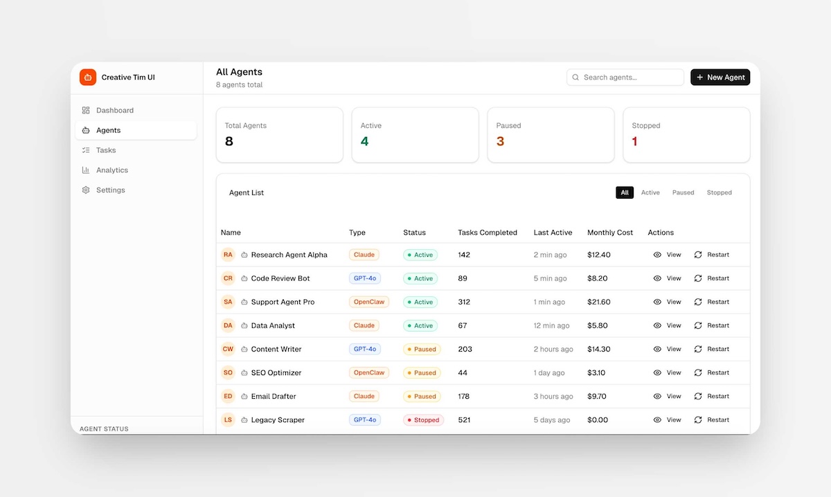
PagesComplete, ready-to-use full-page layouts for React and Next.js. Drop in a full page — dashboards, management views, and multi-section layouts composed from multiple blocks. Install with one command and customize to your needs.
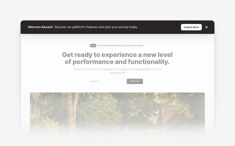
BannerAttention-grabbing banner components for React and Next.js. Build notification banners, promotional headers, announcement bars, and call-to-action banners with dismissible options.
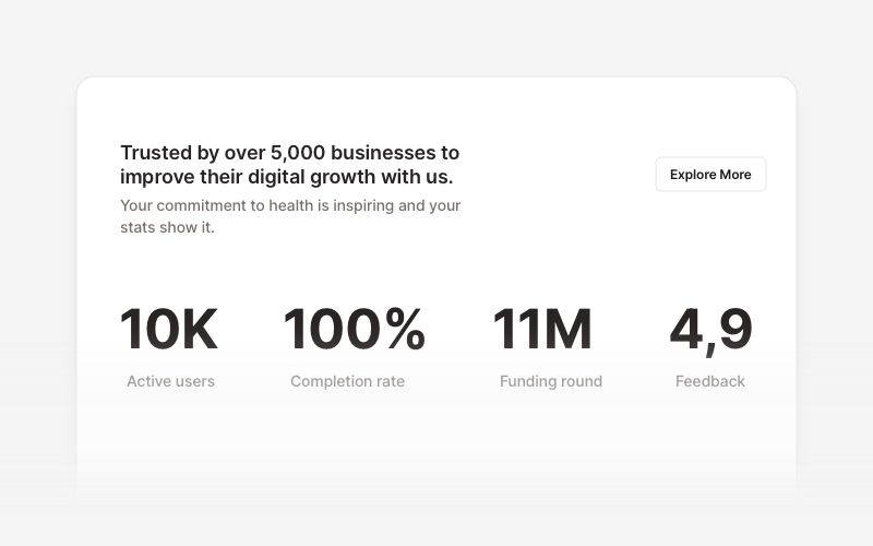
StatsProfessional statistics and metrics components for React and Next.js. Build data showcases, KPI dashboards, achievement displays, growth metrics, and performance indicators with customizable layouts and dark theme variations.