Basic banner with call-to-action button and dismiss - shadcn/ui
A notification banner with transparent and colored variants, featuring a promotional message with call-to-action button and dismissible close functionality. Built with shadcn/ui Button component for clean, accessible announcement displays. Perfect for promotional headers, announcement bars, and site-wide notifications.
Preview
Explore More Blocks
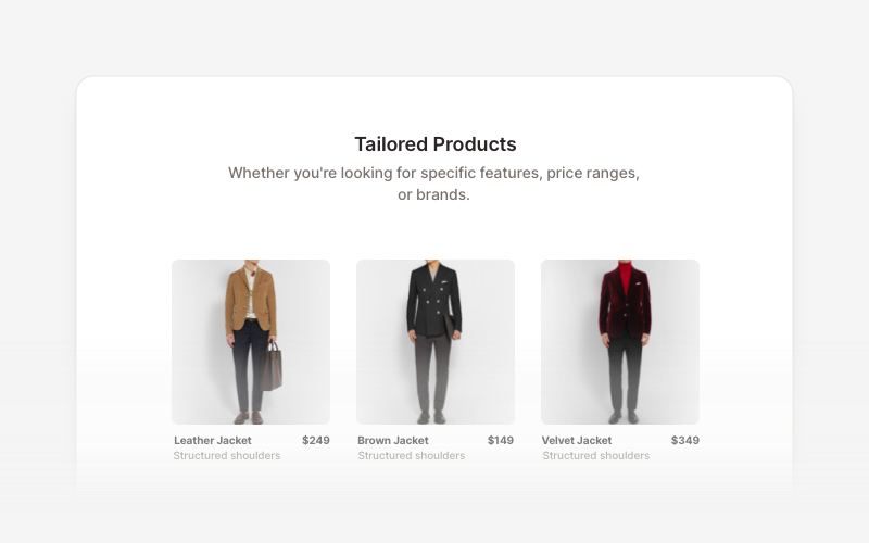
Product ListProfessional product listing and showcase components for React and Next.js. Build product grids, filtered lists, rating displays, and ecommerce product catalogs with customizable layouts.
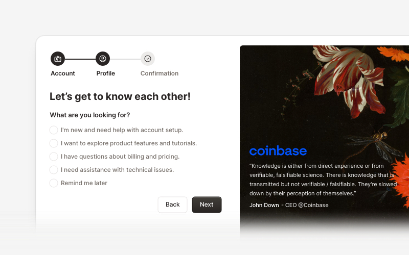
OnboardingProfessional user onboarding and welcome components for React and Next.js. Build multi-step onboarding flows, welcome cards, stepper forms, verification screens, and guided setup experiences with customizable layouts.
LogoProfessional brand logo showcase components for React and Next.js. Build trust sections, partner displays, client logos, and company ecosystem layouts with various styles and configurations.
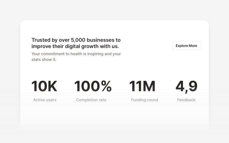
StatsProfessional statistics and metrics components for React and Next.js. Build data showcases, KPI dashboards, achievement displays, growth metrics, and performance indicators with customizable layouts and dark theme variations.
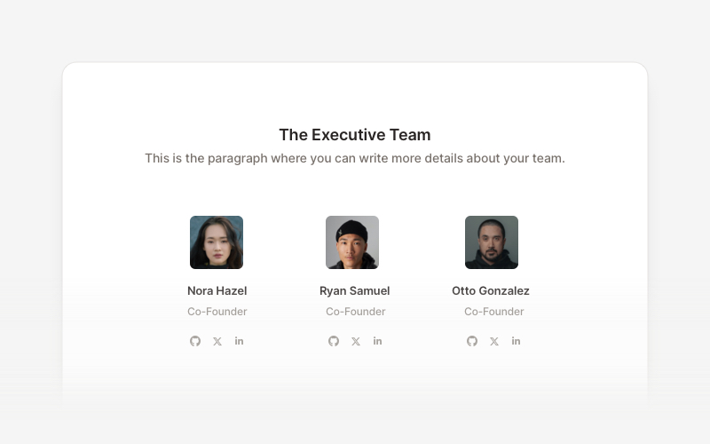
TeamProfessional team member showcase components for React and Next.js. Build team pages, member profiles, organization charts, and employee directories with customizable layouts.
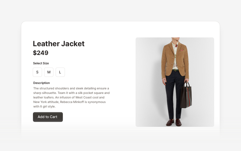
EcommerceProfessional ecommerce components for React and Next.js. Build product listings, shopping carts, checkout flows, and complete online store experiences.
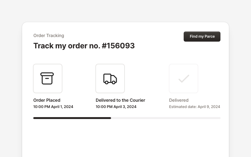
OrderProfessional order tracking and management components for React and Next.js. Build order details pages, tracking timelines, shipping status displays, order summaries, and delivery management interfaces with customizable layouts.
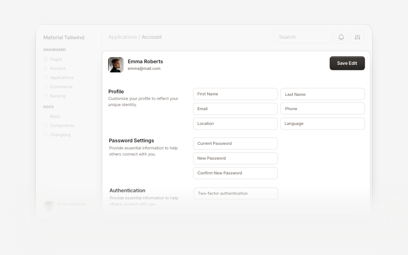
AccountBeautiful and customizable account management components for React and Next.js. Build user profiles, settings, authentication flows, and account dashboards with ready-to-use blocks.