Simple banner variations with centered text and actions - shadcn/ui
PROA collection of centered banner variations showcasing different content layouts: plain text, text with action icon, text with single CTA, and text with dual CTAs. Built with shadcn/ui Button component for flexible announcement displays. Ideal for feature announcements, update notifications, and promotional content.
Preview
Explore More Blocks
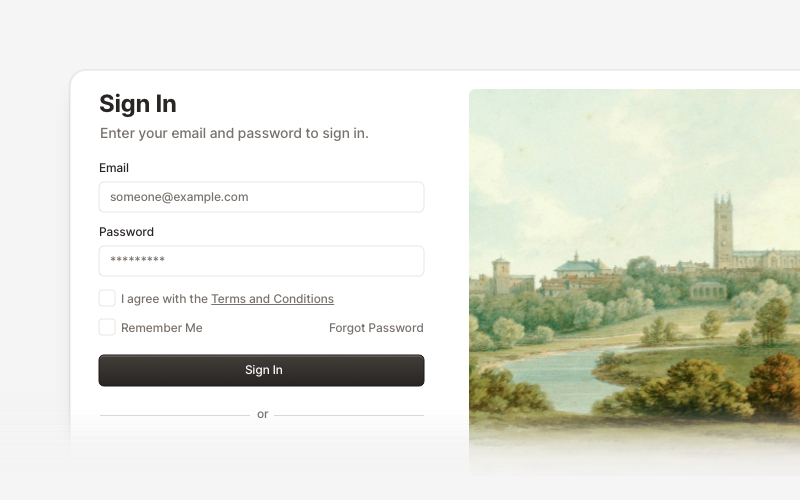
AuthenticationSecure authentication components and login flows for React and Next.js. Build sign-in forms, registration pages, password reset flows, and authentication interfaces.
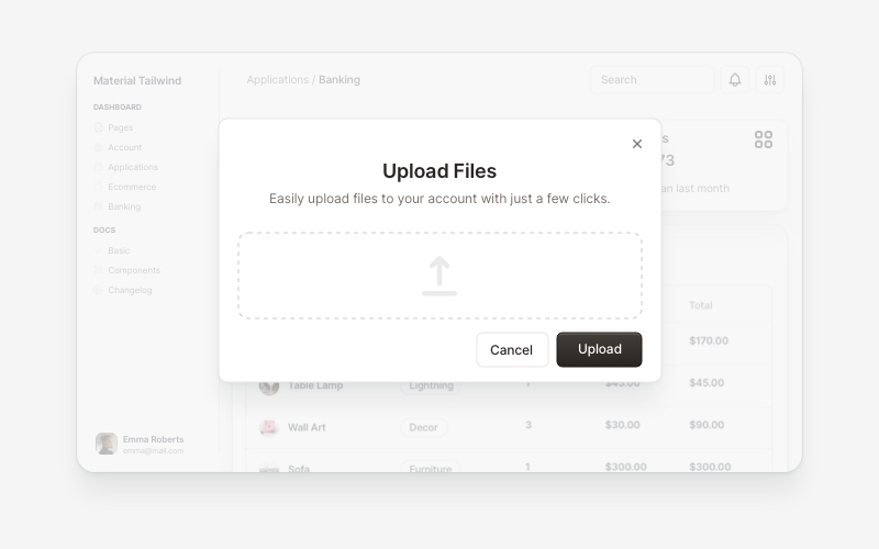
ModalsBeautiful modal and dialog components for React and Next.js. Build popups, confirmations, forms, and interactive overlay interfaces with accessible components.
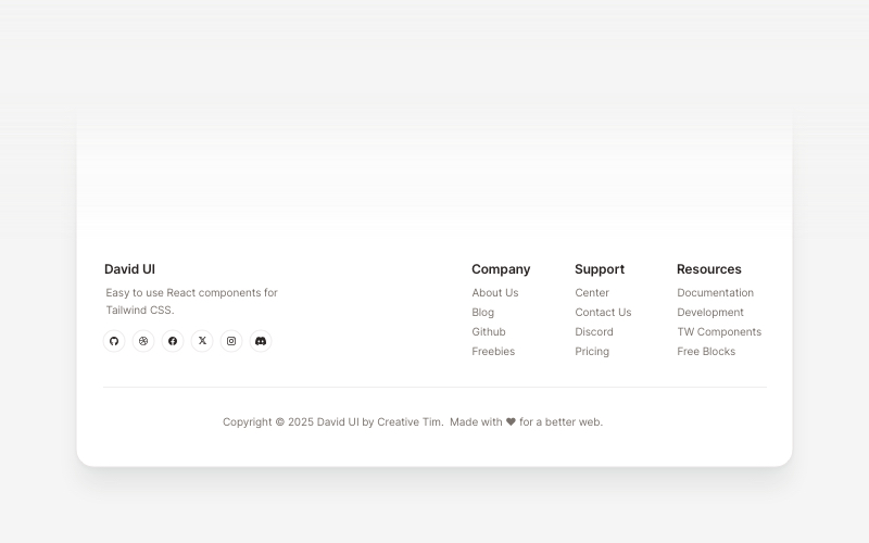
FootersModern footer components and section layouts for React and Next.js. Build professional website footers with links, social media, newsletters, and navigation.
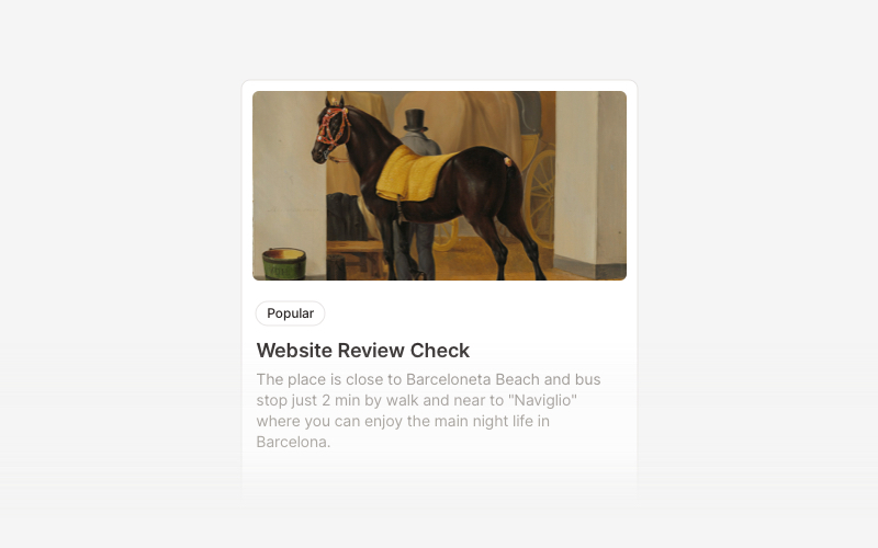
CardVersatile card layout components for React and Next.js. Build content cards with avatars, images, backgrounds, call-to-action buttons, and various layouts for displaying information in organized containers.
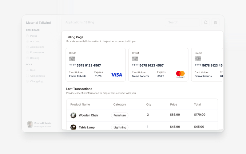
BillingProfessional billing and payment UI components for React and Next.js. Build payment forms, invoices, subscription management, and checkout flows with pre-built blocks.
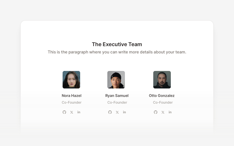
TeamProfessional team member showcase components for React and Next.js. Build team pages, member profiles, organization charts, and employee directories with customizable layouts.
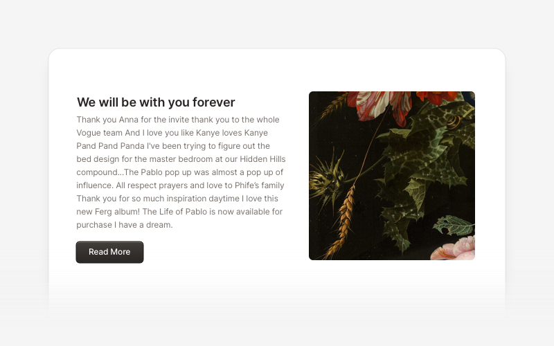
ContentVersatile content layout components for React and Next.js. Build blog posts, articles, portfolios, project showcases, comment sections, and rich content presentations with customizable designs.
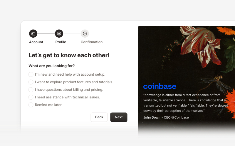
OnboardingProfessional user onboarding and welcome components for React and Next.js. Build multi-step onboarding flows, welcome cards, stepper forms, verification screens, and guided setup experiences with customizable layouts.