Blog cards with view more button - shadcn/ui
PROUse this versatile blog section example that includes cards for each blog post with a suggestive image, title, description, author, publication date, and category of the blog post, all styled using shadcn/ui components.
Preview
Explore More Blocks
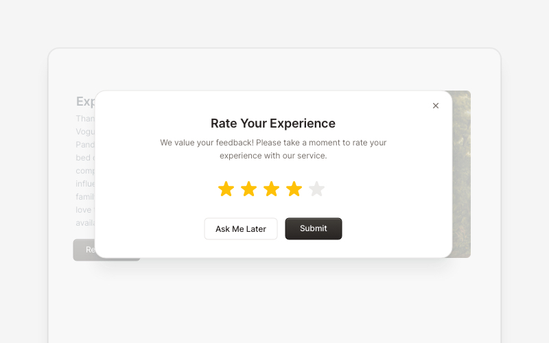
PopupEngaging popup and notification components for React and Next.js. Build welcome messages, cookie notifications, subscription forms, success confirmations, and promotional announcements with dismissible options and call-to-action elements.
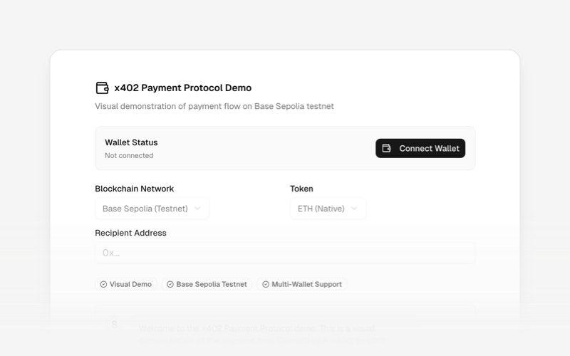
x402Internet-native payment protocol components for React and Next.js. Build AI agent payments, HTTP-based stablecoin transactions, and autonomous commerce experiences using the x402 protocol.
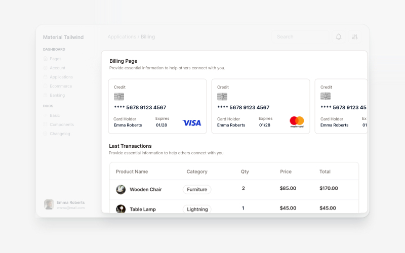
BillingProfessional billing and payment UI components for React and Next.js. Build payment forms, invoices, subscription management, and checkout flows with pre-built blocks.
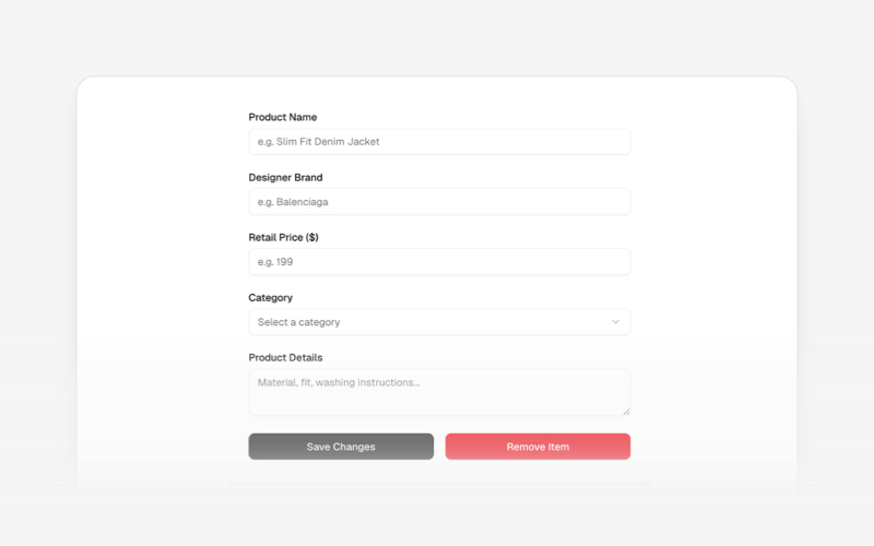
CRUDsComplete CRUD interface components and data management blocks for React and Next.js. Build admin panels, data tables, forms, and database management interfaces.
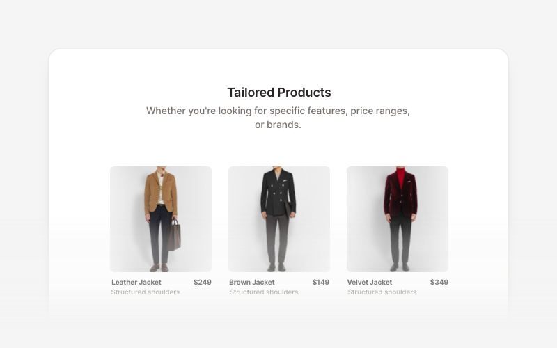
Product ListProfessional product listing and showcase components for React and Next.js. Build product grids, filtered lists, rating displays, and ecommerce product catalogs with customizable layouts.
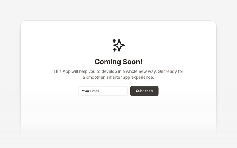
Coming SoonProfessional coming soon and launching soon page components for React and Next.js. Build launch pages with countdown timers, email subscriptions, video backgrounds, app previews, and notification signup forms.
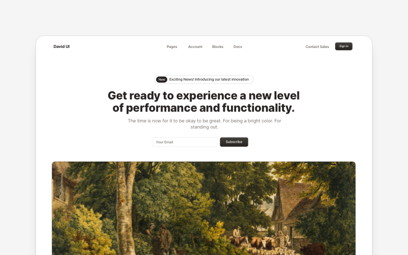
HeroEye-catching hero section components for React and Next.js. Build landing page heroes, call-to-action sections, lead generation forms, and compelling above-the-fold content.
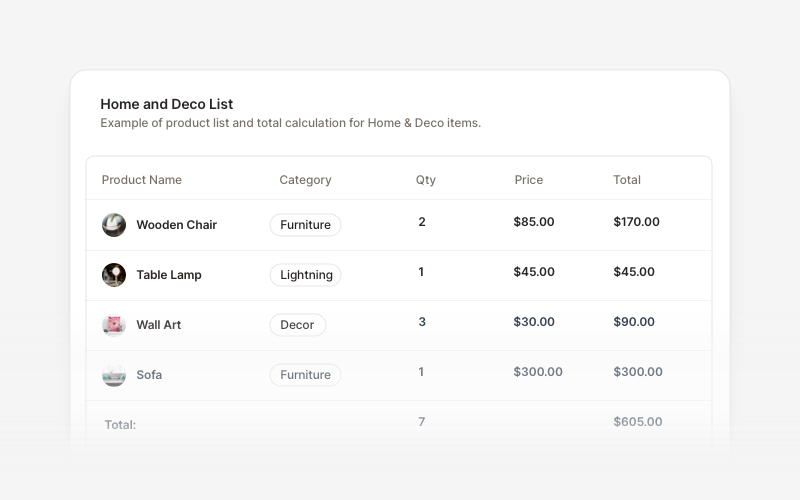
TableProfessional data table components for React and Next.js. Build product comparisons, crypto trackers, inventory tables, sales reports, member lists, invoices, and transaction records with sortable columns and interactive features.