Simple blog content cards - shadcn/ui
In the example below, each card represents a distinct piece of information, featuring an image, a title, a brief description, and some additional details like author attribution and the post date, built with shadcn/ui for visual consistency.
Preview
Explore More Blocks
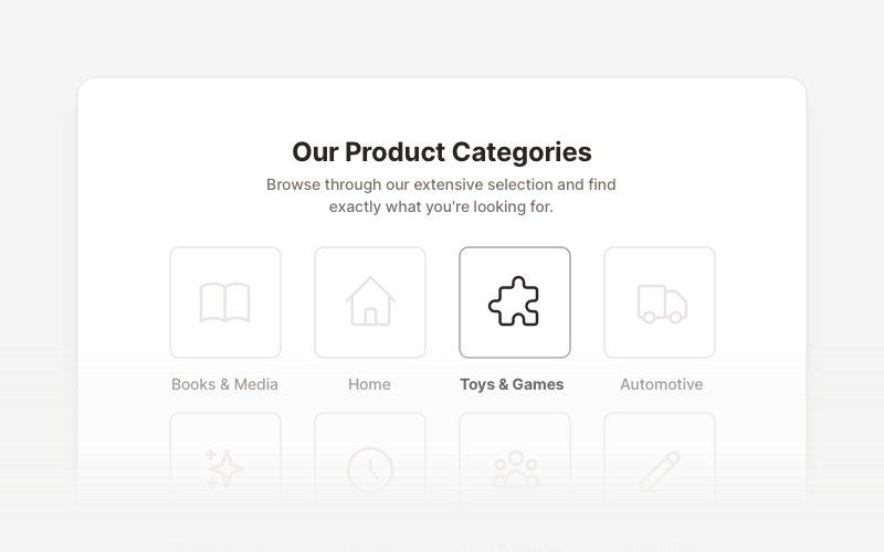
LayoutProfessional category showcase and product layout components for React and Next.js. Build category grids, product collections, navigation sections, and organized content displays.
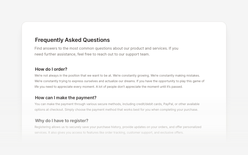
FAQsClean and accessible FAQ components and help section layouts for React and Next.js. Build knowledge bases, support pages, and frequently asked questions interfaces.
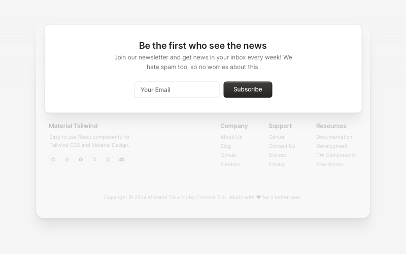
NewsletterModern newsletter subscription components for React and Next.js. Build email capture forms, subscribe popups, modals, and newsletter sections with validation and call-to-action elements.
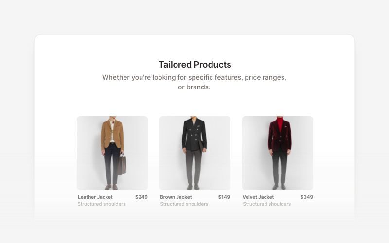
Product ListProfessional product listing and showcase components for React and Next.js. Build product grids, filtered lists, rating displays, and ecommerce product catalogs with customizable layouts.
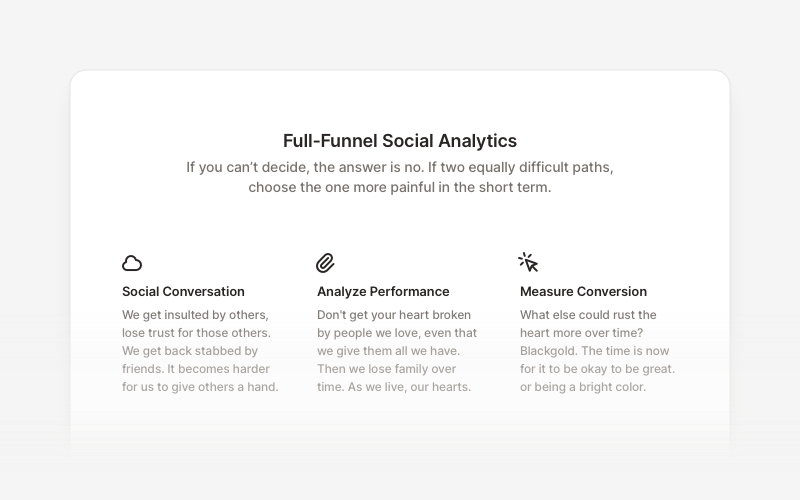
FeatureProfessional feature showcase components for React and Next.js. Build product features, service highlights, benefits sections, and feature comparison layouts with icons, images, and call-to-action elements.
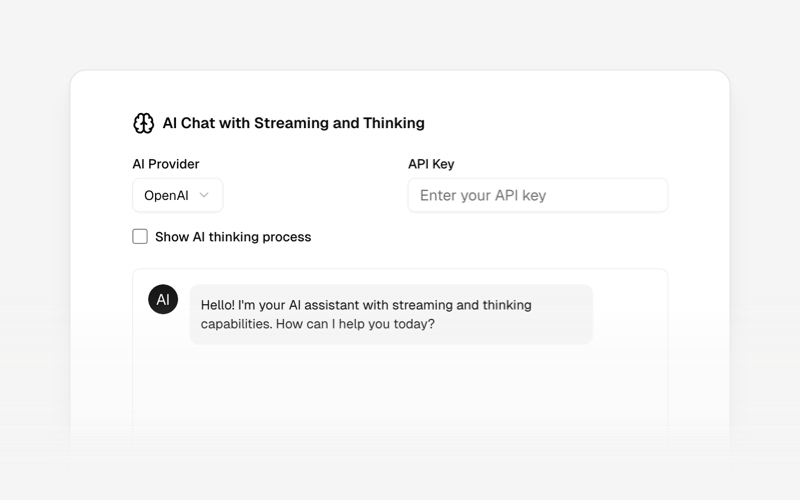
AI AgentsModern AI agent interface components and chat UI blocks for React and Next.js. Create conversational AI experiences, streaming responses, and interactive agent interfaces.
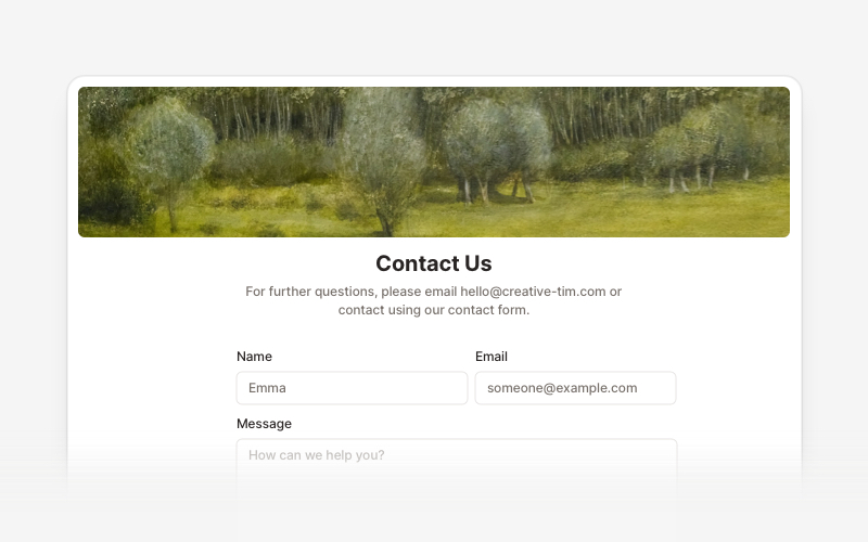
ContactProfessional contact form components and section layouts for React and Next.js. Build contact pages, feedback forms, support sections, and communication interfaces.
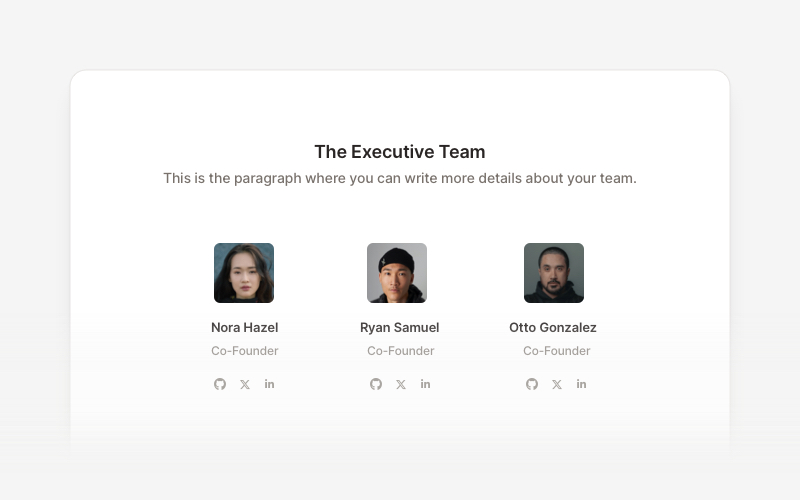
TeamProfessional team member showcase components for React and Next.js. Build team pages, member profiles, organization charts, and employee directories with customizable layouts.