Content card with header image and author avatar - shadcn/ui
A content card featuring a header image, category tag, title, description, and author information with avatar and posting date. Perfect for blog posts, articles, and content listings.
Preview
Explore More Blocks
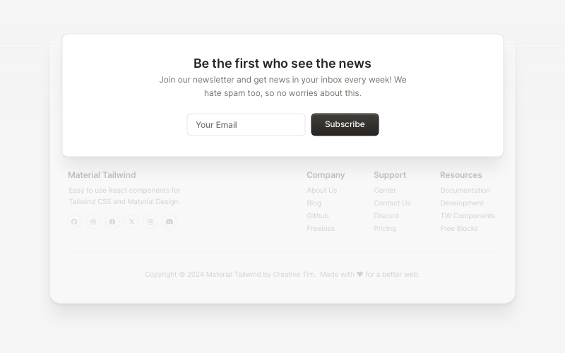
NewsletterModern newsletter subscription components for React and Next.js. Build email capture forms, subscribe popups, modals, and newsletter sections with validation and call-to-action elements.
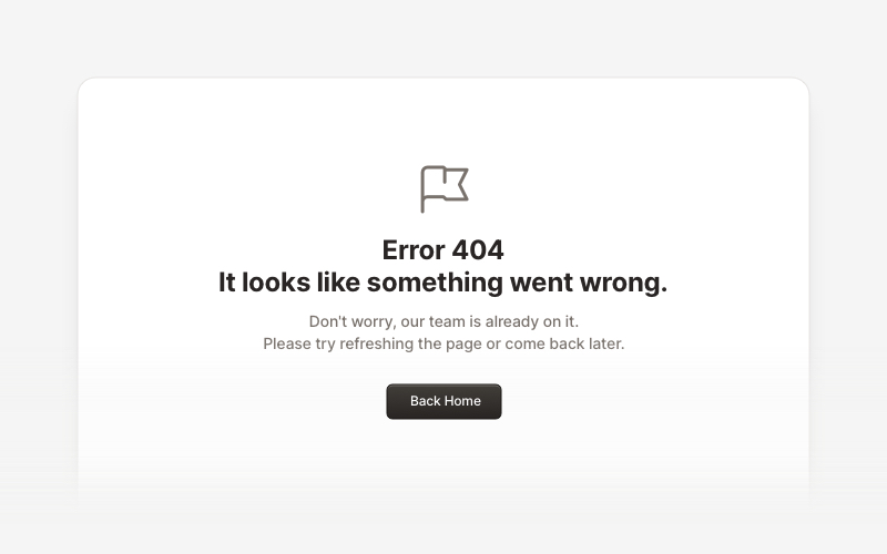
ErrorProfessional error page components for React and Next.js. Build 404 and 500 error pages with various layouts, icons, emoji, background images, and call-to-action buttons for better user experience.
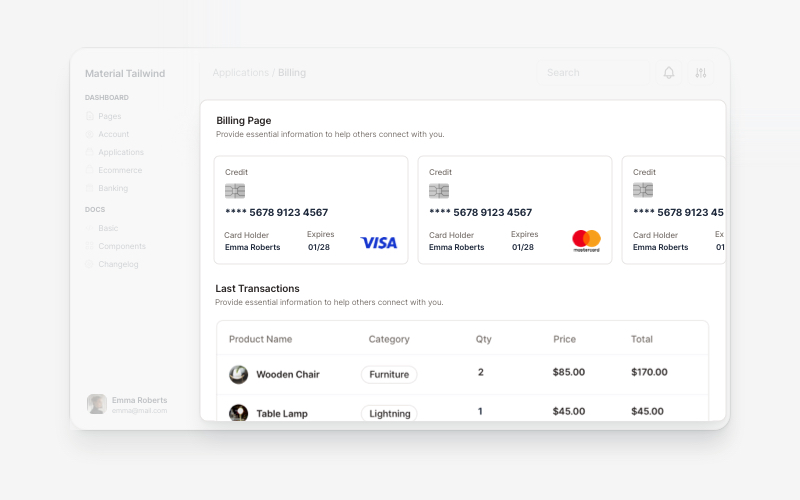
BillingProfessional billing and payment UI components for React and Next.js. Build payment forms, invoices, subscription management, and checkout flows with pre-built blocks.
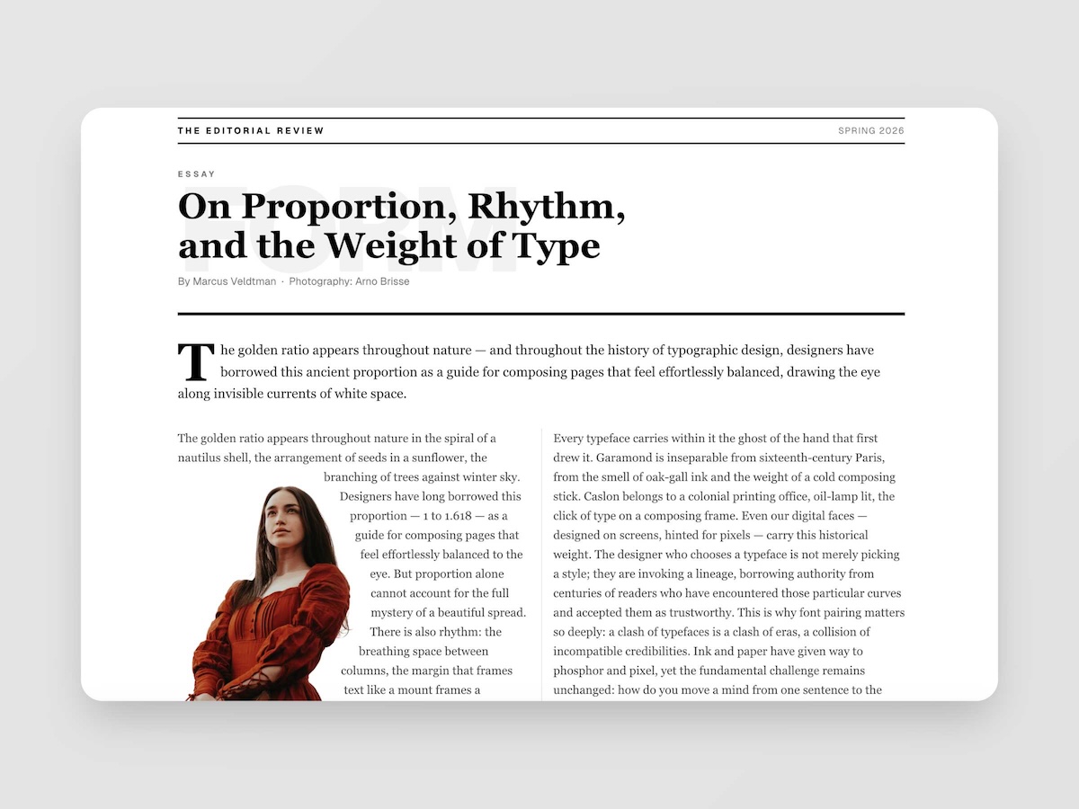
EditorialMagazine-quality editorial layouts where typography is the design. Multi-column spreads, text wrapping around images with pixel-precise line routing via Pretext, oversized words as visual anchors, pull quotes, drop caps, and the kind of spatial confidence you find in print — now in React.
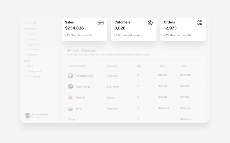
WidgetsVersatile widget components for React and Next.js. Build dashboard widgets, stats cards, join-now sections, and data visualization panels with customizable designs.
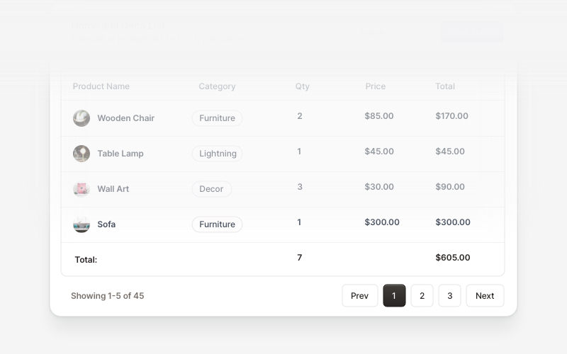
Table FooterProfessional table footer components for React and Next.js. Build pagination controls, row selection displays, date range filters, progress indicators, and action buttons for data tables with customizable layouts.
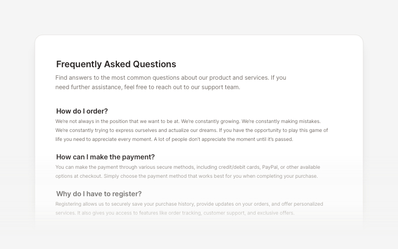
FAQsClean and accessible FAQ components and help section layouts for React and Next.js. Build knowledge bases, support pages, and frequently asked questions interfaces.
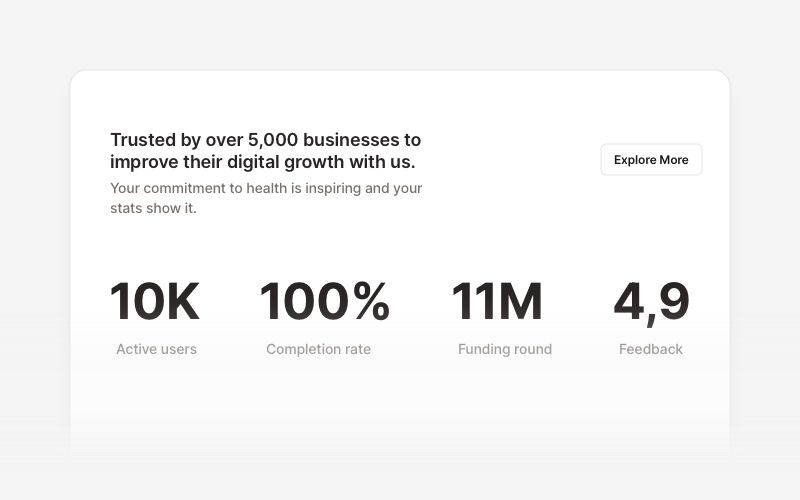
StatsProfessional statistics and metrics components for React and Next.js. Build data showcases, KPI dashboards, achievement displays, growth metrics, and performance indicators with customizable layouts and dark theme variations.