Features with dark background theme - shadcn/ui
PRODark-themed feature grid with white text and icons. Three-column layout with features and a highlighted card showing image and CTA button. Perfect for dark mode designs.
Preview
Explore More Blocks
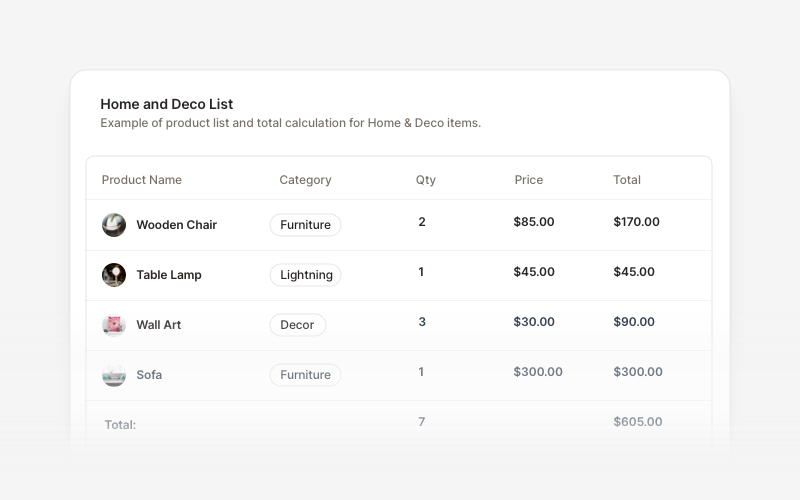
TableProfessional data table components for React and Next.js. Build product comparisons, crypto trackers, inventory tables, sales reports, member lists, invoices, and transaction records with sortable columns and interactive features.
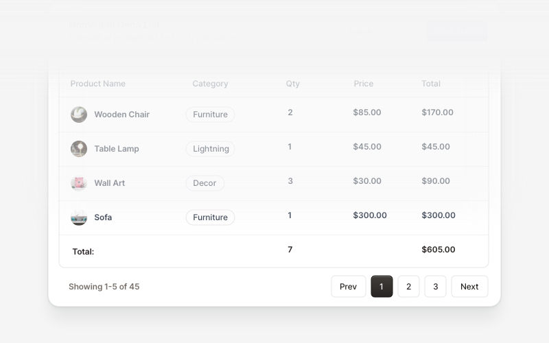
Table FooterProfessional table footer components for React and Next.js. Build pagination controls, row selection displays, date range filters, progress indicators, and action buttons for data tables with customizable layouts.
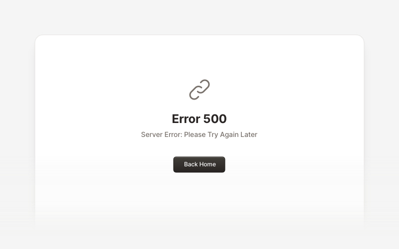
MaintenanceProfessional maintenance and downtime page components for React and Next.js. Build scheduled maintenance notifications, system upgrade messages, and under construction pages with email notifications and social links.
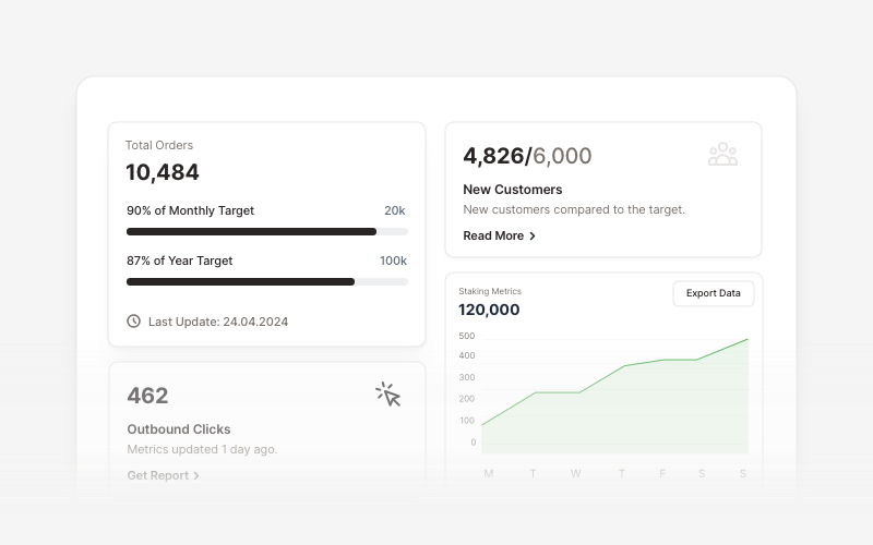
KPIProfessional KPI (Key Performance Indicator) card components for React and Next.js. Build metric displays, performance snapshots, dashboard cards with icons, badges, arrows, progress bars, charts, and action buttons to showcase business metrics and analytics.
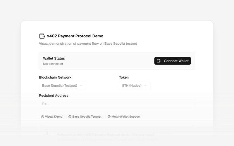
x402Internet-native payment protocol components for React and Next.js. Build AI agent payments, HTTP-based stablecoin transactions, and autonomous commerce experiences using the x402 protocol.
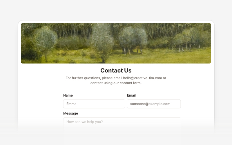
ContactProfessional contact form components and section layouts for React and Next.js. Build contact pages, feedback forms, support sections, and communication interfaces.
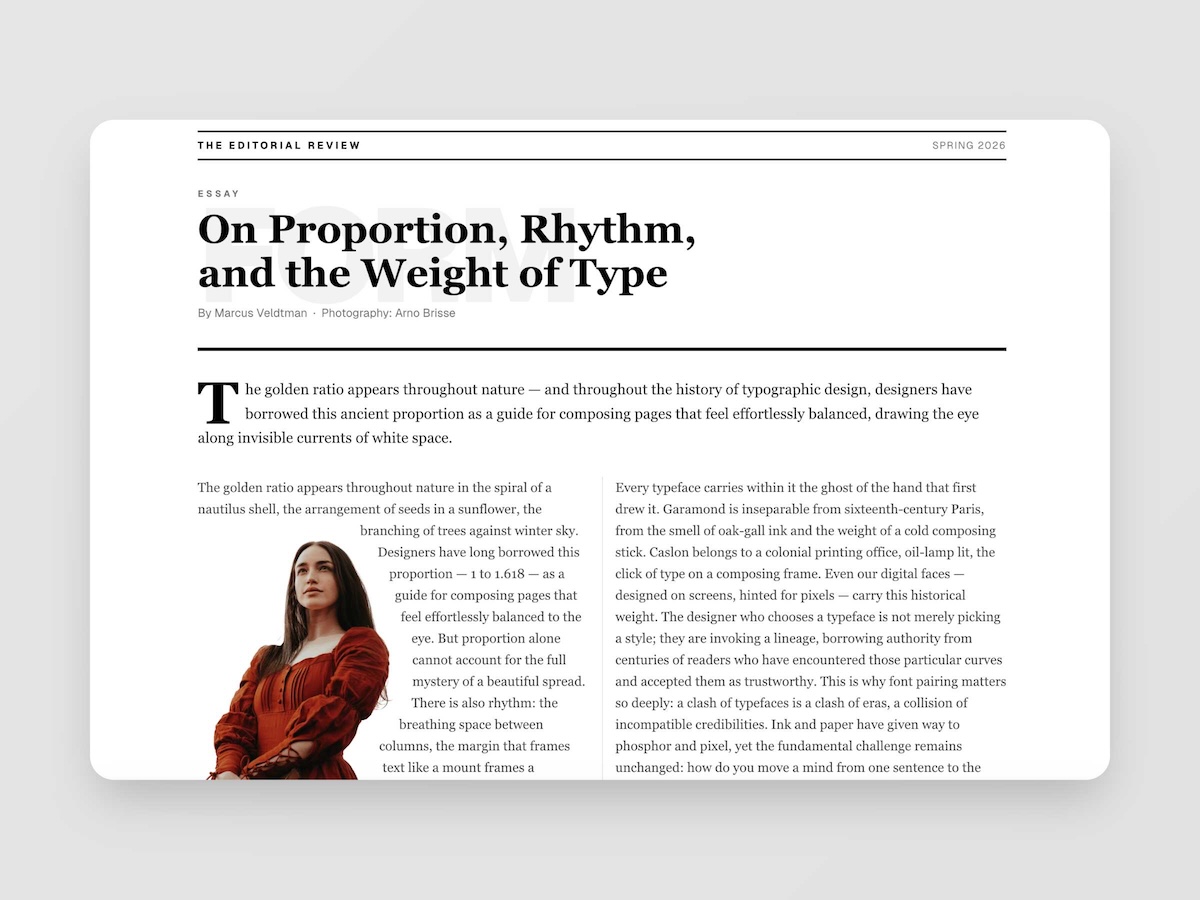
EditorialMagazine-quality editorial layouts where typography is the design. Multi-column spreads, text wrapping around images with pixel-precise line routing via Pretext, oversized words as visual anchors, pull quotes, drop caps, and the kind of spatial confidence you find in print — now in React.
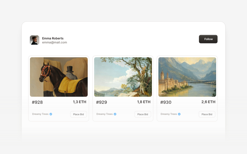
Web3 CardsModern Web3 and blockchain card components for React and Next.js. Build wallet connection cards, NFT displays, token interfaces, and decentralized application card layouts.