Minimalist logo grid with grayscale styling - shadcn/ui
PROClean minimalist logo showcase with subtle grayscale and opacity effects. Features accent colored label and bold statistics. Perfect for modern, professional landing pages.
Preview
Component Details
- ID
- minimalist-logo-block
- Type
- Block
- Access
- PRO
- Category
- Logo
- Published
- 3 Apr 2026
Files Included
- app/minimalist-logo-block/page.tsx
- components/creative-tim/blocks/minimalist-logo-block.tsx
Explore More Blocks
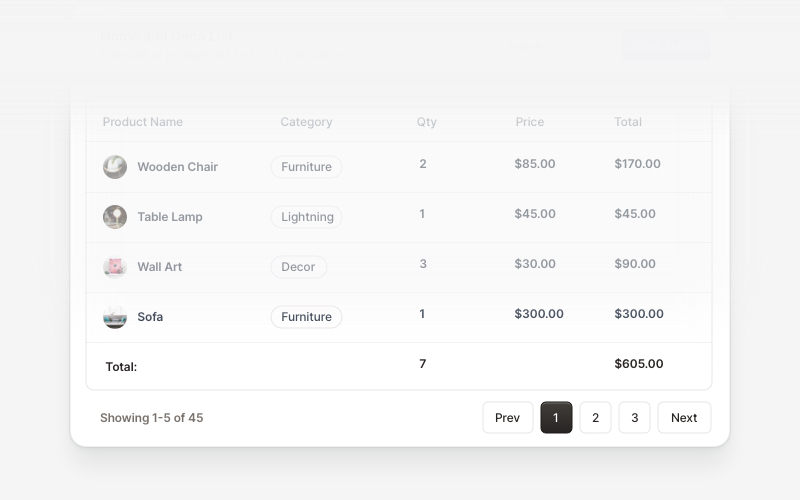
Table FooterProfessional table footer components for React and Next.js. Build pagination controls, row selection displays, date range filters, progress indicators, and action buttons for data tables with customizable layouts.
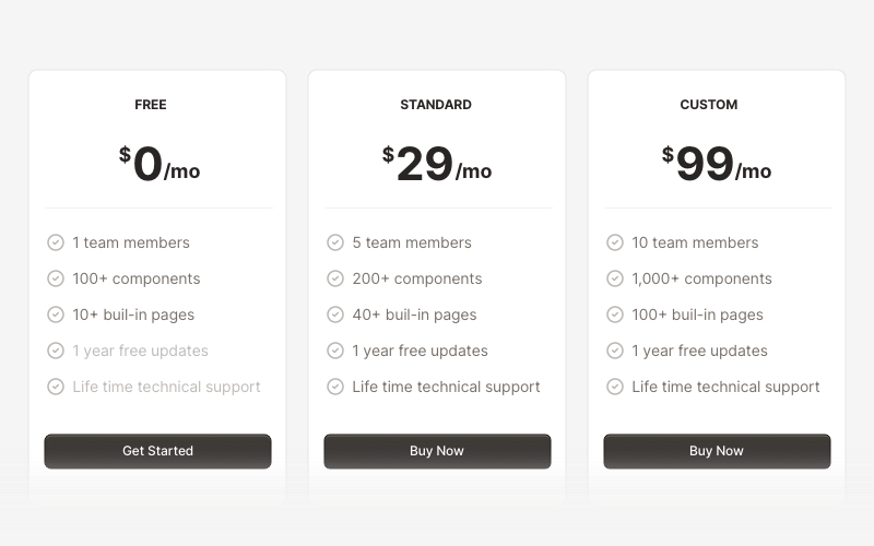
PricingProfessional pricing and plan comparison components for React and Next.js. Build pricing tables, subscription plans, feature comparisons, and pricing toggles with monthly/annual options.
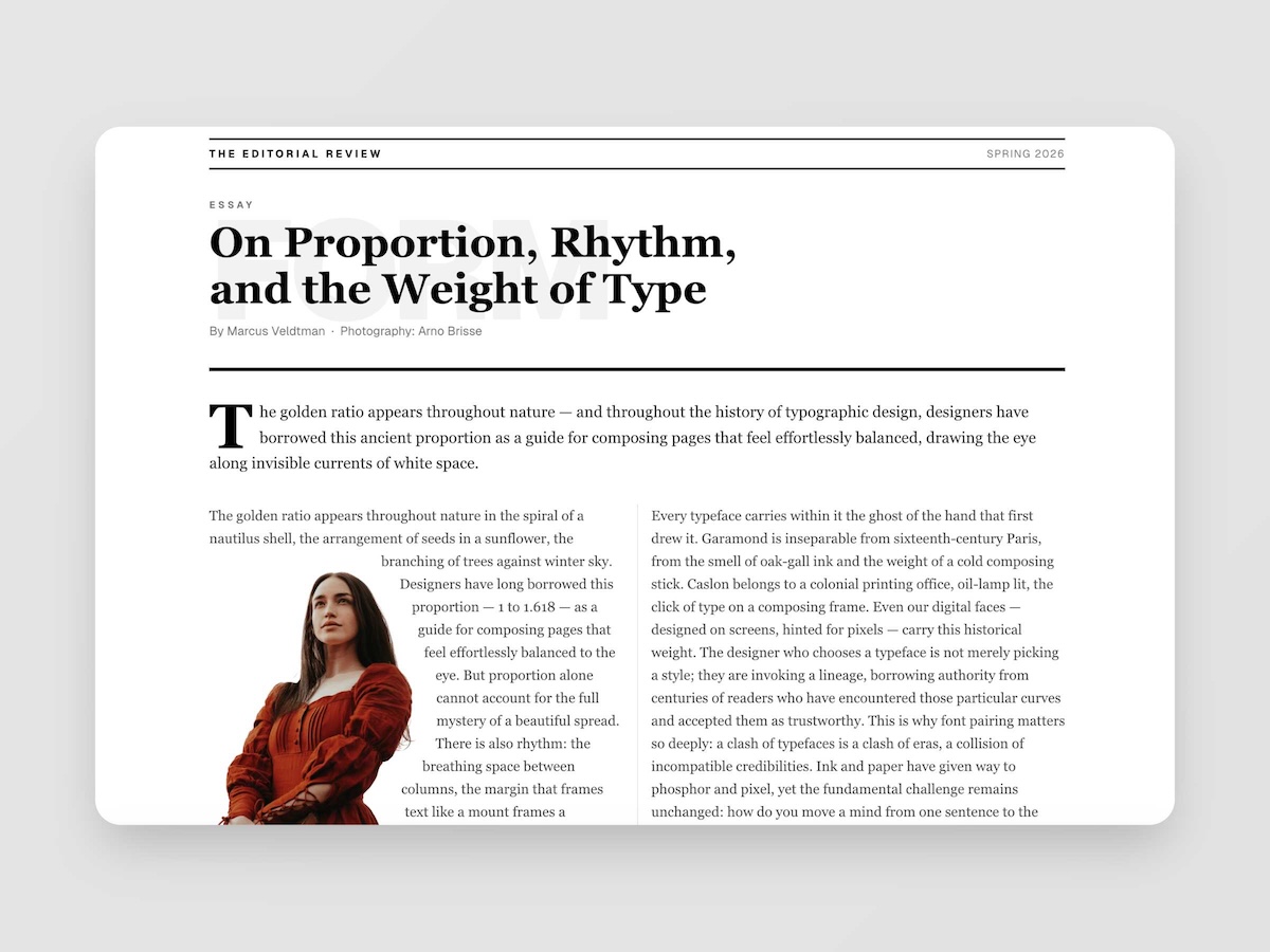
EditorialMagazine-quality editorial layouts where typography is the design. Multi-column spreads, text wrapping around images with pixel-precise line routing via Pretext, oversized words as visual anchors, pull quotes, drop caps, and the kind of spatial confidence you find in print — now in React.
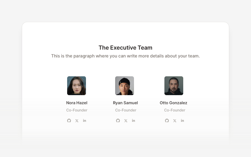
TeamProfessional team member showcase components for React and Next.js. Build team pages, member profiles, organization charts, and employee directories with customizable layouts.
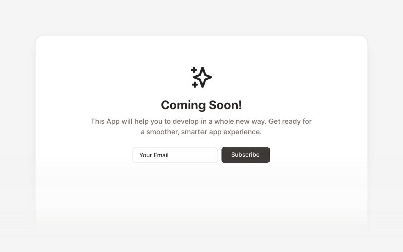
Coming SoonProfessional coming soon and launching soon page components for React and Next.js. Build launch pages with countdown timers, email subscriptions, video backgrounds, app previews, and notification signup forms.

PopupEngaging popup and notification components for React and Next.js. Build welcome messages, cookie notifications, subscription forms, success confirmations, and promotional announcements with dismissible options and call-to-action elements.
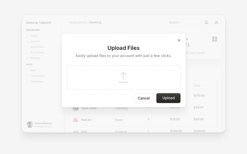
ModalsBeautiful modal and dialog components for React and Next.js. Build popups, confirmations, forms, and interactive overlay interfaces with accessible components.
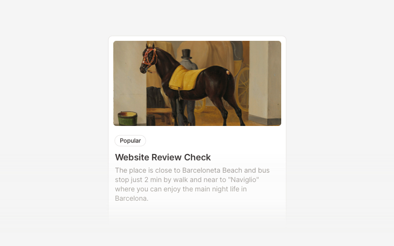
CardVersatile card layout components for React and Next.js. Build content cards with avatars, images, backgrounds, call-to-action buttons, and various layouts for displaying information in organized containers.