Disable collection lock rules modal with alert and impact list - shadcn/ui
PROPreview
Explore More Blocks
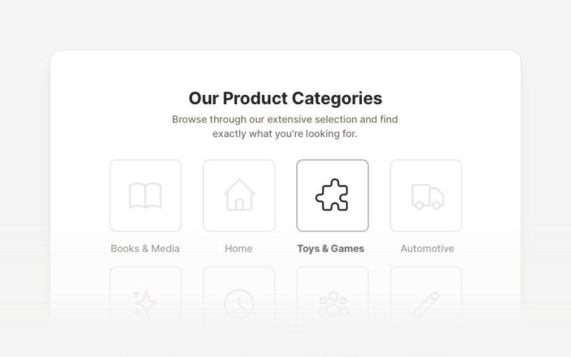
LayoutProfessional category showcase and product layout components for React and Next.js. Build category grids, product collections, navigation sections, and organized content displays.
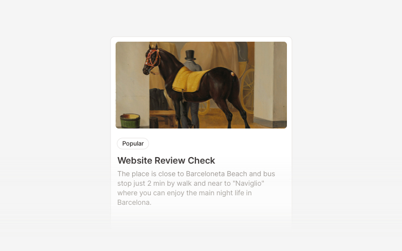
CardVersatile card layout components for React and Next.js. Build content cards with avatars, images, backgrounds, call-to-action buttons, and various layouts for displaying information in organized containers.
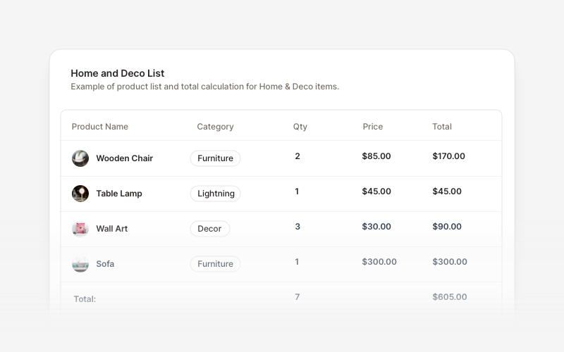
TableProfessional data table components for React and Next.js. Build product comparisons, crypto trackers, inventory tables, sales reports, member lists, invoices, and transaction records with sortable columns and interactive features.
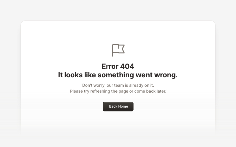
ErrorProfessional error page components for React and Next.js. Build 404 and 500 error pages with various layouts, icons, emoji, background images, and call-to-action buttons for better user experience.
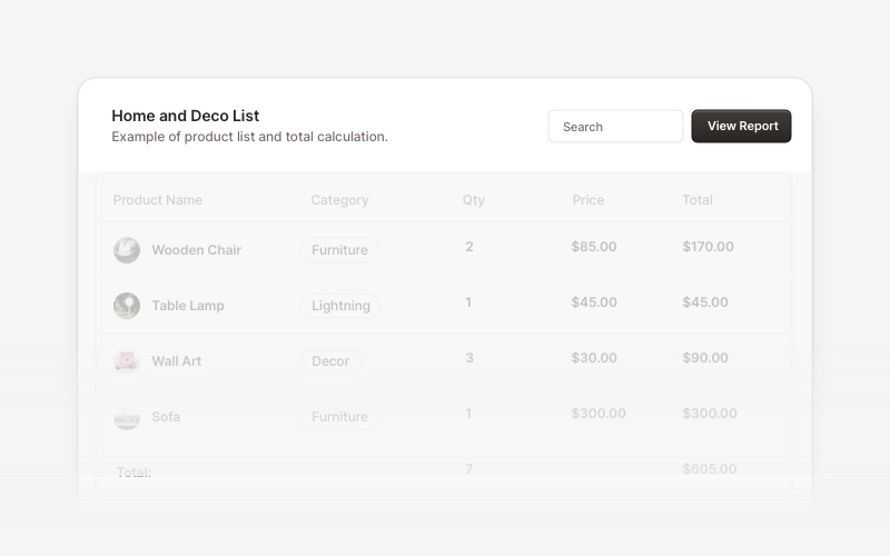
Table HeaderProfessional table header components for React and Next.js. Build search bars, filter controls, category tabs, action buttons, and sorting options for data tables with flexible layouts.
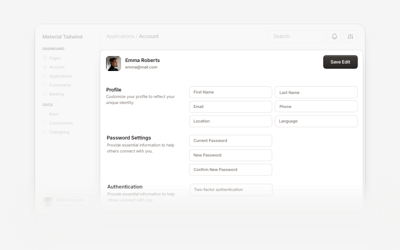
AccountBeautiful and customizable account management components for React and Next.js. Build user profiles, settings, authentication flows, and account dashboards with ready-to-use blocks.
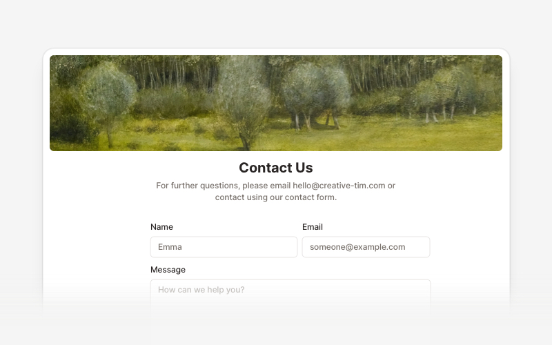
ContactProfessional contact form components and section layouts for React and Next.js. Build contact pages, feedback forms, support sections, and communication interfaces.
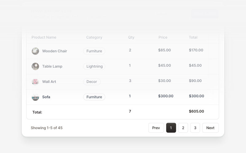
Table FooterProfessional table footer components for React and Next.js. Build pagination controls, row selection displays, date range filters, progress indicators, and action buttons for data tables with customizable layouts.