Simple features grid with CTA buttons - shadcn/ui
Four-column feature grid with centered heading and description. Each feature card includes a title, description, and 'Read More' button for exploring details.
Preview
Explore More Blocks
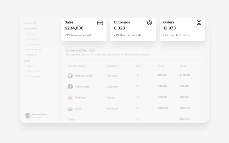
WidgetsVersatile widget components for React and Next.js. Build dashboard widgets, stats cards, join-now sections, and data visualization panels with customizable designs.
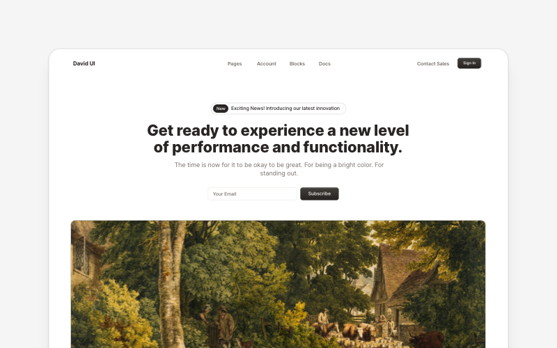
HeroEye-catching hero section components for React and Next.js. Build landing page heroes, call-to-action sections, lead generation forms, and compelling above-the-fold content.
LogoProfessional brand logo showcase components for React and Next.js. Build trust sections, partner displays, client logos, and company ecosystem layouts with various styles and configurations.
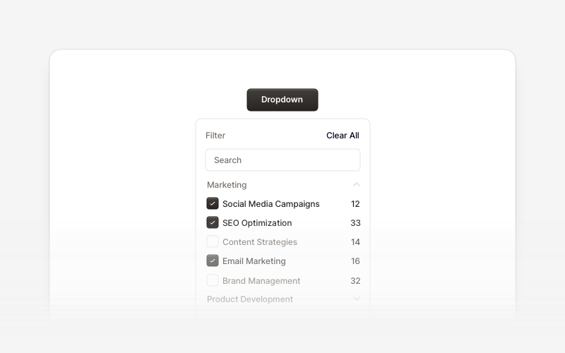
DropdownProfessional dropdown menu and filter components for React and Next.js. Build priority filters, status filters, checkbox filters, range selectors, searchable filters, and tabbed filter menus for advanced data filtering.
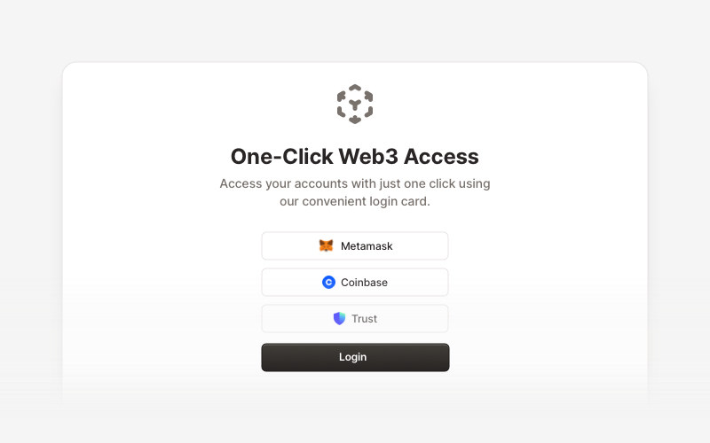
Web3 LoginModern Web3 authentication components for React and Next.js. Build crypto wallet login interfaces, blockchain selection screens, QR code authentication, and secure Web3 access flows with support for Metamask, Coinbase, Trust Wallet, and other popular crypto wallets.
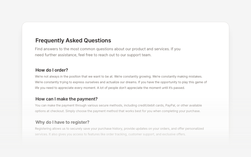
FAQsClean and accessible FAQ components and help section layouts for React and Next.js. Build knowledge bases, support pages, and frequently asked questions interfaces.
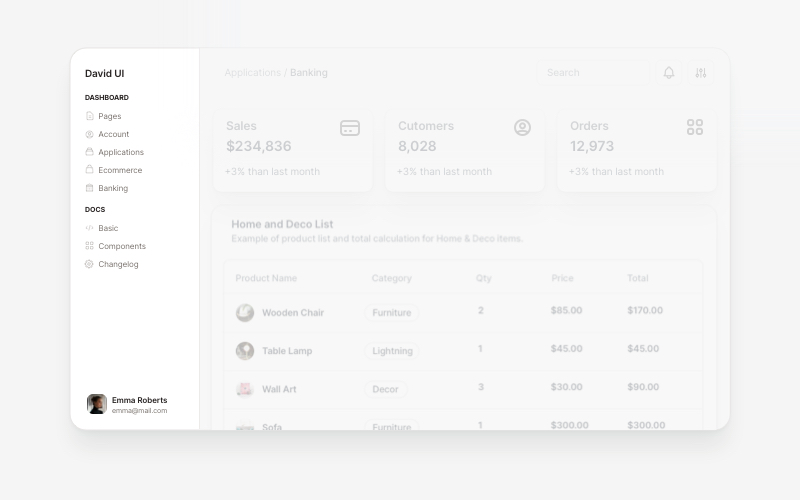
SidebarProfessional sidebar navigation and menu components for React and Next.js. Build dashboard sidebars, app navigation, crypto wallets, calendar views, task managers, and feature-rich sidebar layouts with customizable content.
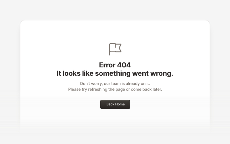
ErrorProfessional error page components for React and Next.js. Build 404 and 500 error pages with various layouts, icons, emoji, background images, and call-to-action buttons for better user experience.